OUTCOME
₦1B+
Daily Transfer Volume
26×
Revenue Growth
40%
User Base Growth
4.8★
App Store Rating
THE PROBLEM
A bank with world-class infrastructure but users were churning and features were failing.
By 2024, the platform had accumulated a paradox common to fast-growing fintechs: the underlying infrastructure was genuinely excellent, but users couldn't access what was under the hood.
The signals were unambiguous
- App Store ratings had fallen to less than 2.5, a visible, public indictment
- Daily active users declining steadily across both individual and business segments
- Transaction volume suppressed: under 100M naira monthly, a fraction of potential
- Support ticket volume high and growing: compliance complications, account upgrades, card management failures
- New features shipping but performing poorly, with low adoption that initially looked like product-market fit problems
- Revenue had dropped sharply; both individual and business customers were churning
The business impact was acute. Revenue had dropped sharply. Both individual and business customers were churning. A platform built on strong technical foundations was haemorrhaging trust at the surface.
There was also an internal compounding problem: a significant gap between design and engineering implementation. Designs were handed off correctly (the tooling and process were right) but what shipped often didn't match what was designed. Inconsistency was accumulating across the entire product surface at a systemic level.
THE MANDATE
A full overhaul. Every surface. From the ground up.
In Q4 2024, the decision was made at the executive level: a complete redesign of Safe Haven's entire Internet Banking System.
Platforms in Scope
- Individual Internet Banking: native mobile app (iOS & Android) and web application
- Corporate Banking: native mobile app (iOS & Android) and web application, Developer & Fintech Tools
- Responsive web designs
- Public website (deferred to subsequent release)
GATHERING INSIGHT
Before anything else, let's take a deep dive
I led a comprehensive review of the existing Internet Banking System across every touchpoint, covering both individual and business surfaces. This was a deep, structured team investigation across three dimensions: design audit, UX audit, and performance audit.
What the Audit Revealed
The findings were worse than expected. The product had accumulated years of additive feature development without a coherent design system to govern it.

What led to the Audit
During a development review, I noticed one implementation that didn't match the design. I flagged it, and then another appeared. And another. That moment triggered the full audit. What looked like isolated handoff errors turned out to be a systemic problem accumulating across the entire codebase for years.
User Research
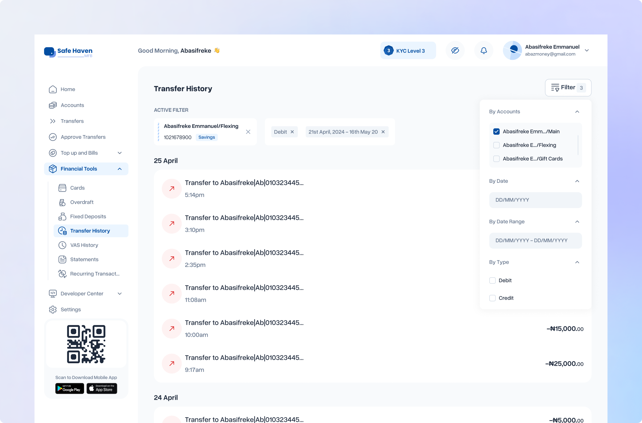
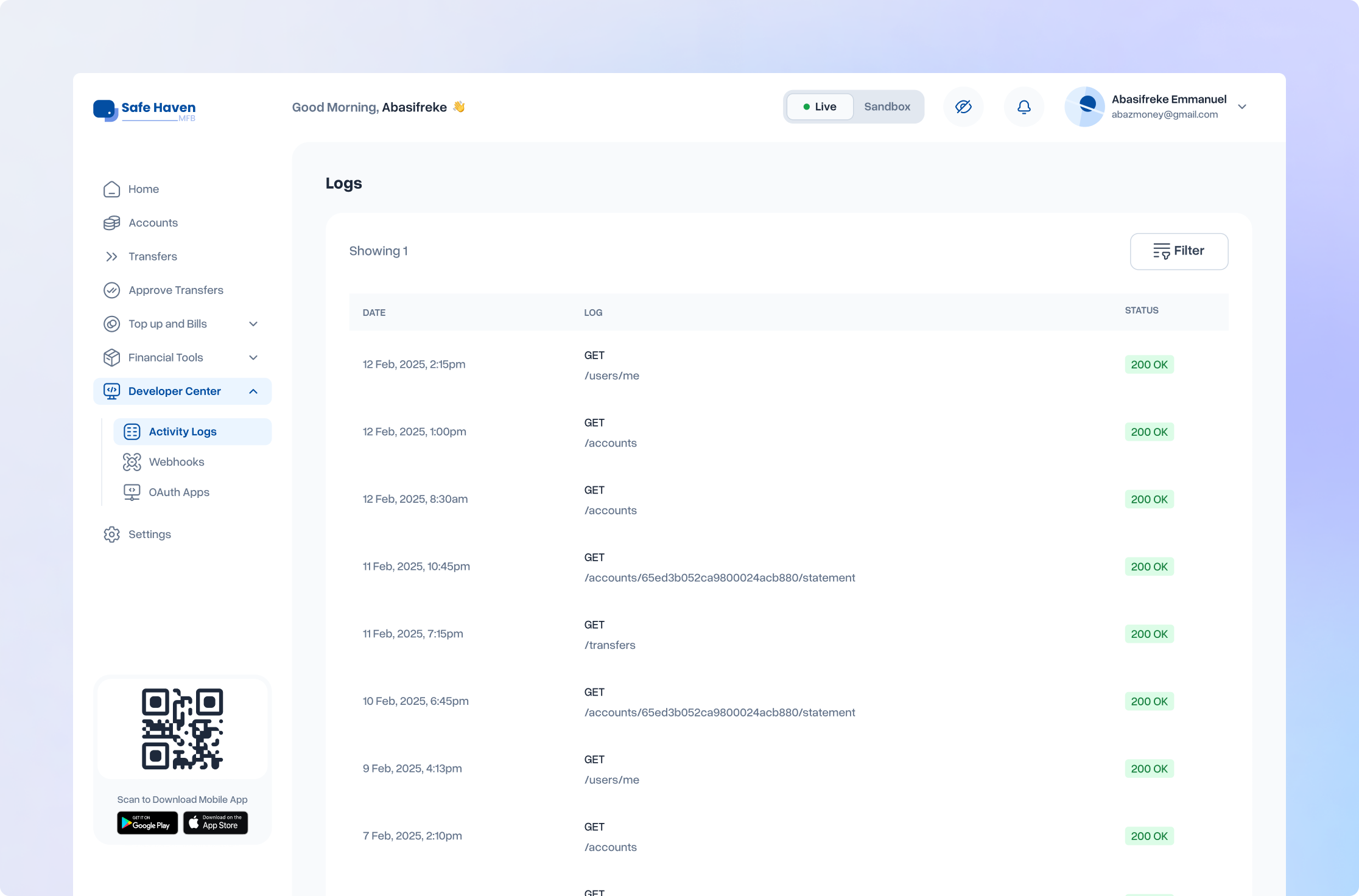
The audit gave us the internal diagnosis. We validated it externally through support ticket analysis (a systematic review of complaint patterns) and user testing (structured observation of how real users navigated the existing system).
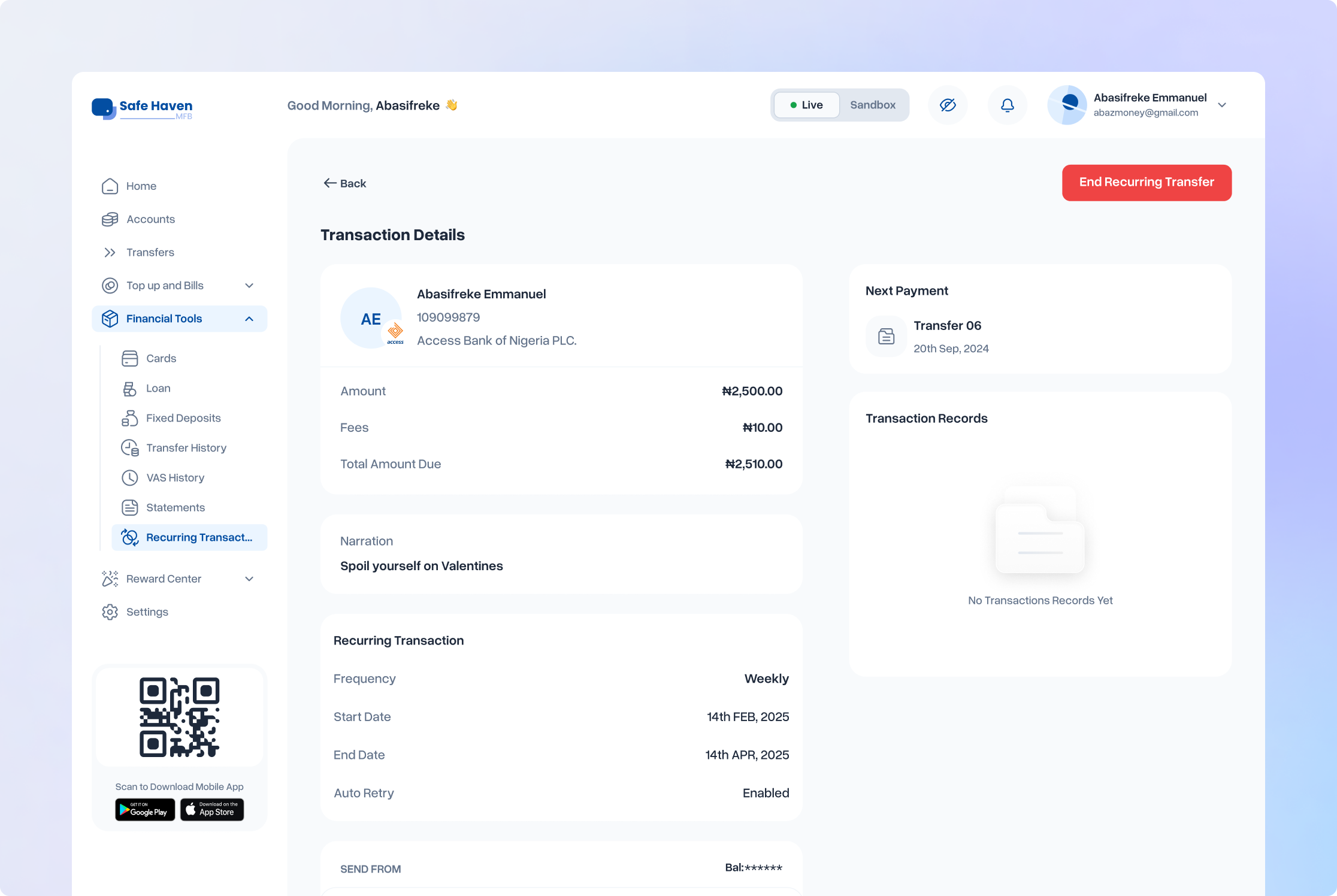
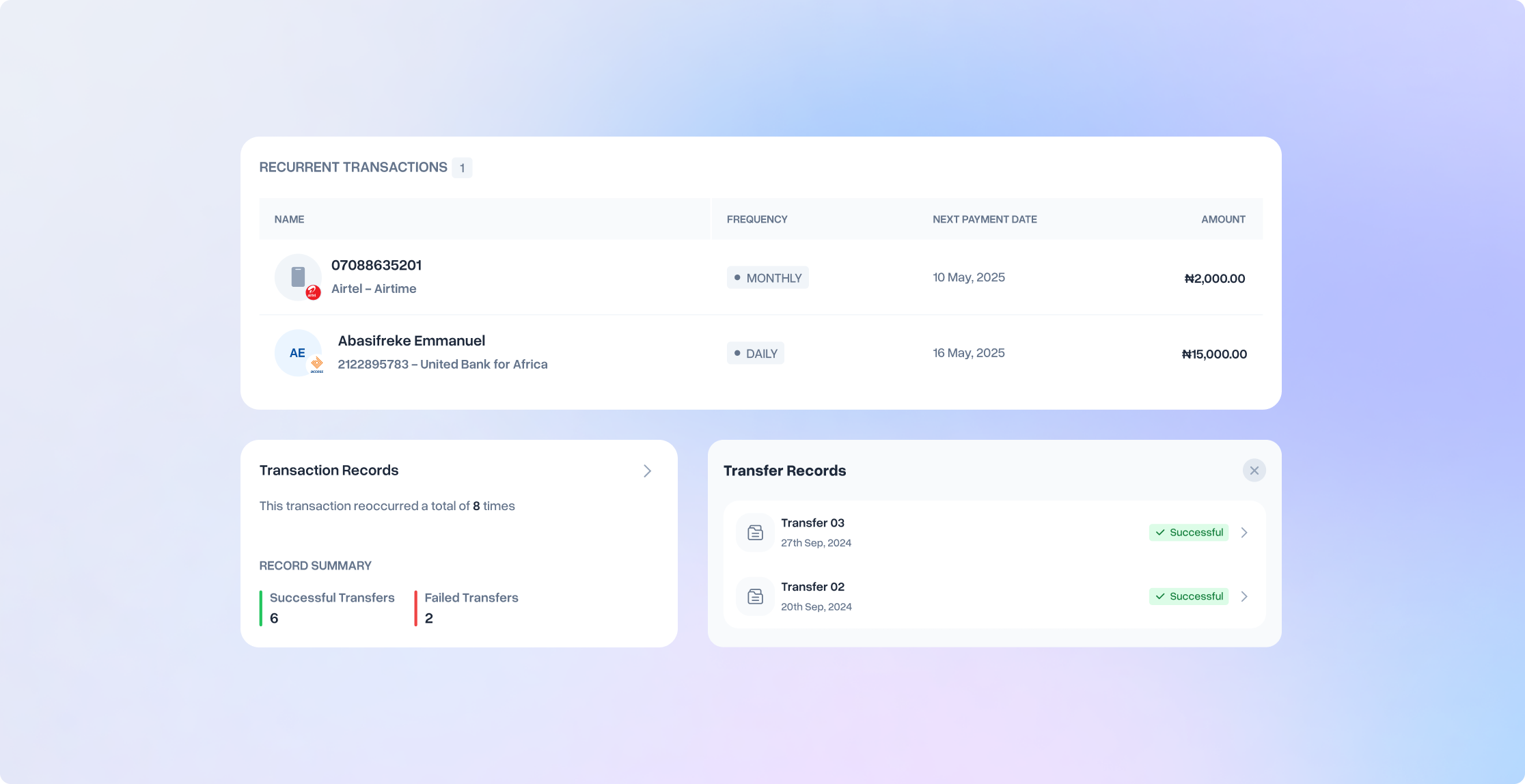
“Oh this is so good. I didn't even know it existed and it's such a need right now. Keeping up with payment schedules for salary, subscriptions... I can just put these payments on a schedule.”
— From a user, on discovering the recurring transaction feature that had been live in the product for months.
This was the pattern across multiple high-value features. The discoverability failure wasn't a feature quality problem. It was an architecture and communication problem. Users who found the features loved them. Almost nobody was finding them.
UX STRATEGY
The UX strategy framework
With a diagnostic this clear, the risk was moving too fast. Audit data can drive design into over-correction: fixing every finding, redesigning everything at once, optimising for the audit rather than for the user. The strategy we set was deliberate: use the findings to set direction, but let human outcomes anchor every decision.
If we do a great job on this redesign, whose life gets improved and how?
This question became the orienting frame for everything that followed.
Answering this question forced us beyond feature lists and business metrics to think in terms of human outcomes.
Ella
If we do a great job on the redesign of the Internet Banking, Ella will be able to bank seamlessly, discovering and accessing smart banking features without friction, confusion, or support dependency.
MEL Group
If we do a great job on this redesign, MEL Group will be able to integrate Safe Haven APIs, use business banking tools seamlessly, and complete compliance onboarding without external dependencies or support strain.
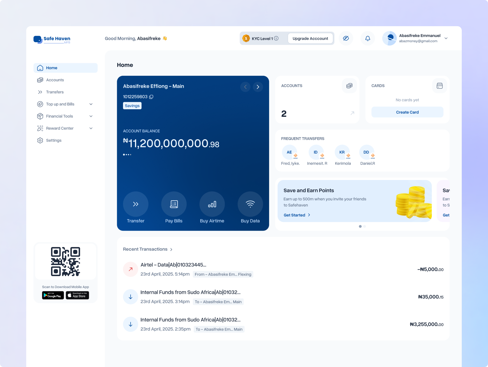
Increase daily active users and reduce churn across both segments
Grow transaction volume, the core health signal for a banking platform
Reduce support ticket volume by resolving root causes of top complaint categories
Improve App Store ratings as a proxy for overall experience quality
Increase feature adoption, especially for high-value features with low discovery rates
DESIGN
Building the foundation before anything - The Design System V1
Before designing a single new screen, I made a foundational call: the design system comes first. Every piece of accumulated inconsistency across the platform could be traced back to the absence of a single source of truth. We were not going to repeat that mistake.
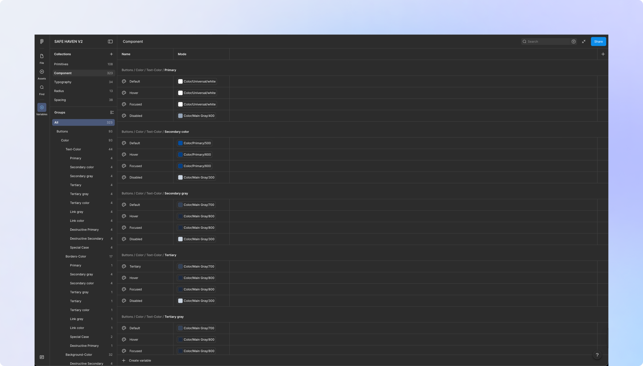
Primitive Tokens: Starting From Structure
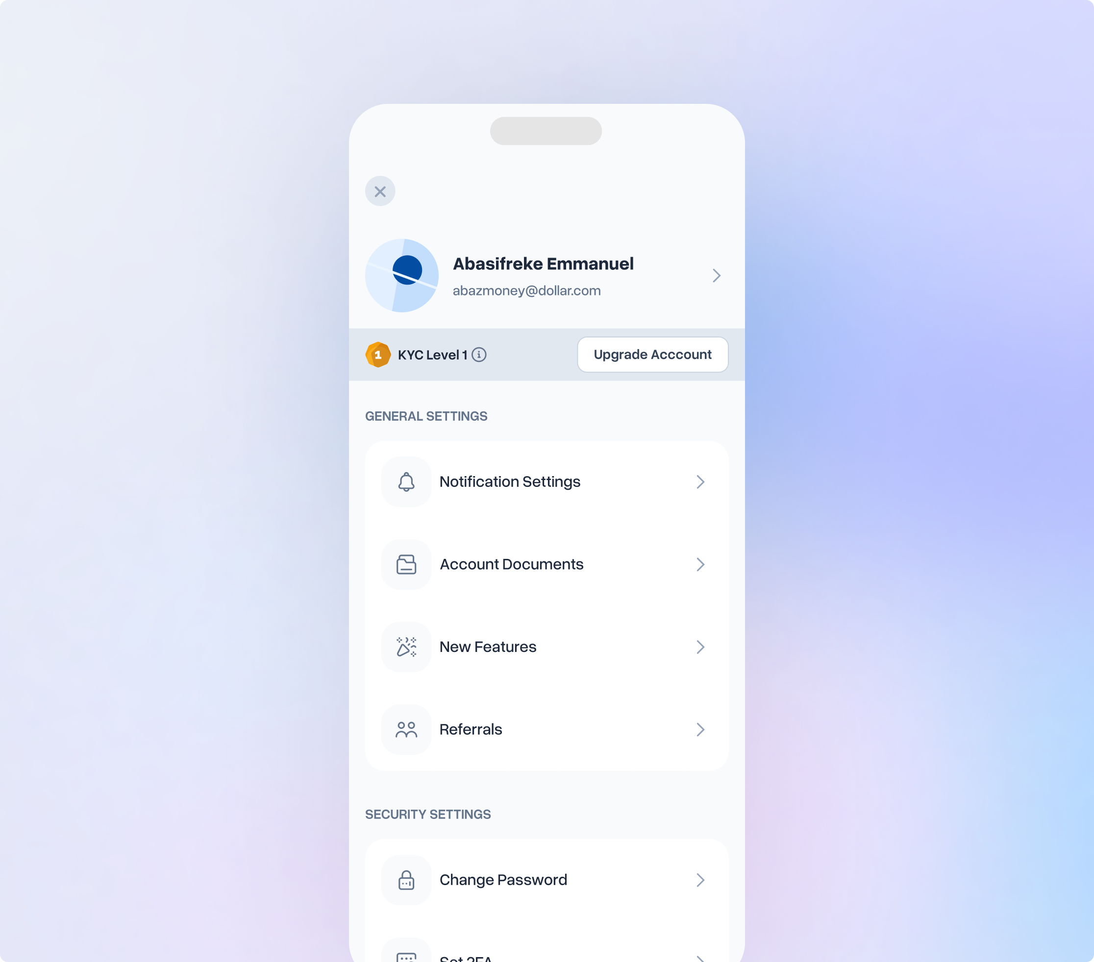
I built the design foundation from scratch, constrained by the existing brand but establishing proper structure where none had existed. The foundation covered colour, typography, spacing, icons, and elevation. I set the primitive layer personally, then delegated design token construction to the first designer and accessibility testing to the second.
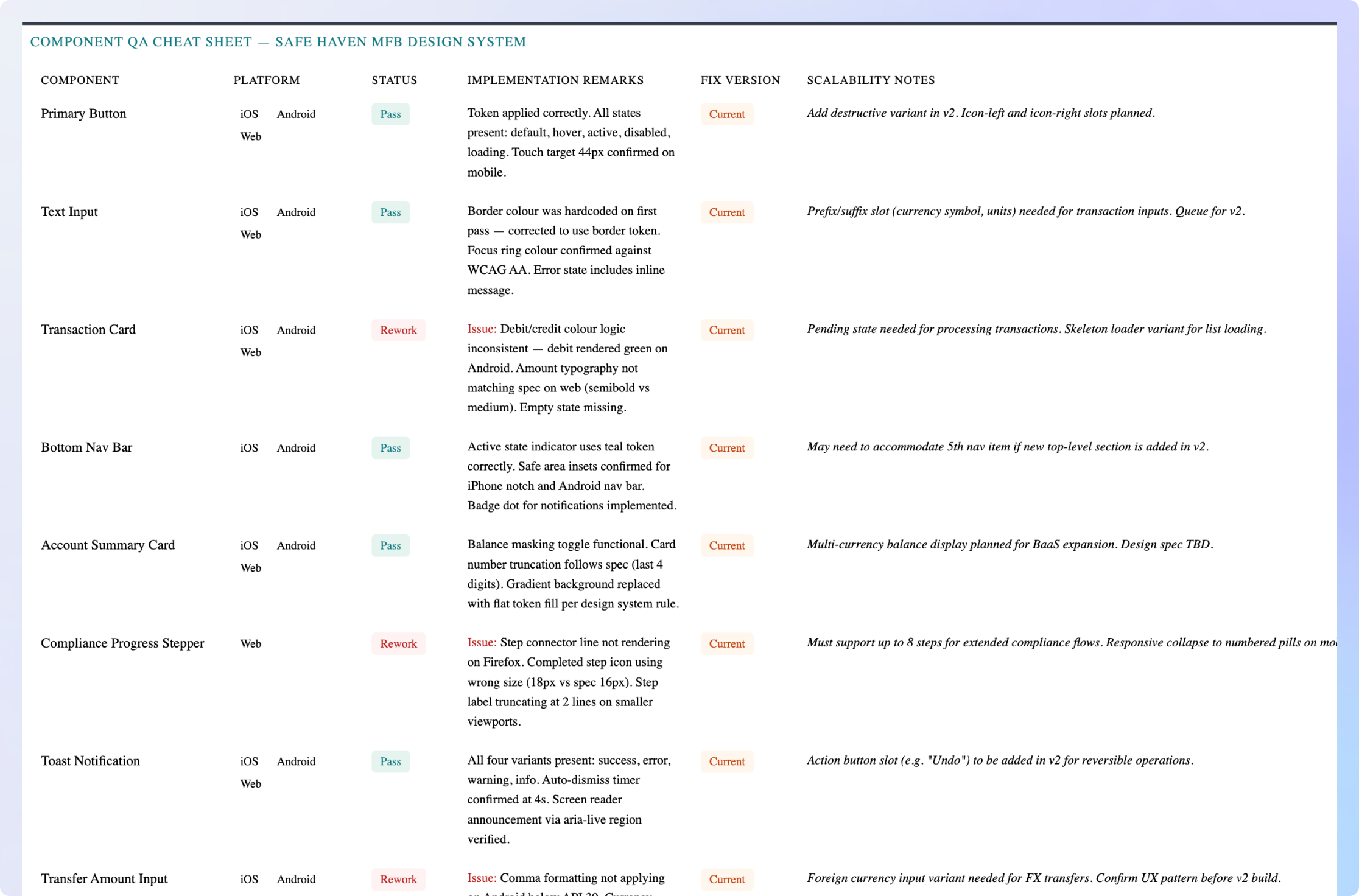
Component Validation Rules
Every component had to pass all validation criteria before being admitted to the library. No exceptions.
Token Compliance
Every visual property expressed through design tokens. No hardcoded values permitted anywhere in the library.
Platform Compatibility
Designed and tested for mobile (iOS & Android), desktop, and responsive web. All three. Not assumed.
State Completeness
Every interactive component must account for: default, hover, active, focused, disabled, loading, empty, error, and success states.
Accessibility Compliance
WCAG AA contrast ratios. Minimum touch target sizes. Keyboard navigability. Tested, not assumed.
Documentation
Usage guidance and rules accompany every component before it is published to the library.
Closing the Design–Engineering Gap
The implementation mismatch wasn't a handoff problem. It was a systems problem. Without a component library that developers could build from directly, every feature required individual interpretation of design files. Interpretation introduces drift. We ran a 4-week intensive developer sprint: engineers built the core component library in code from the design specifications. A shared QA cheat sheet, accessible to design, engineering, and stakeholders, governed every review. Columns for component specs, implementation remarks, and scalability plans. Design maintained it. Everyone owned it.
Now to the platform redesigns.
With the design system in place, redesign work began across all platforms. The process was deliberately non-linear: mobile and desktop ran in parallel, and insights from one platform informed decisions on another through continuous iteration and beta feedback cycles.
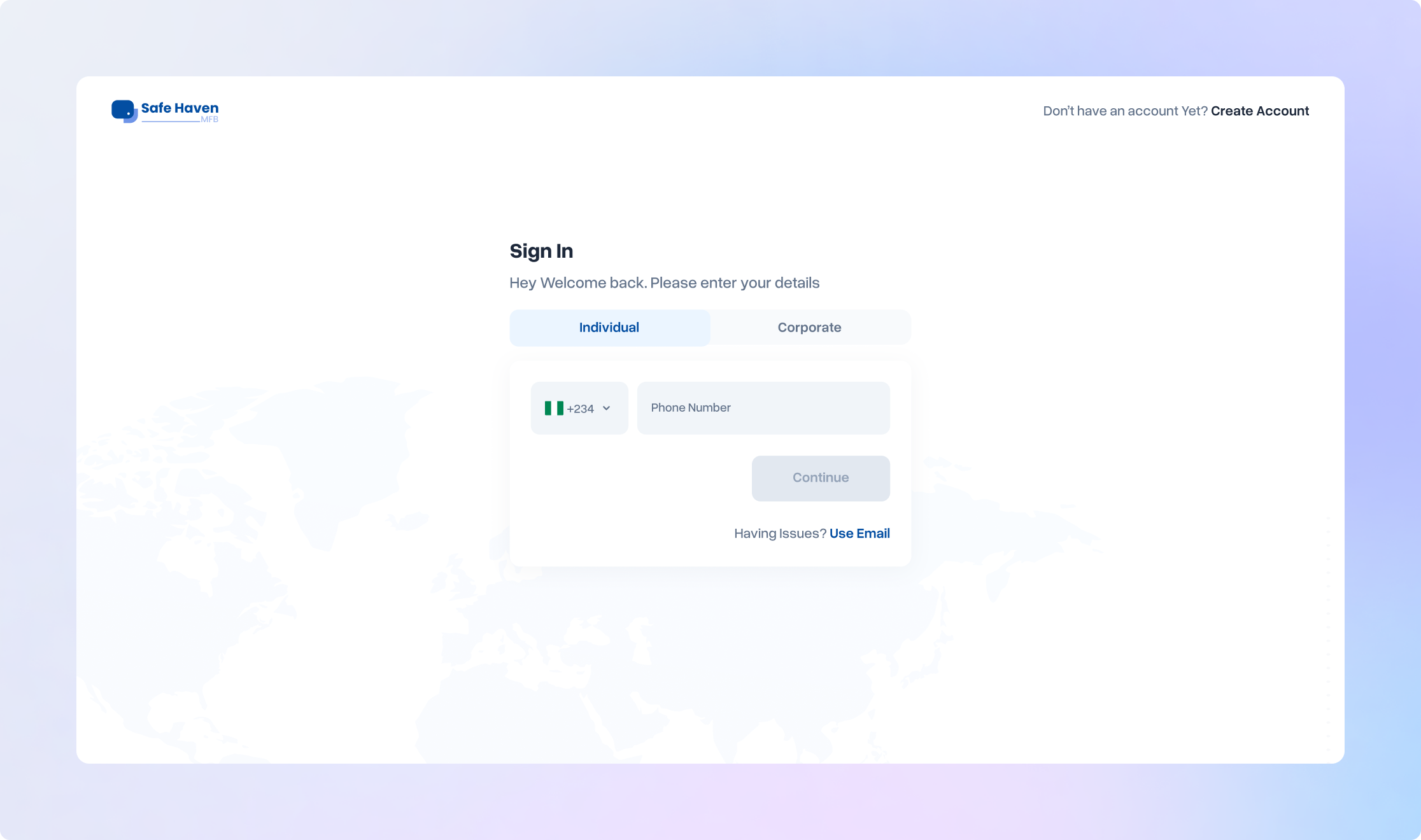
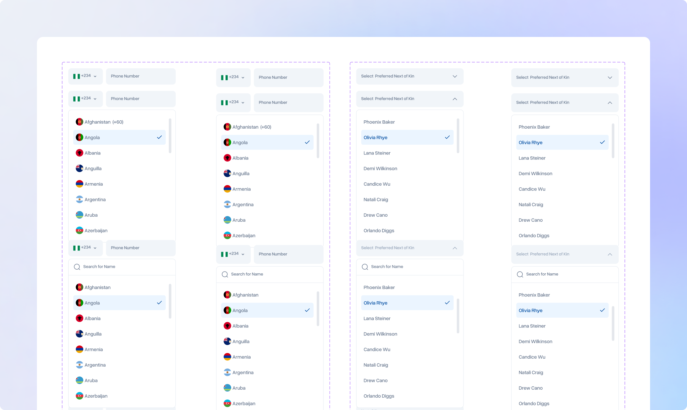
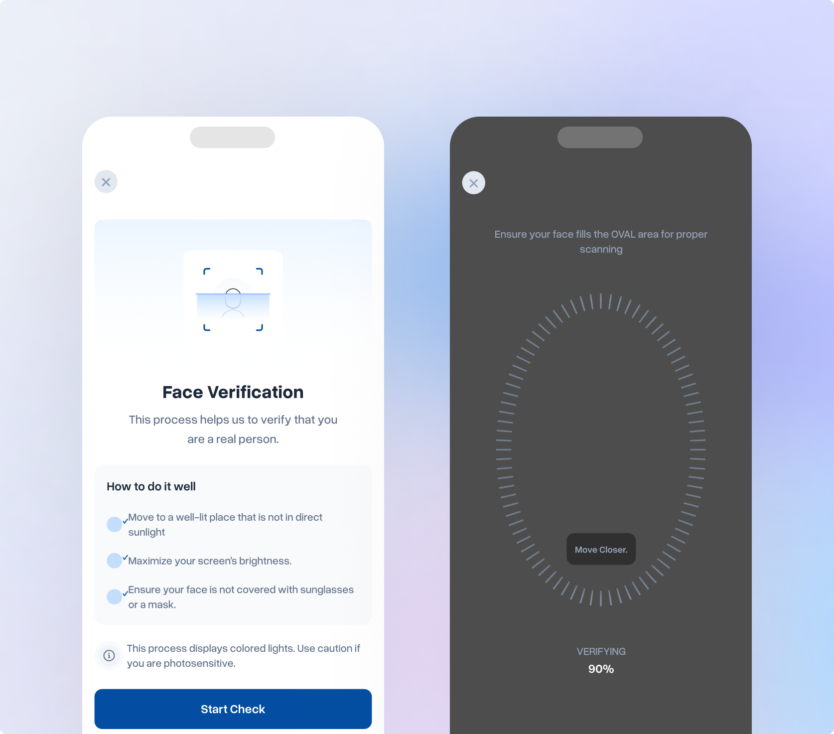
Individual Banking: Mobile App (iOS & Android)
The mobile app was the primary touchpoint for individual customers and the most visible experience failure. The core focus areas were;
IA restructure
In-app feature communication
Onboarding rebuild
Core App Feature Redesign
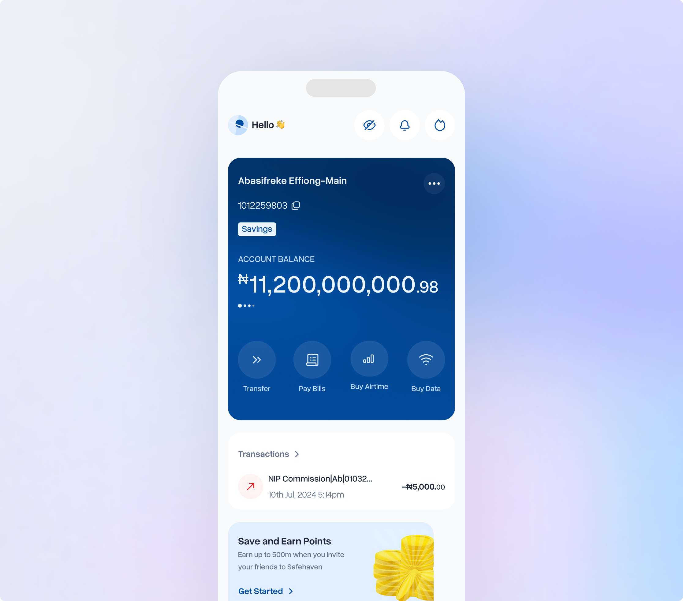
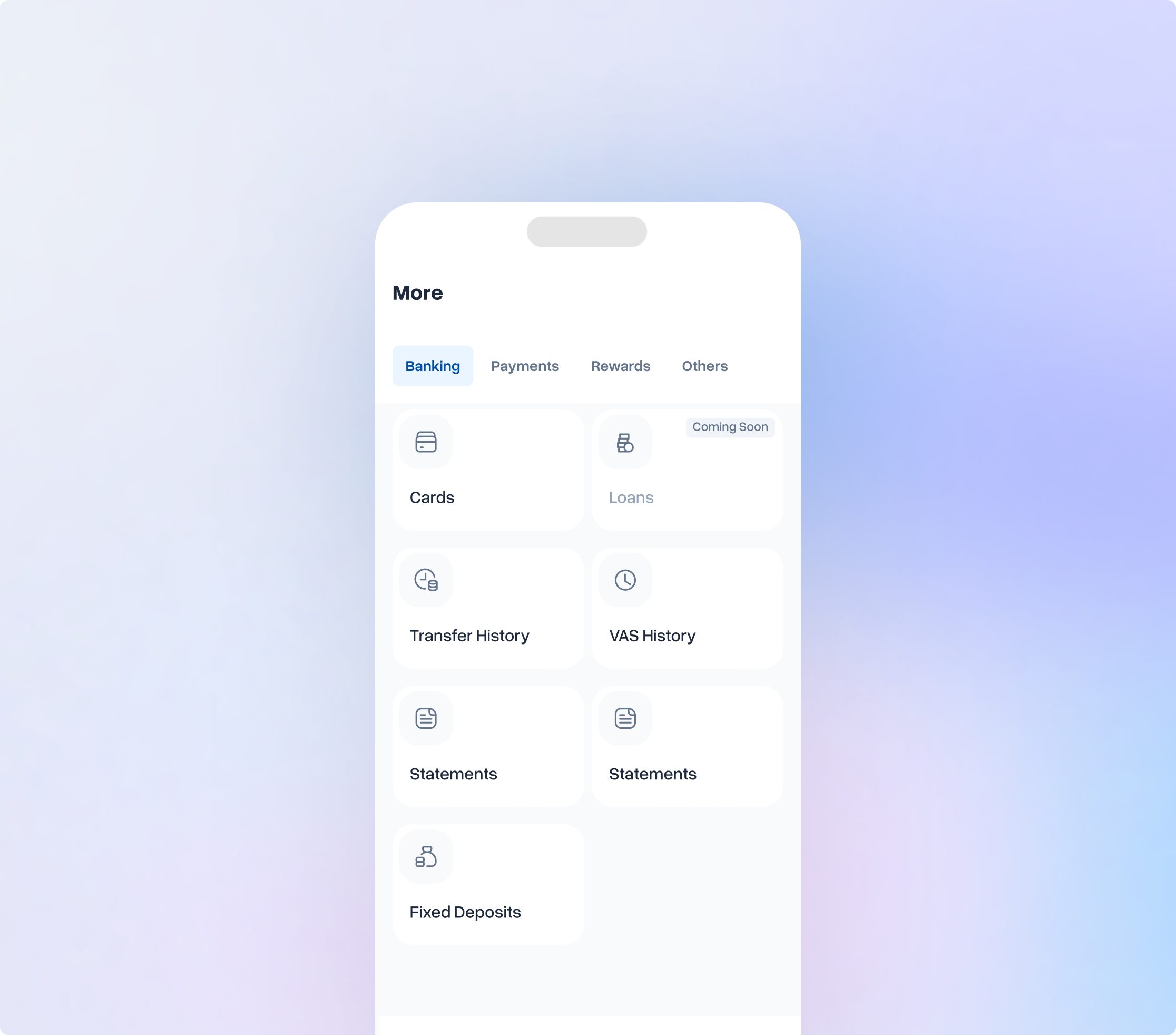
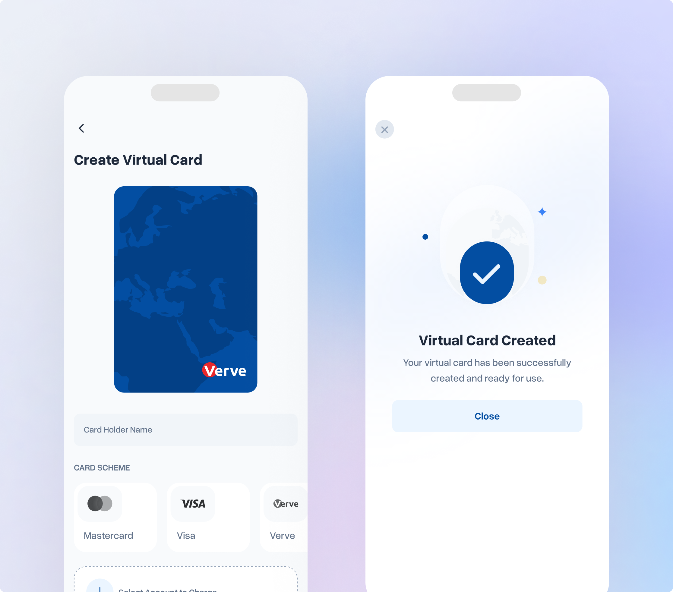
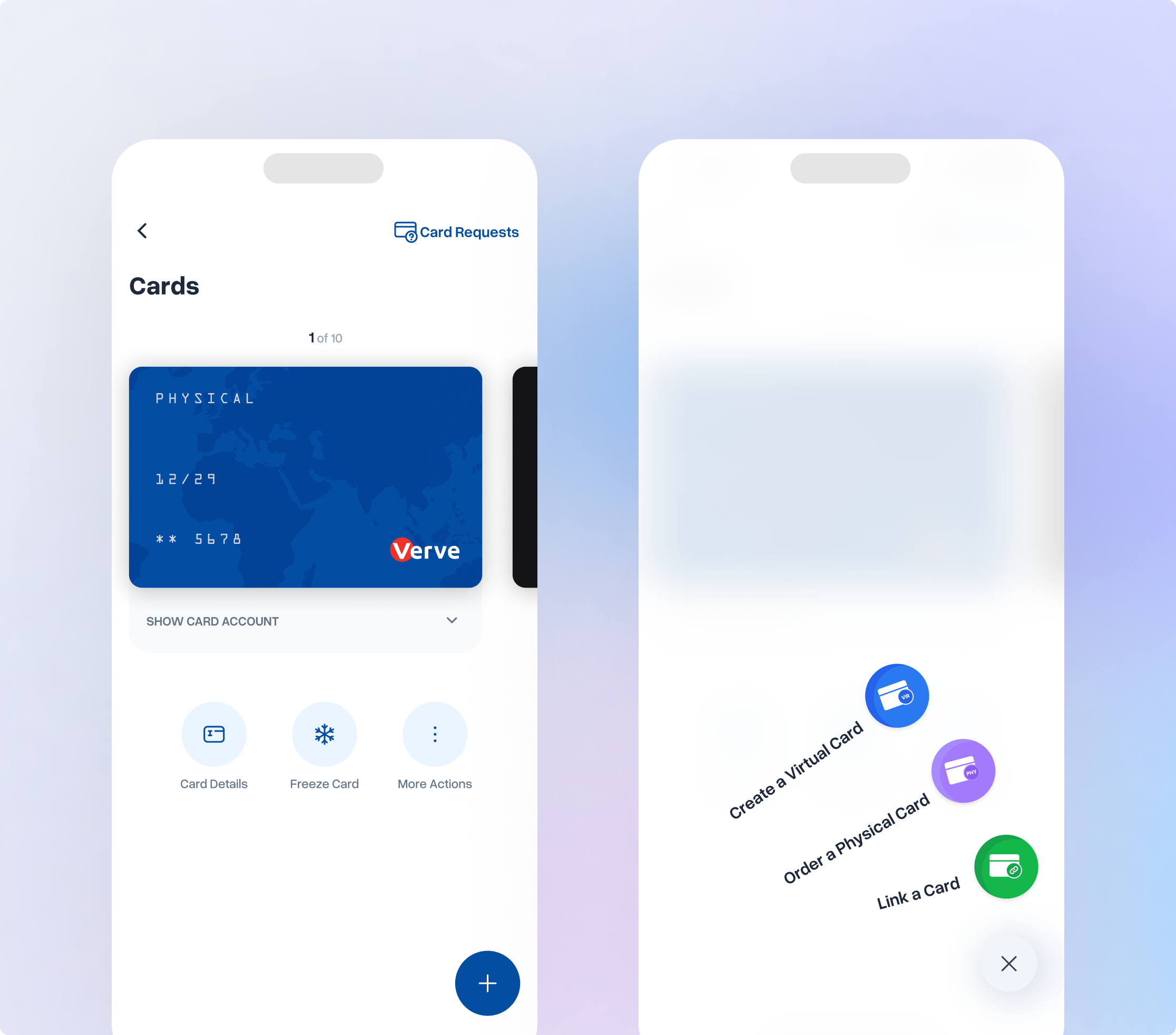
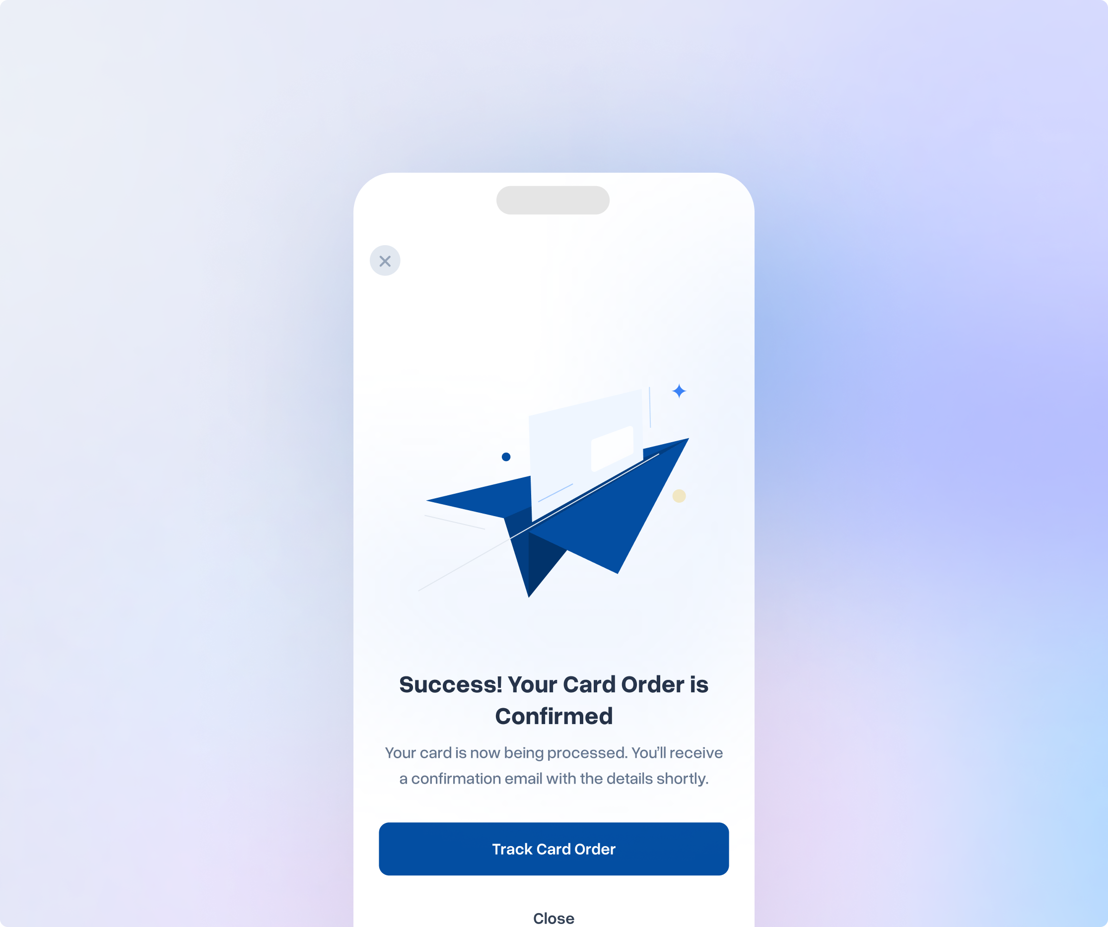
Card operations, virtual and physical card creation, customisation, and shipment etc. were entirely manual. Every step cost time and money. The strategic decision to automate this end-to-end was also a design decision: take what operations staff handled behind the scenes and put it directly in the hands of users, without losing a single step in translation.
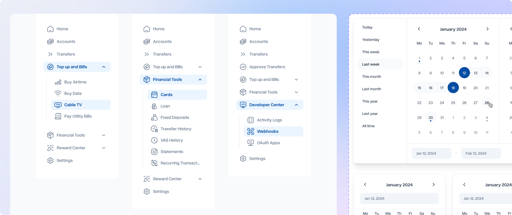
Individual Banking: Web Application
The web experience was designed in parallel with the mobile app, maintaining visual and functional consistency across platforms while accounting for the different interaction model and information density appropriate for desktop contexts. Desktop users have more screen real estate and a different mental model for navigation; the redesign respected this without diverging from the unified design system.
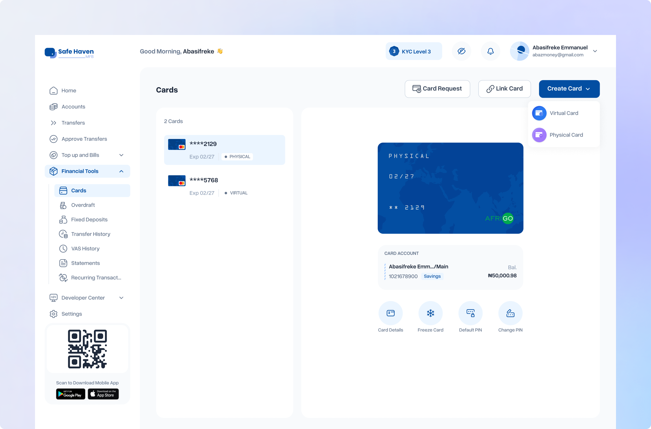
Corporate Banking
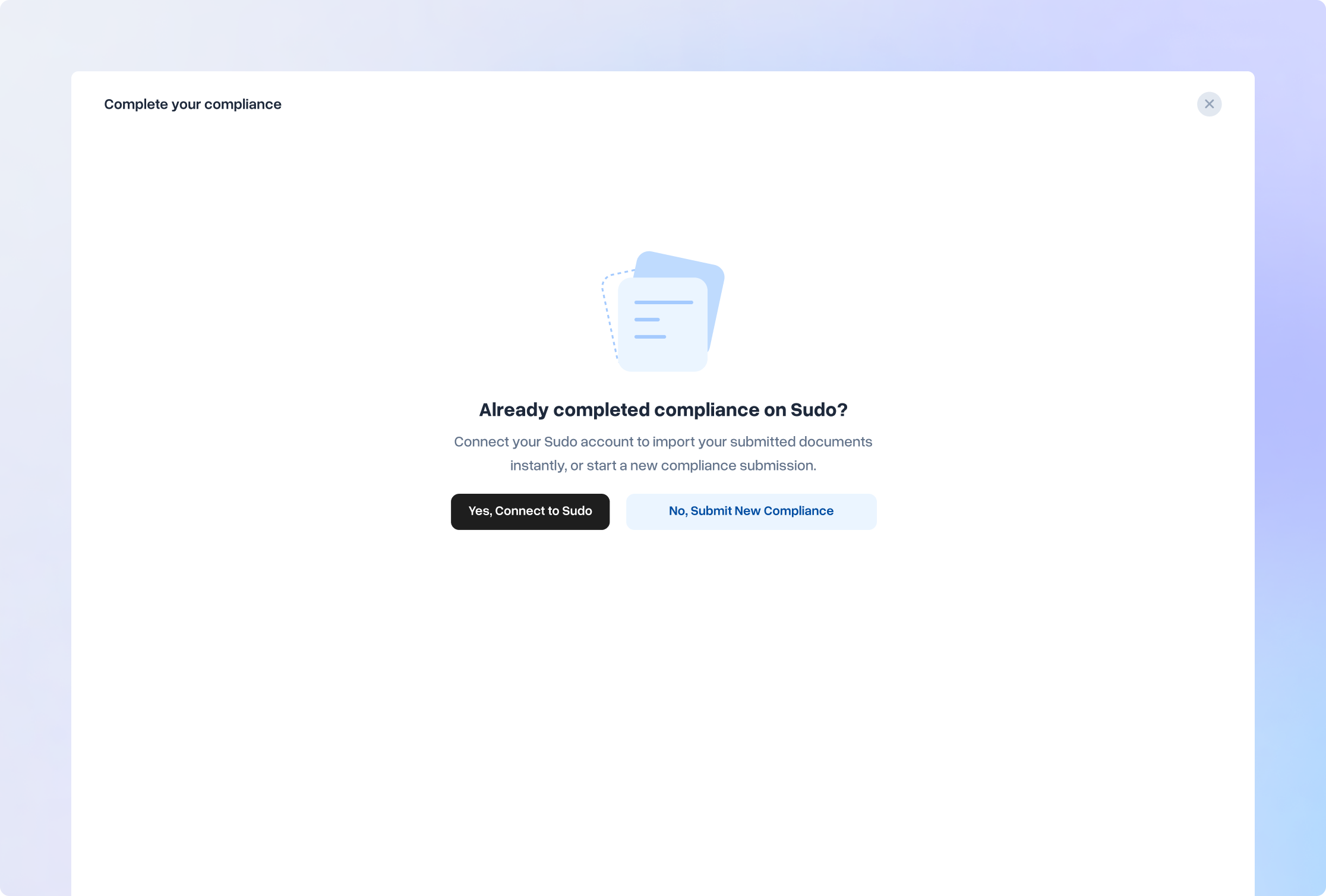
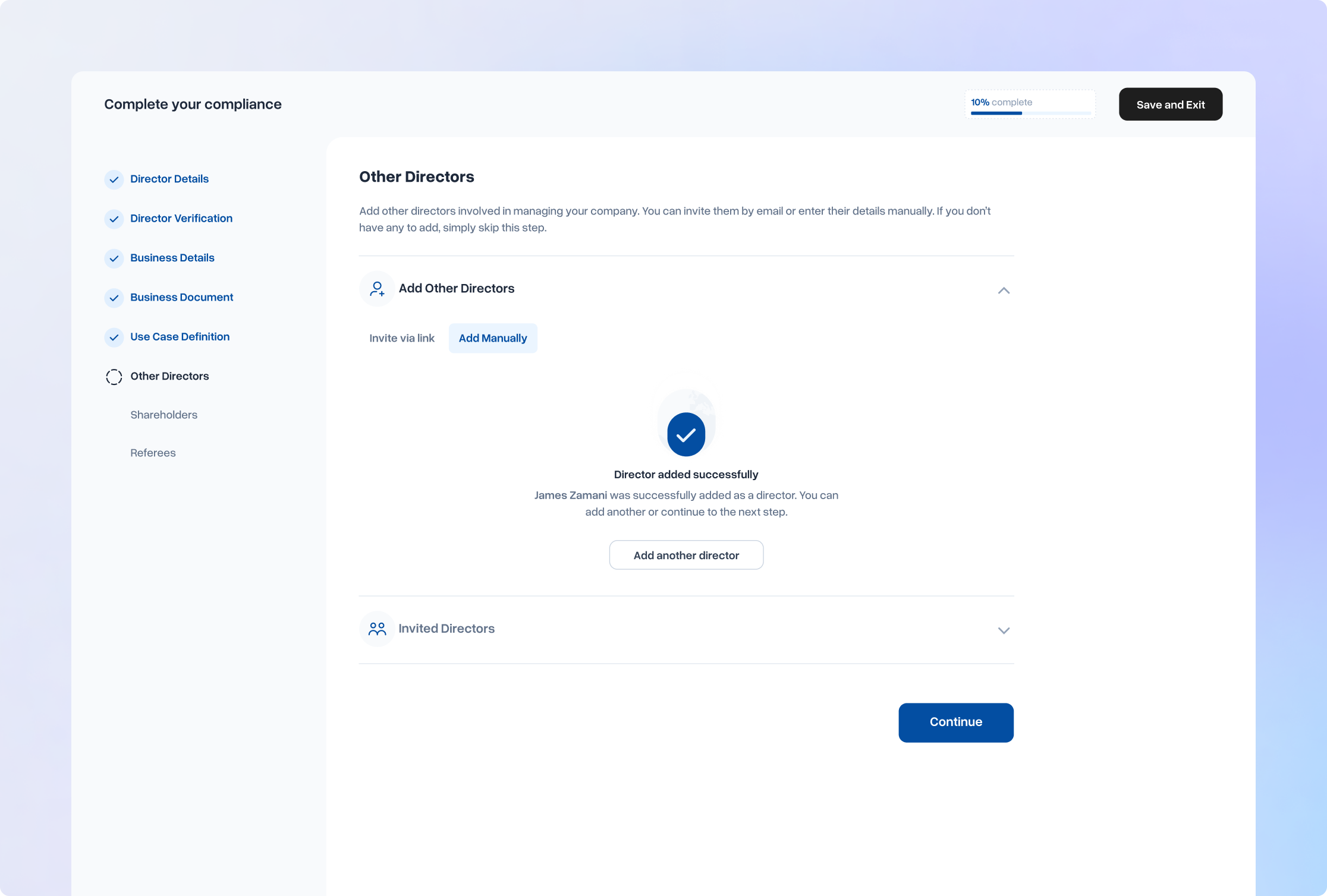
The most significant design challenge across all the platforms was the Corporate Banking compliance onboarding flow. This was a genuinely broken experience causing user drop-off and unsustainable support load.
The Stakeholder Challenge and how I handled it
A stakeholder challenged the multi-step data collection flow, arguing that the number of clicks made it feel complex. He was right that it was multi-step. I disagreed that this was a problem, and said so. For business customers completing a regulatory compliance process and handing over sensitive company data, a process that feels thorough builds trust. A compliance flow that completes in two clicks does not inspire confidence. The psychological signal of rigour was a feature, not a flaw. Beyond trust: cognitive chunking reduced overwhelm; progress indicators created commitment; error recovery was localised to individual steps. The stakeholder accepted the reasoning. The flow shipped as designed.
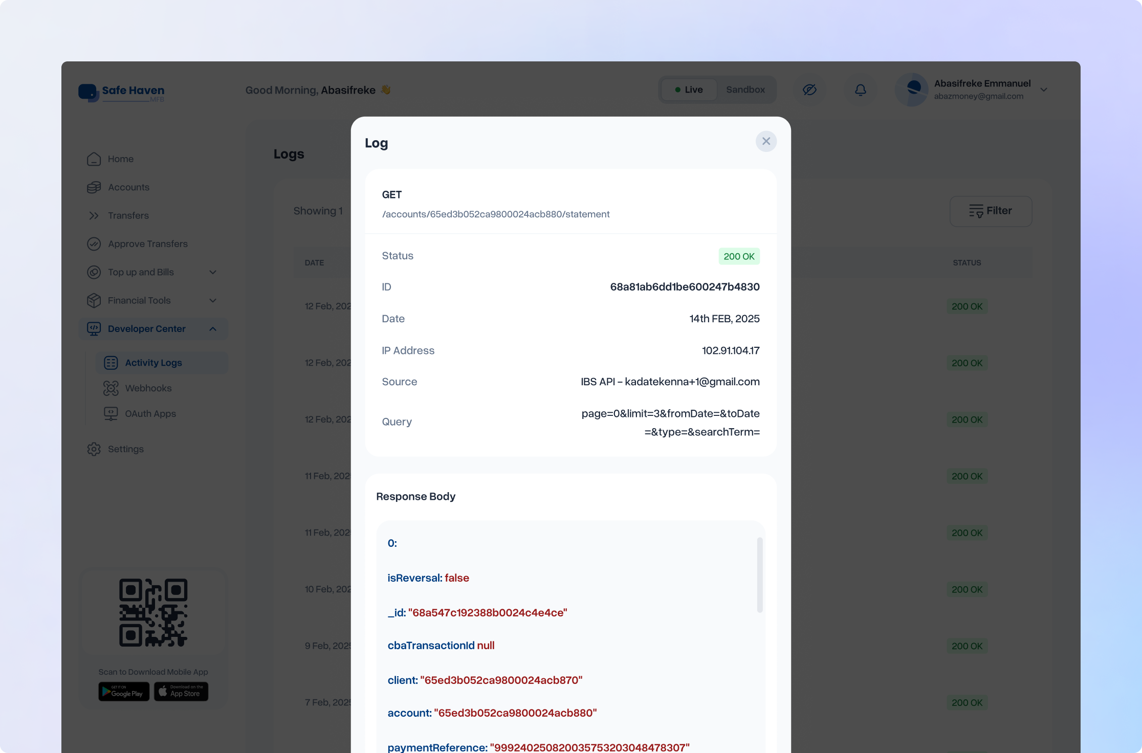
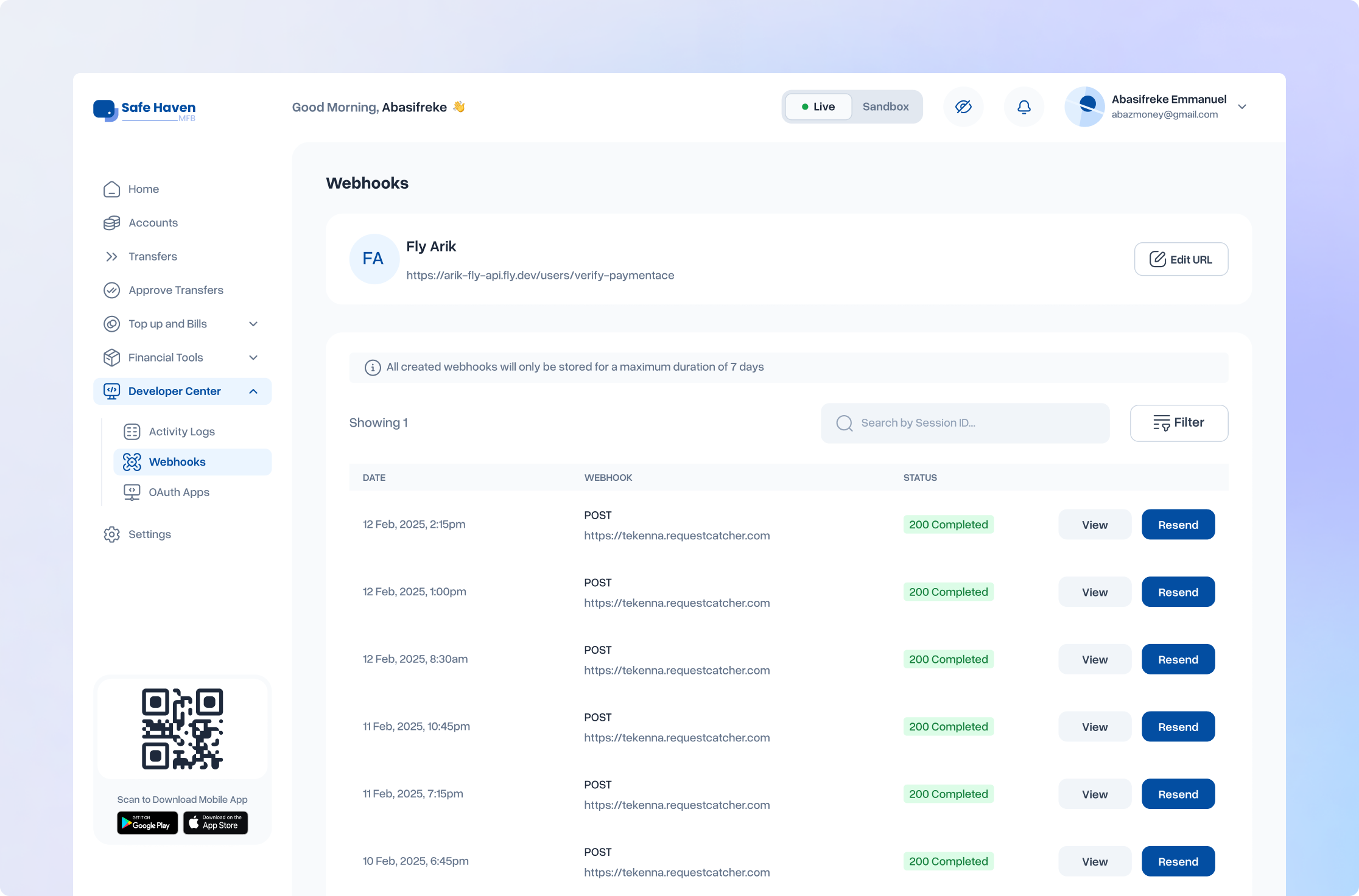
Developer & Fintech Tools
The developer platform served technical teams and fintechs building on Safe Haven's BaaS infrastructure: users with high technical fluency and low tolerance for interface friction. The redesign addressed API access and key management, sandbox environment experience, and fintech onboarding, integrating the same compliance architecture built for business banking where applicable.
Beta, Iteration & Launch
Test, refine, repeat. Then Ship
Beta launched in October 2025 with three participant groups: internal staff, selected external customers, and members of Safe Haven's community programme. The objective was not just to find bugs. It was to observe real behaviour in context and identify what the design had missed or underestimated.
How We Collected Feedback
Feedback channels were matched to user type. Business customers communicated through Slack, allowing for detailed, technical back-and-forth. Individual users provided feedback through in-app mechanisms and direct conversations. Internal staff surfaced edge cases that external users were less likely to flag early.
What Changed Between Beta and Launch
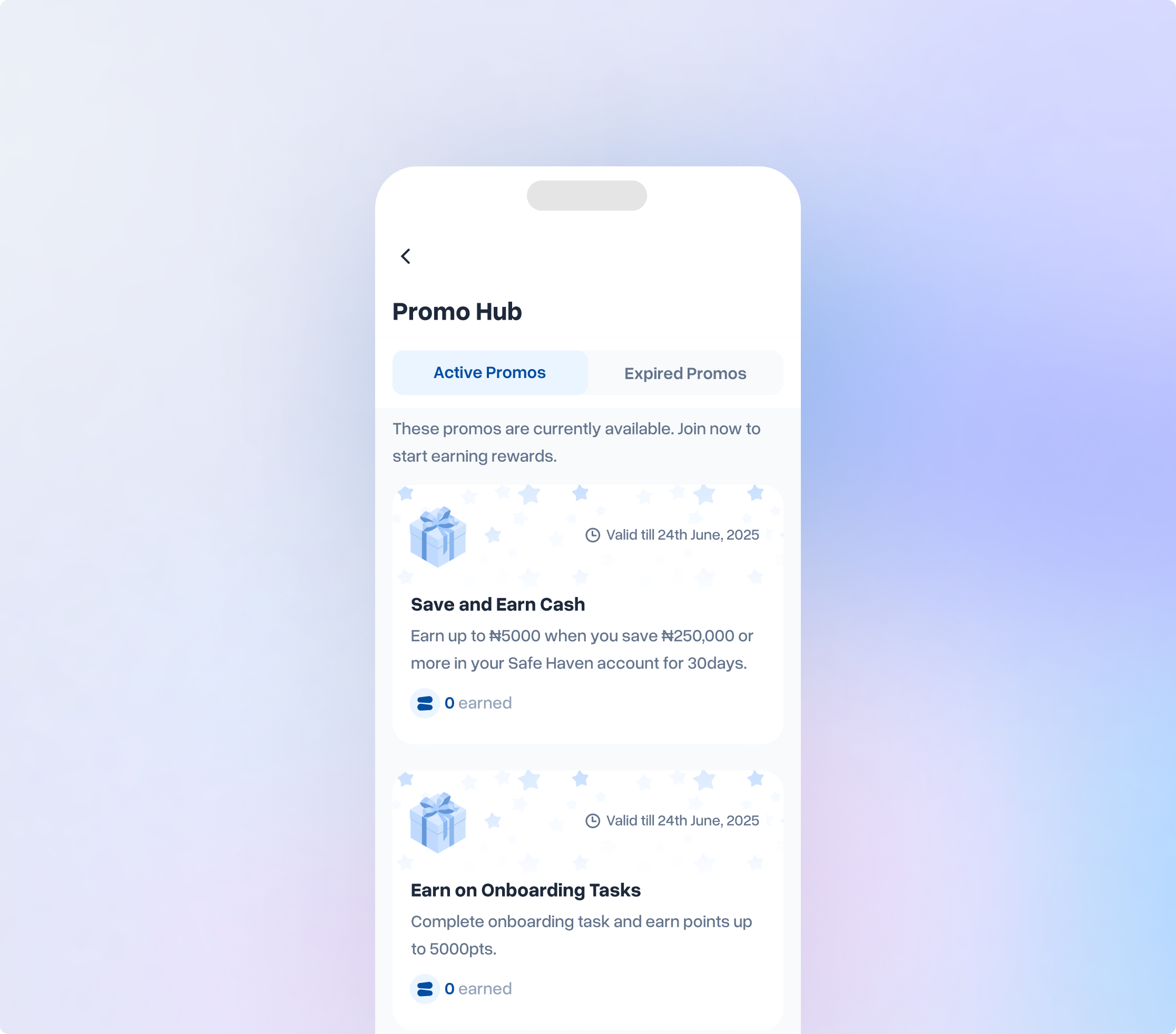
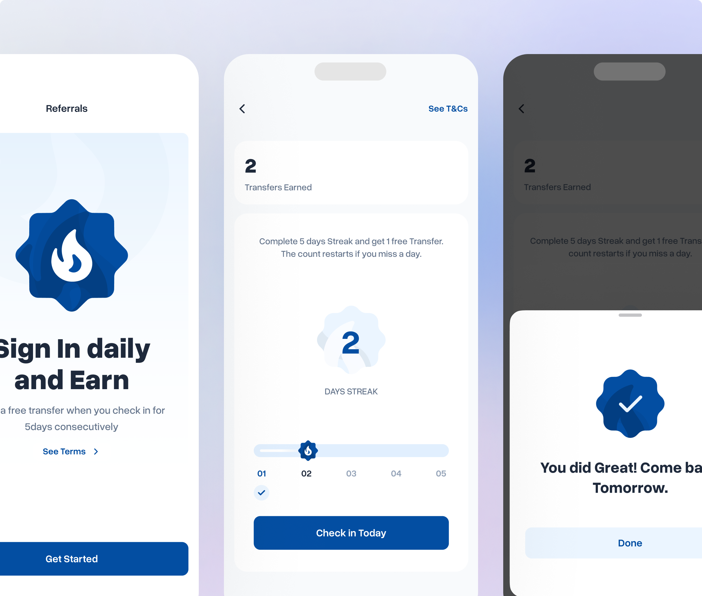
The beta-to-launch cycle produced meaningful, user-validated additions. Several features that had been planned but not fully specified were accelerated into the launch build based on signal from beta participants:
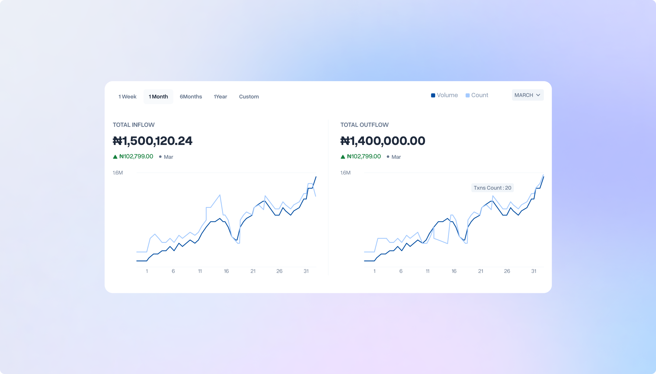
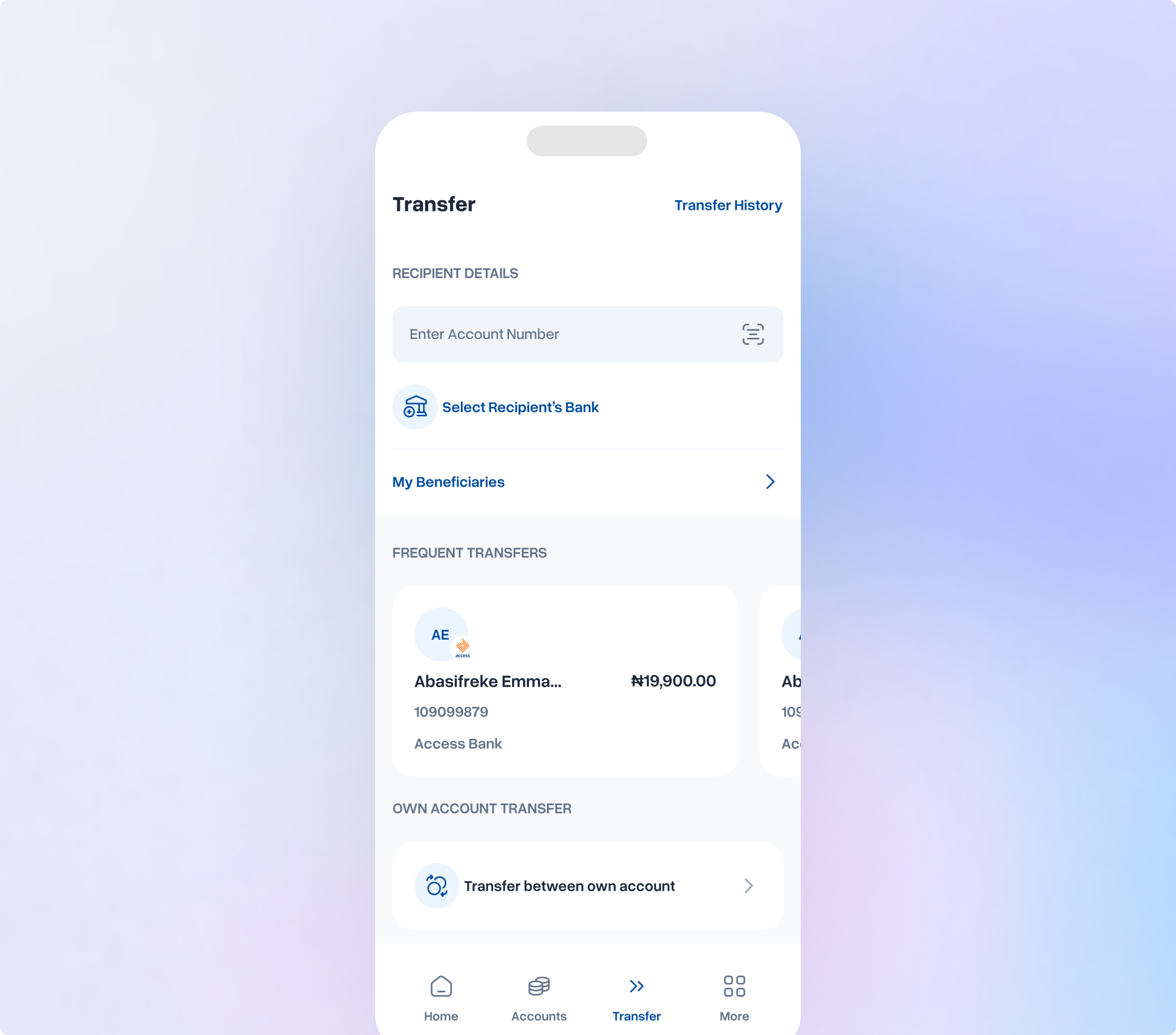
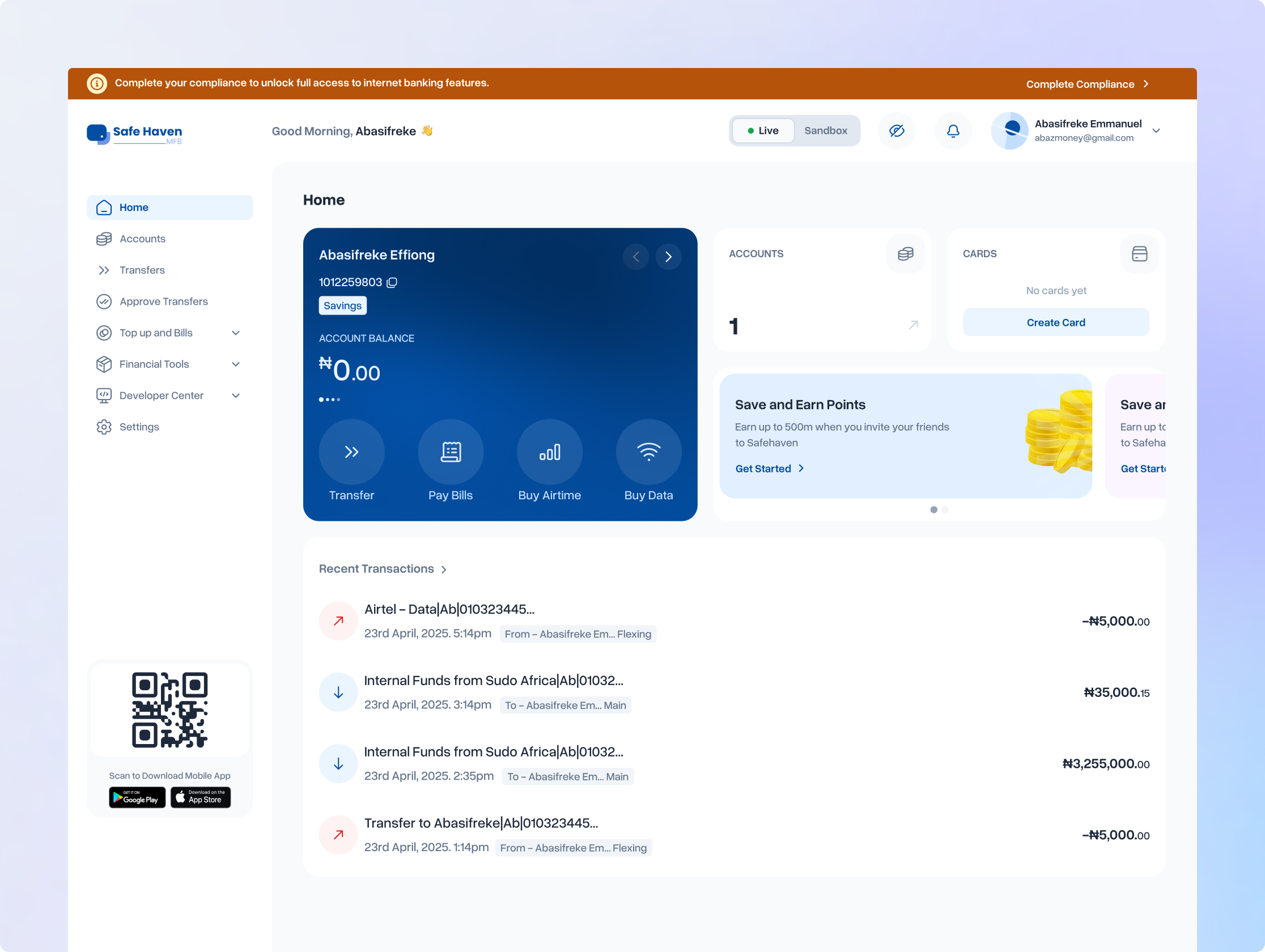
- Account summary: A consolidated view of account status and recent activity, surfaced prominently on the home experience. Beta users navigated to multiple screens to piece together information that should have been available at a glance. This fixed it.
- Quarterly wrap: A periodic summary of a user's banking activity over time, giving individuals a sense of their financial behaviour. The idea had been planned; beta accelerated the decision to include it in the launch build.
- Feature and flow refinements: Multiple surfaces were refined based on observed navigation patterns: where users paused, where they backtracked, and where they expected to find things they couldn't locate.

Outcomes
Results and Impacts after launch
The results were unambiguous. Across every signal that had indicated failure before the redesign, the platform was operating at a fundamentally different level.
The beta-to-launch cycle produced meaningful, user-validated additions. Several features that had been planned but not fully specified were accelerated into the launch build based on signal from beta participants:
- Transaction volume shifted from under ₦100M monthly to over ₦1B in daily transfers, immediate at launch and building week over week
- Revenue grew by more than 26× within four months of the full launch
- User base expanded approximately 40% across both individual and business segments
- App Store ratings climbed from approximately 2-something to 4.8, a near-complete reversal of public user sentiment
- Support ticket volume dropped sharply, particularly in compliance, account upgrade, and card management: the top three pre-redesign complaint categories
Challenges
Getting Buy-In on the Scope
When I disclosed the full project scope to the team, the response was close to alarm. The scope was objectively large. What made the difference was not minimising it but contextualising it. I walked the team through the framework, the phased approach, how the design system foundation would multiply efficiency across all platforms, and the progress metrics that would make the work feel measurable rather than infinite. I got genuine buy-in, not reluctant compliance.
Navigating Stakeholder Dynamics
As Head of Design reporting directly to the CEO, I operated at the intersection of executive expectations and product reality. This meant making calls in the midst of authority and holding those calls when challenged.
Reflection
Formalise research earlier
The support ticket analysis and user testing were valuable and validated the audit findings clearly. But a structured, ongoing research practice established earlier would have surfaced the discoverability problem before features were built and failed. Research is most powerful when it prevents wrong decisions.