OUTCOMES
60%+
Reduction in Support calls
50X+
Card creation rate
2 → 4.7
App store rating
↑ DAU
Steady 6-month growth in DAUs
THE PROBLEM
What was the problem?
Root by Sudo had reached an inflection point. The business was ready to scale but the product was not built to support that ambition. What had been acceptable friction at small scale had become a serious liability. The problems were not isolated; they were systemic, cutting across usability, product architecture, performance, and trust.
- Operational Strain on Support Teams
- Alarming App Store Ratings
- Post-Onboarding Drop-Off & The 'Dead End' Problem
- Declining Daily Active Users & Revenue Impact
- Performance & Speed Complaints
The Moment That Defined The Problem...
...I finished the onboarding and I didn't know what to do next. There was nothing telling me where to go or what to do. I deleted the app. I only came back months later because I couldn't find anything else like it.
GATHERING INSIGHTS
Gathering Insights
Complaint Backlog Analysis
Working with Customer Support and Technical Support teams, I conducted a structured analysis of the accumulated backlog of user complaints. Complaints were categorised by type (usability confusion, feature discoverability, transactional errors, and trust concerns) and mapped to specific product surfaces to identify where the product was failing most severely.
The overwhelming majority of support contacts were about tasks that should require zero assistance: funding a card, linking a primary account, making a withdrawal, and setting up settlement preferences. These are core product actions, not edge cases.
Technical support staff had moved beyond answering questions into actively hand-holding users through live sessions. The support team had become a workaround for broken UX.
Complaint volume was concentrated in a small number of flows, giving a clear and immediate signal for where to prioritise the redesign effort.
Many complaints were repeat contacts from the same users, indicating that problems were not being resolved by guidance alone. The issues were structural.
User Interviews
I recruited a focused group of active Root users for in-depth interviews, selecting participants who used the application regularly and had direct experience with its most friction-heavy flows. Sessions were structured around three areas: the onboarding and first-use experience, core transactional flows, and overall perception of product trustworthiness.
Users consistently described confusion about the relationship between their settlement account and their card account. Most assumed they were the same thing. The product gave no explanation, no distinction, and no guidance.
Funding a card and making withdrawals were described as anxiety-inducing. Users were unsure whether their actions had succeeded. Feedback states were either absent or too subtle to register confidence.
Multiple users reported that they had completed onboarding, arrived at the home screen, and had no idea what to do next. The product did not communicate what it was for, or what users should do first.
Users who had persisted beyond onboarding described a sense of distrust in the transaction history. With no distinction between account types, balances and entries felt confusing and unreliable.
Stakeholder Interviews & Business Brief
I conducted structured interviews with the CEO, COO, Head of Business, and a Technical Support representative to understand the business's strategic direction, internal pain points, and the constraints that would shape the design approach. Stakeholders provided a confidential product brief outlining scaling ambitions and commercial priorities.
The business was preparing to scale in a meaningful way, and the existing product was not structurally or experientially ready for that growth. Leadership acknowledged this explicitly.
The Technical Support representative confirmed that the volume of hand-holding calls was unsustainable. The support team was operating as a product crutch rather than an exception handler.
Stakeholders had a clear commercial intent: increase card creation and activation rates. The business understood that users who created cards were significantly more likely to transact, retain, and generate revenue.
There was strong appetite for a post-onboarding experience that created immediate engagement, which opened the door to the default card strategy I later proposed.
The brief surfaced tension between speed of delivery and the depth of change required. The timeline was tight relative to the scope of the problem, which became the central constraint of the project.
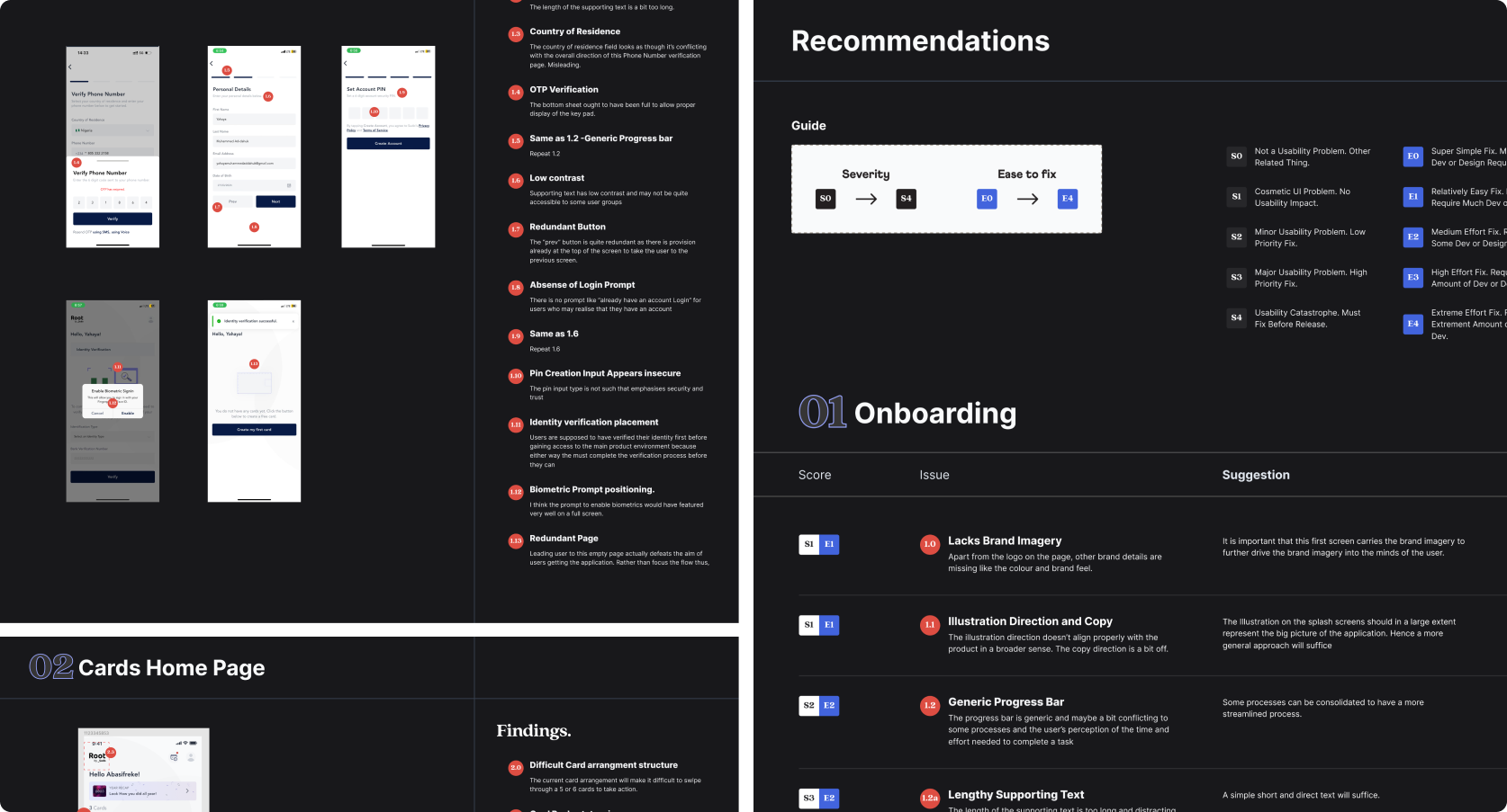
Comprehensive UX Audit
I conducted a full end-to-end heuristic evaluation of the existing Root application across four primary surfaces: Onboarding, Card Home Page, Card Creation, and Card Management.
PUTTING IT TOGETHER
Fixing the Post-Onboarding Experience
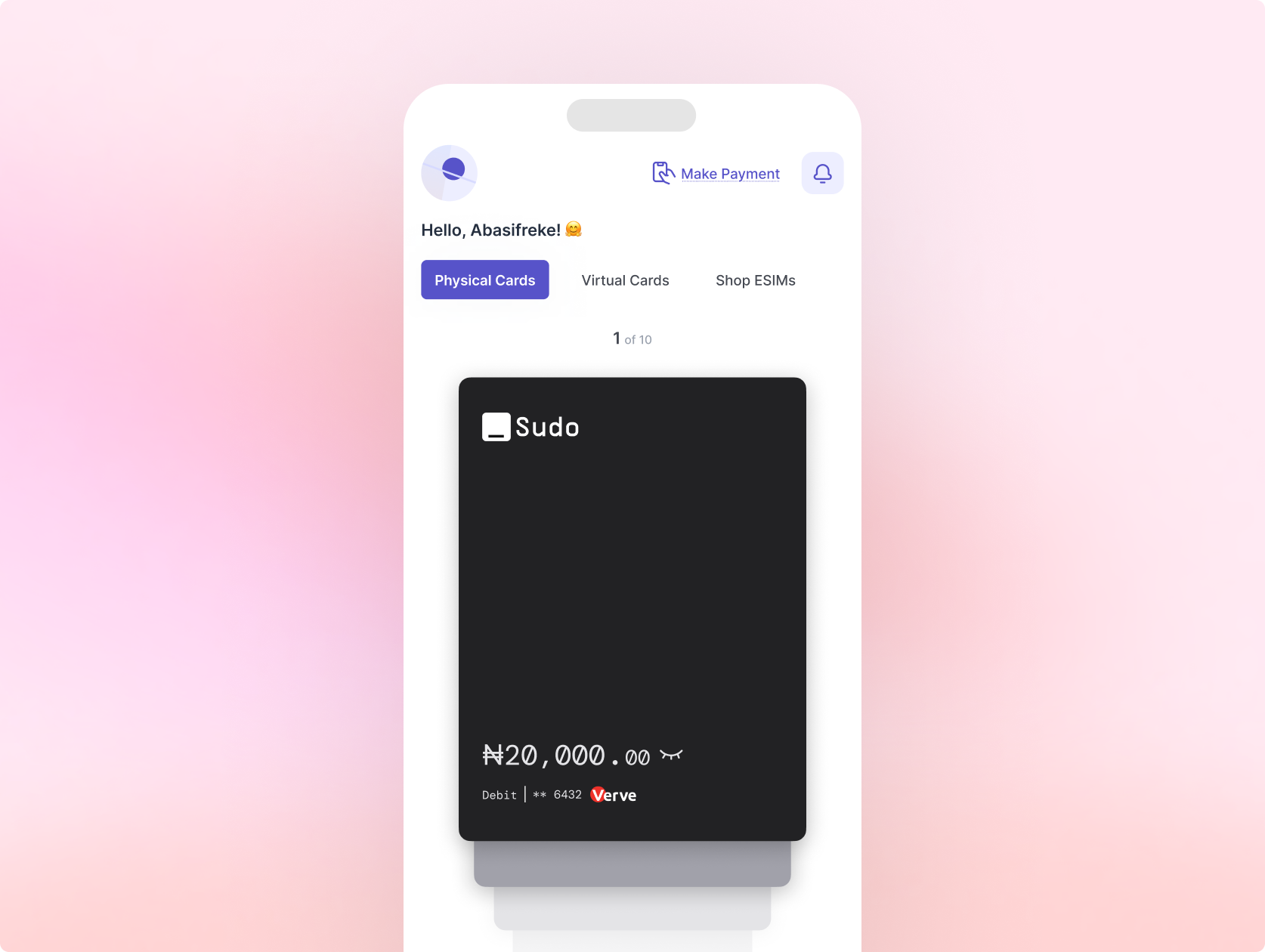
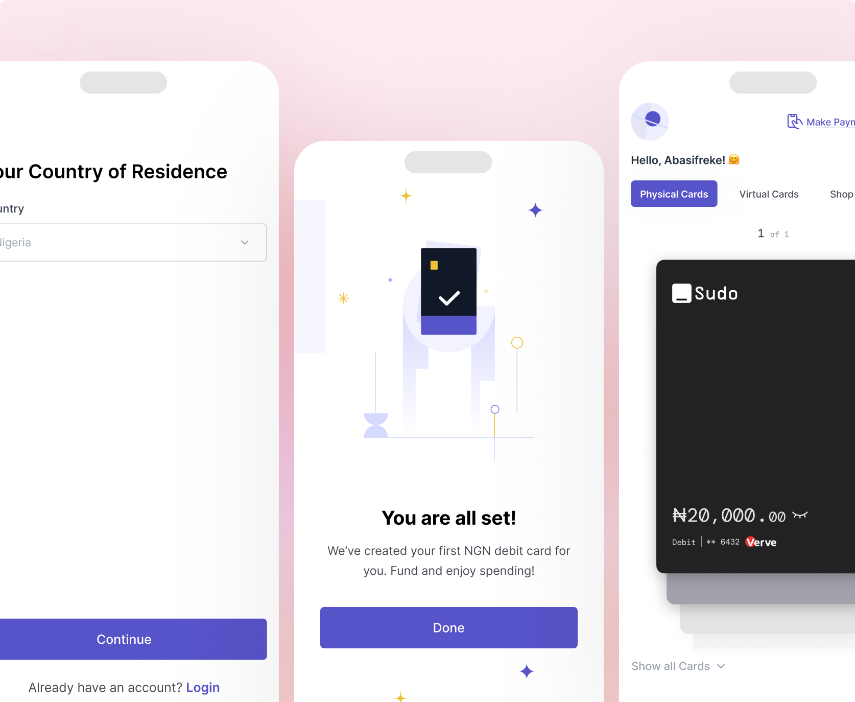
The broken post-onboarding experience was the highest-priority problem. Users were completing a multi-step compliance journey, arriving at the home screen, and having no idea what to do. The product offered no reward for completion, no direction, and no momentum.
The redesign addressed this on two levels: first, the onboarding flow was restructured with logical stages, step indicators, and proper error and success states. Second and most significantly I championed a post-onboarding reward strategy with leadership.
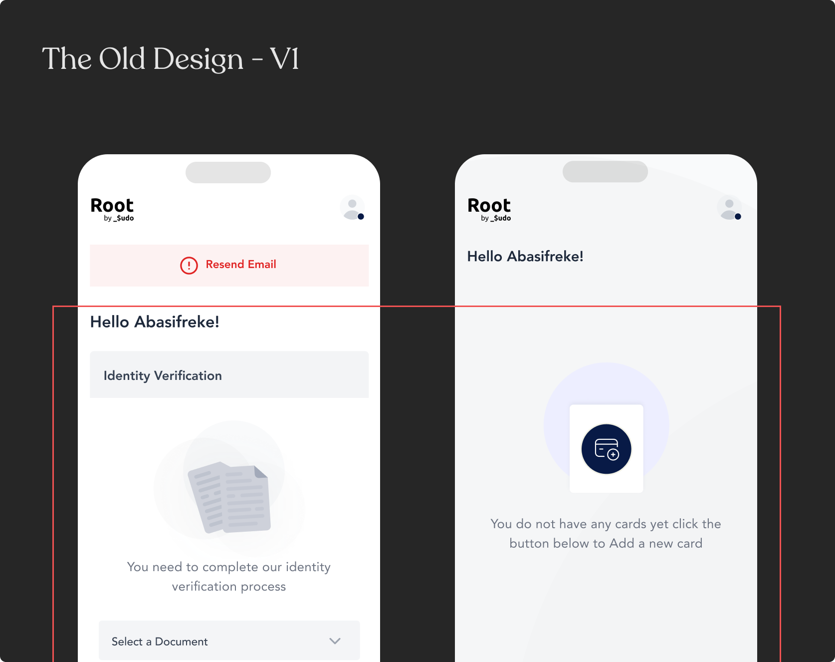
Upon completing compliance, users would be issued a default card automatically, at no cost. This transformed the end of onboarding from a dead end into an AHA moment: users arrived at the home screen with a card already in their name, ready to use. Card creation was no longer a barrier to discover and navigate; it was a gift the product gave them. This required commercial and engineering alignment before the design could proceed.
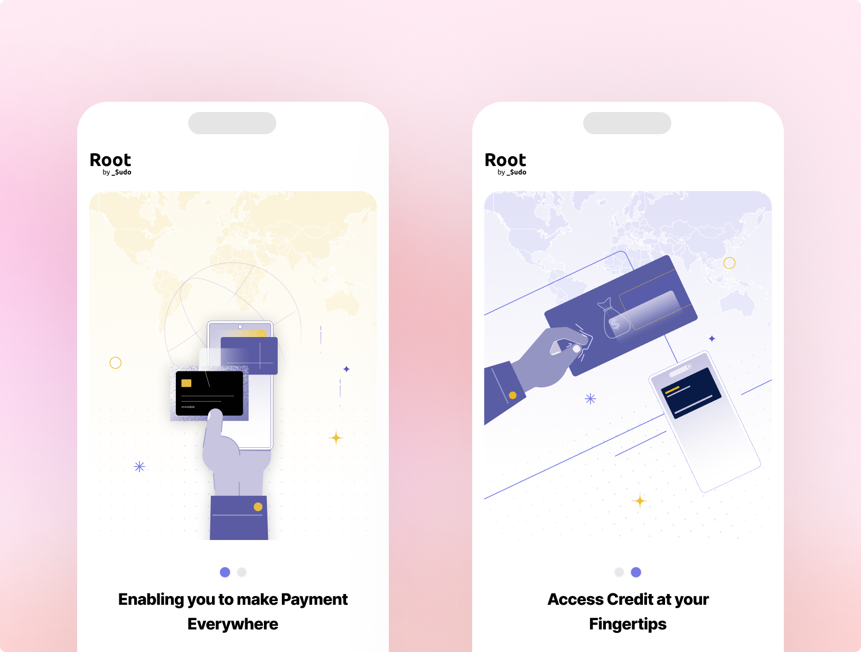
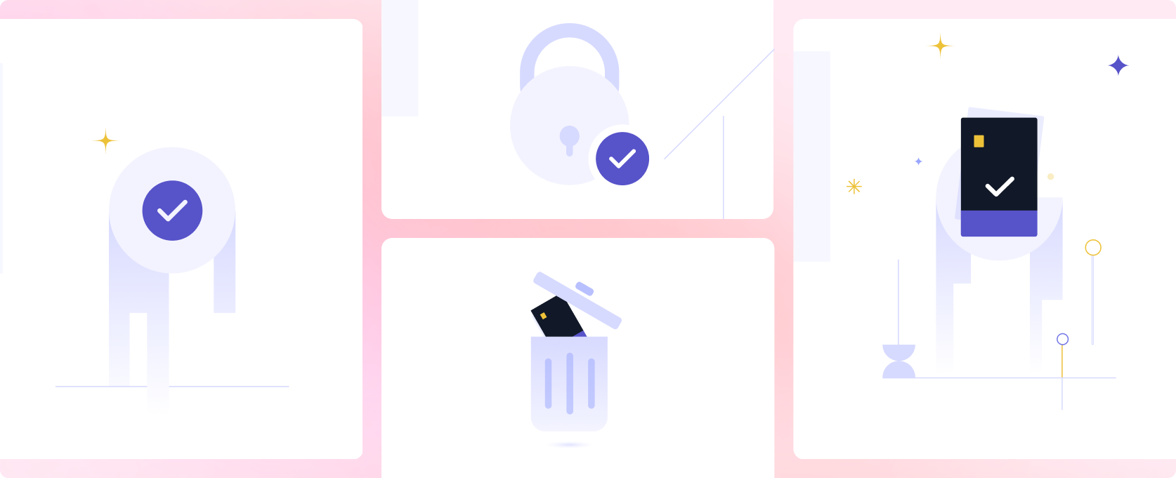
Custom Illustrations: Designing for Emotion, Not Just Function
The decision to invest in custom illustration was a deliberate one. Users interacting with a financial product are, at various points, anxious, uncertain, or simply looking for reassurance that the system has understood them. A well-crafted illustration at the right moment does something a status message cannot: it signals care.
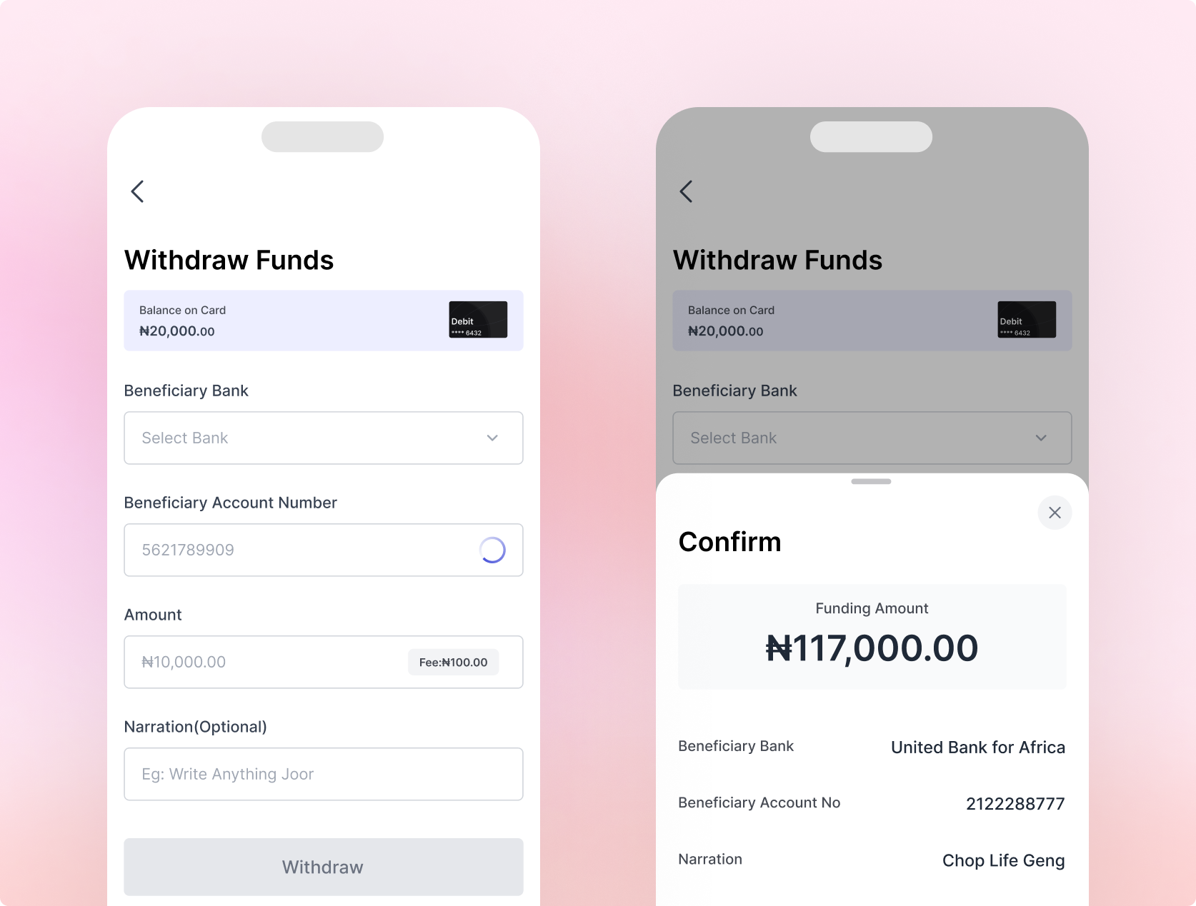
A New Way to Fund and Withdraw
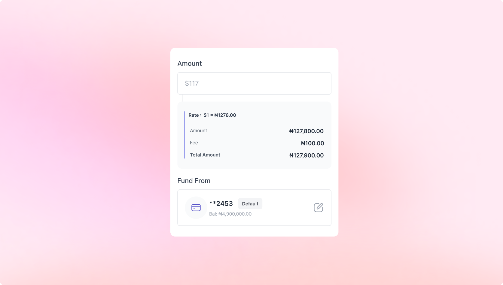
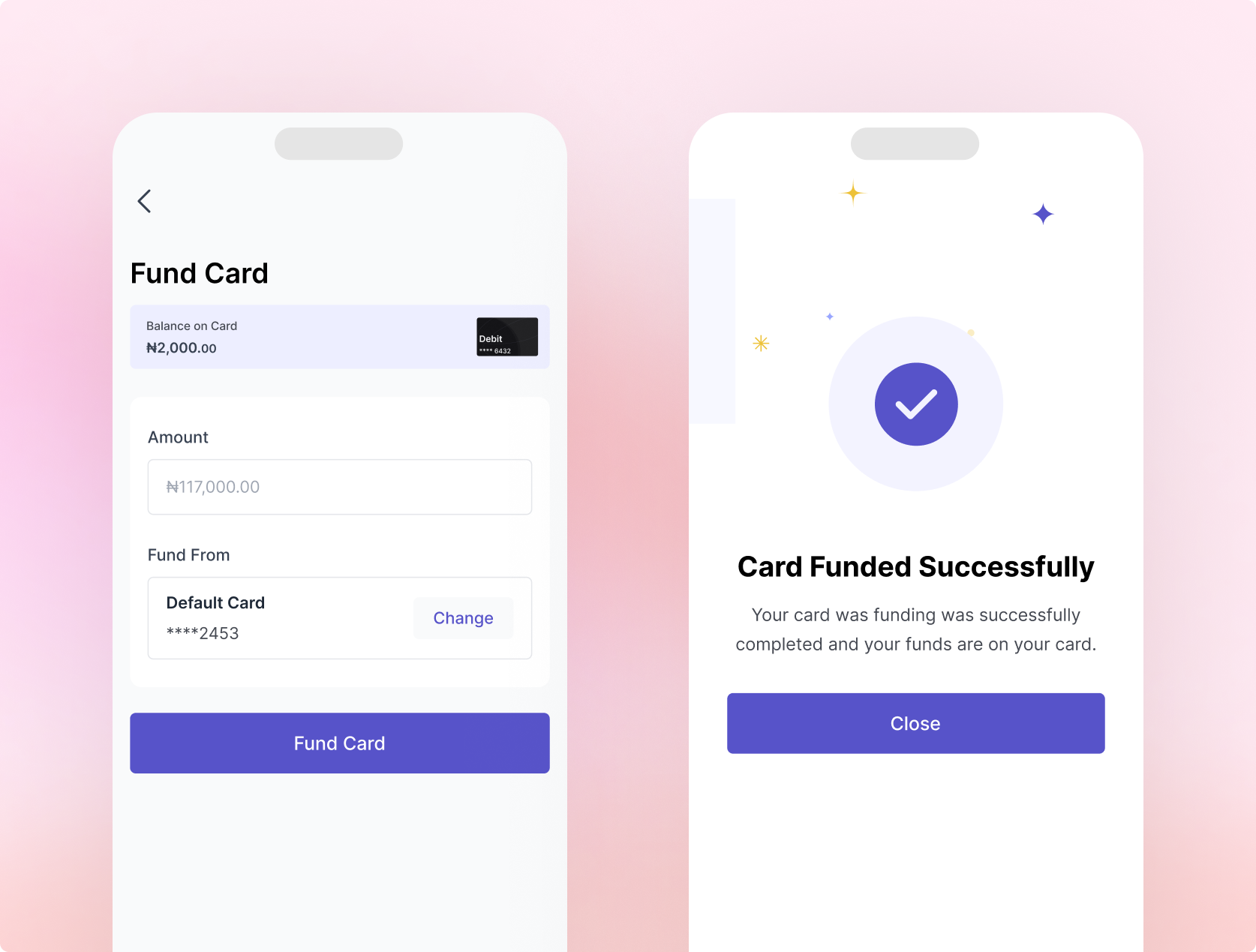
Funding a card and withdrawing money were two of the most complained-about features, both overcomplicated and confusing to use. Both app store reviews and the complaint backlog confirmed it. The redesign introduces clarity when funding and withdrawing with all fees spelt out clearly.
Redesigning the Transaction Experience
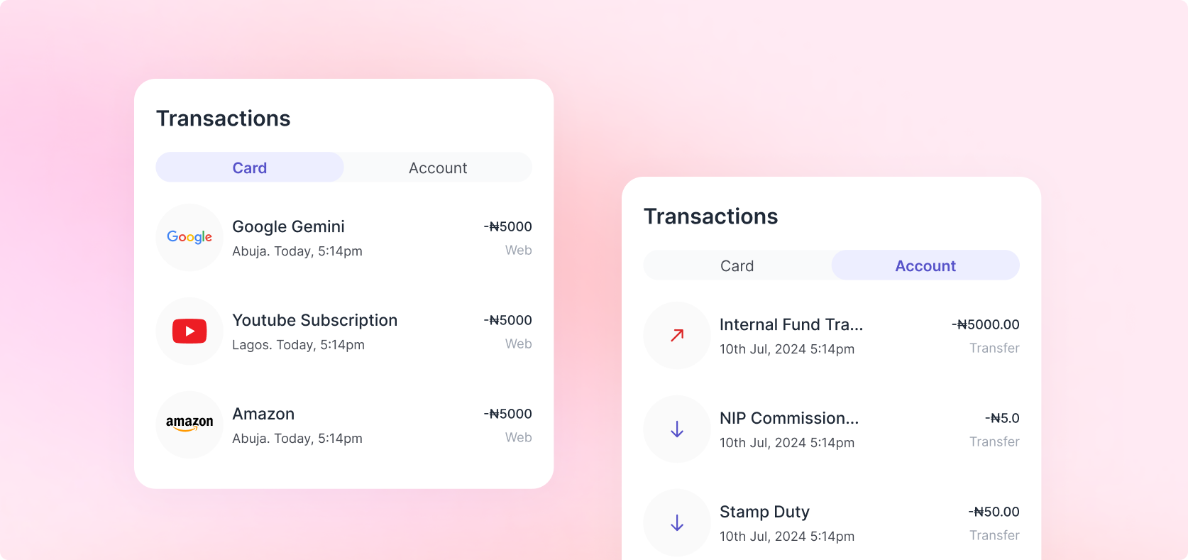
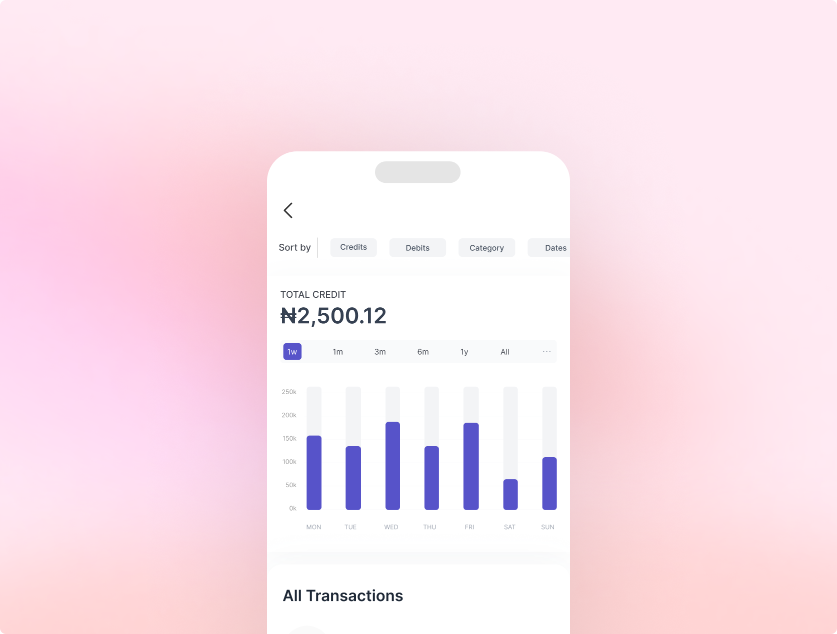
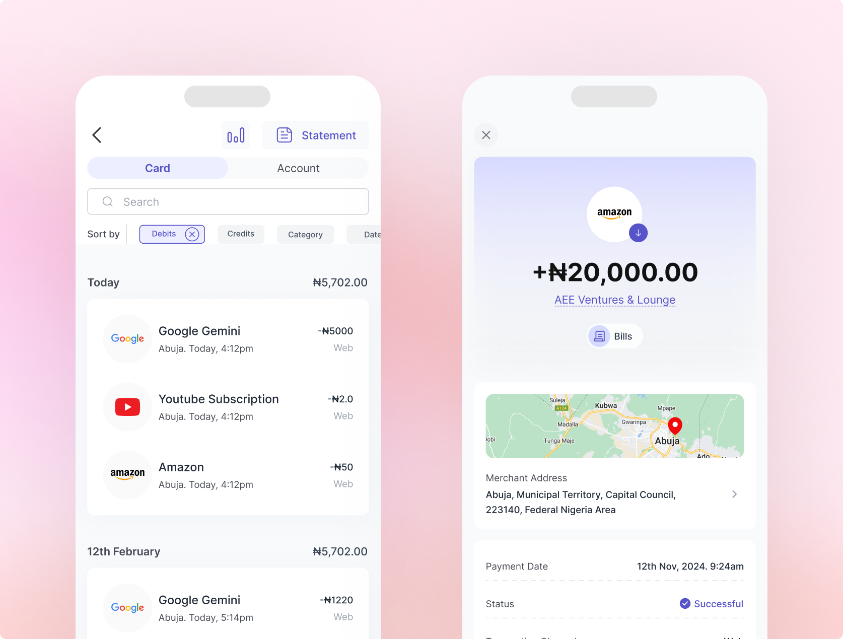
A major source of user confusion was the inability to distinguish between Card Account transactions and Settlement Account transactions. Both appeared in a single undifferentiated list: no labels, no hierarchy, no filters. The redesign introduced a clear structural separation between account types, with distinct views, labelling, and transaction categorisation. Filters by date, type, and status were added for power users.
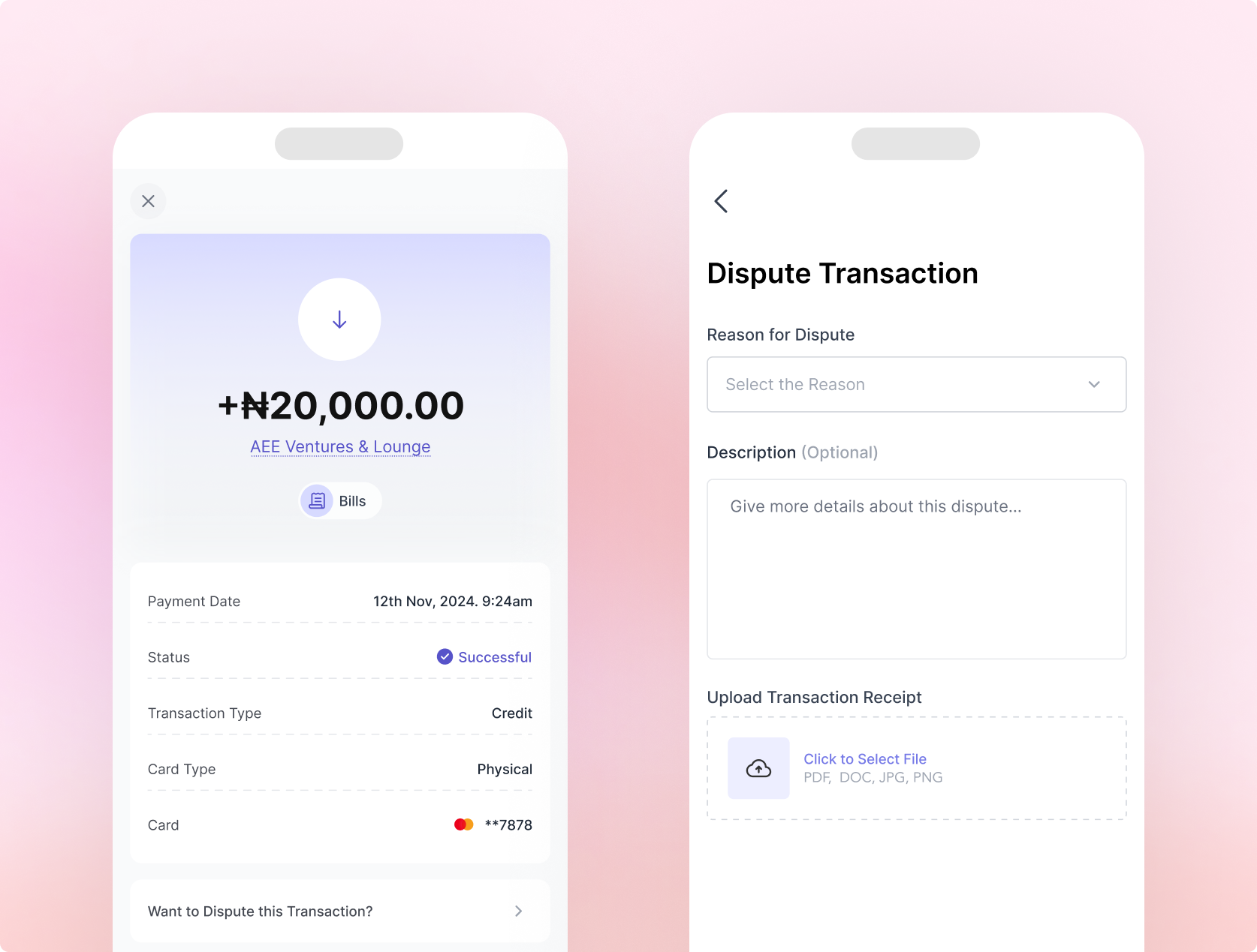
The Dispute Transaction Feature
One of the most significant new features introduced was an in-app transaction dispute mechanism. Previously, users experiencing an incorrect charge or suspected fraud had no structured in-app recourse. They had to call support, often without resolution. I led the initiative to design a dispute flow allowing users to flag transactions, select a category, provide evidence, and submit a structured request, reducing unstructured support contacts significantly.
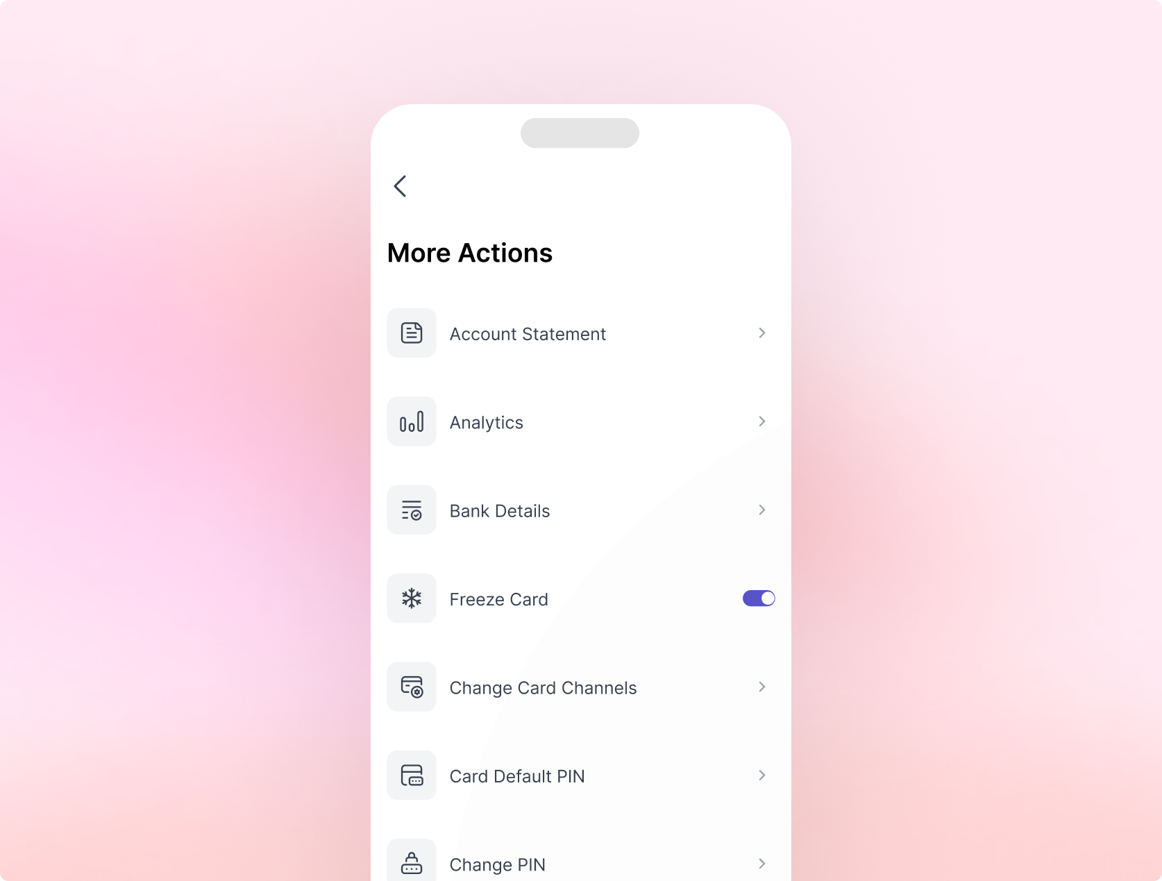
Repositioning Features for Findability
One of the clearest symptoms of a broken information architecture is when users cannot find features they know exist. Before the redesign, core card management capabilities were buried, inconsistently placed, or entirely absent from the surfaces where users expected to find them. The Freeze Card toggle, card channel controls, PIN management, and account statement access all lived in locations that did not reflect how users think about managing a card.
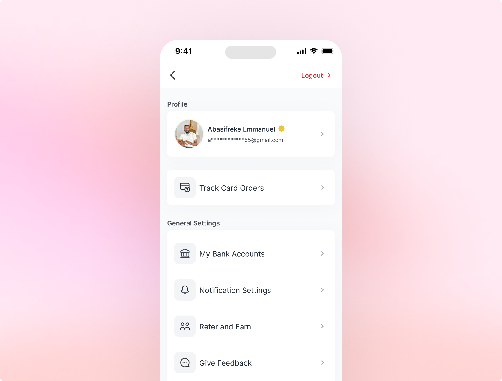
The Profile Restructure
Before the redesign, account-level settings were scattered with no logical grouping and no clear owner. Users who wanted to manage their bank accounts, update notification preferences, or track a physical card order had no reliable place to look. The profile page was an afterthought, not a destination. A well-structured profile page reduces misdirected support contacts and gives users a sense of control over their account.
CHALLENGES
Navigating Stakeholder Alignment
With four senior stakeholders involved, alignment required deliberate effort. Disagreements arose around pace of change (simultaneous vs. phased launch), the default card strategy (requiring commercial commitment), and scope of the dispute flow. My approach to every disagreement was the same: return to the evidence. Every design decision presented to stakeholders was anchored in specific complaint data, user research findings, or drop-off analytics. Evidence, not opinion, was the currency of every alignment conversation.
Engineering Collaboration on Performance
The app performance issues were fundamentally technical, but a designer who ignores performance is designing in a vacuum. I worked closely with engineering to ensure redesigned flows were architected to avoid new performance burdens, flagging optimised asset sizes, lazy-loading patterns for transaction histories, and streamlined screen transitions at handoff.
OUTCOME
Results and Impacts
The redesign launched to the full user base and the results were swift, measurable, and cross-functional. Outcomes below represent directional figures based on post-launch monitoring, confirmed by Customer Support, analytics review, and app store data.
Qualitative Shift
Customer support staff reported an immediate change in the nature of inbound contacts. Users were no longer calling to ask how to fund a card or link an account. App store reviews shifted in both tone and content, with users specifically citing improved onboarding clarity, ease of card creation, and a cleaner transaction view. For several reviewers, the redesigned product felt like "a completely different app", which, architecturally and experientially, it was.
REFLECTIONS AND LEARNINGS
What I'd Do Differently
Establish a Design Validation Loop Earlier
Timeline pressure made it tempting to move quickly from research to implementation. In hindsight, at least one structured usability testing round on mid-fidelity prototypes, especially for the post-onboarding flow, would have surfaced edge cases before they reached engineering.