
CONTEXT
Where Funge Started
The V1 product was a straightforward NFT marketplace: list, browse, buy. It ran on Android, leveraged Polygon's low transaction fees as its primary value proposition, and had a small but engaged community on Discord. It did what it said on the tin, but not much more.
The problem was not the concept. NFTs were attracting a new wave of users beyond the crypto-native crowd: artists, collectors, and curious newcomers who had no tolerance for the steep learning curves that defined established platforms like OpenSea or Rarible. Funge had an opening. The question was whether the product could grow into it.
The Business Problem
The client's ask was broad: expand the platform scope based on user feedback. After reviewing the data, it became clear there were four distinct problems stacked inside that brief:
- Retention was shallow. Buy/sell mechanics alone were not creating reasons to return daily.
- Discovery was broken. Users could not find collections without direct links.
- The onboarding gap was wide. Beginners dropped off before completing their first transaction.
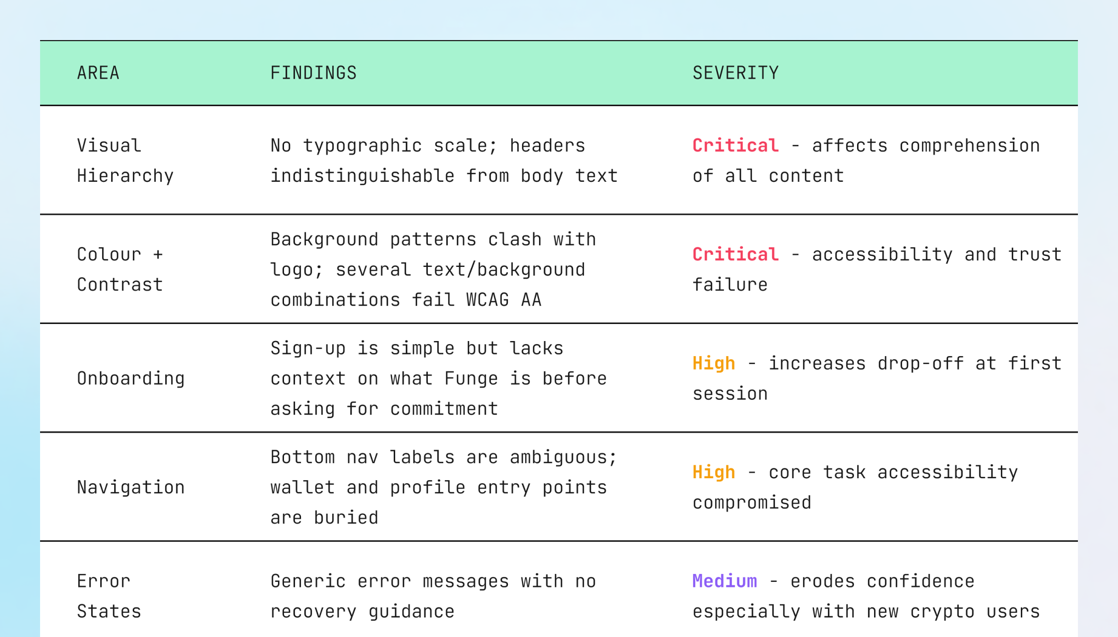
- The MVP's visual execution had undermined trust. Low contrast, clashing backgrounds, no clear type hierarchy.
Design principle adopted early
Every feature decision would be evaluated against one question: does this reduce the distance between a curious newcomer and their first successful NFT interaction?
RESEARCH + DISCOVERY
Understanding the Problem Space
I structured the research around three parallel tracks that are essential on marketplace projects: understanding the existing product's failure modes, understanding user mental models (not just pain points), and understanding where competitors had created real competitive moats versus superficial ones.
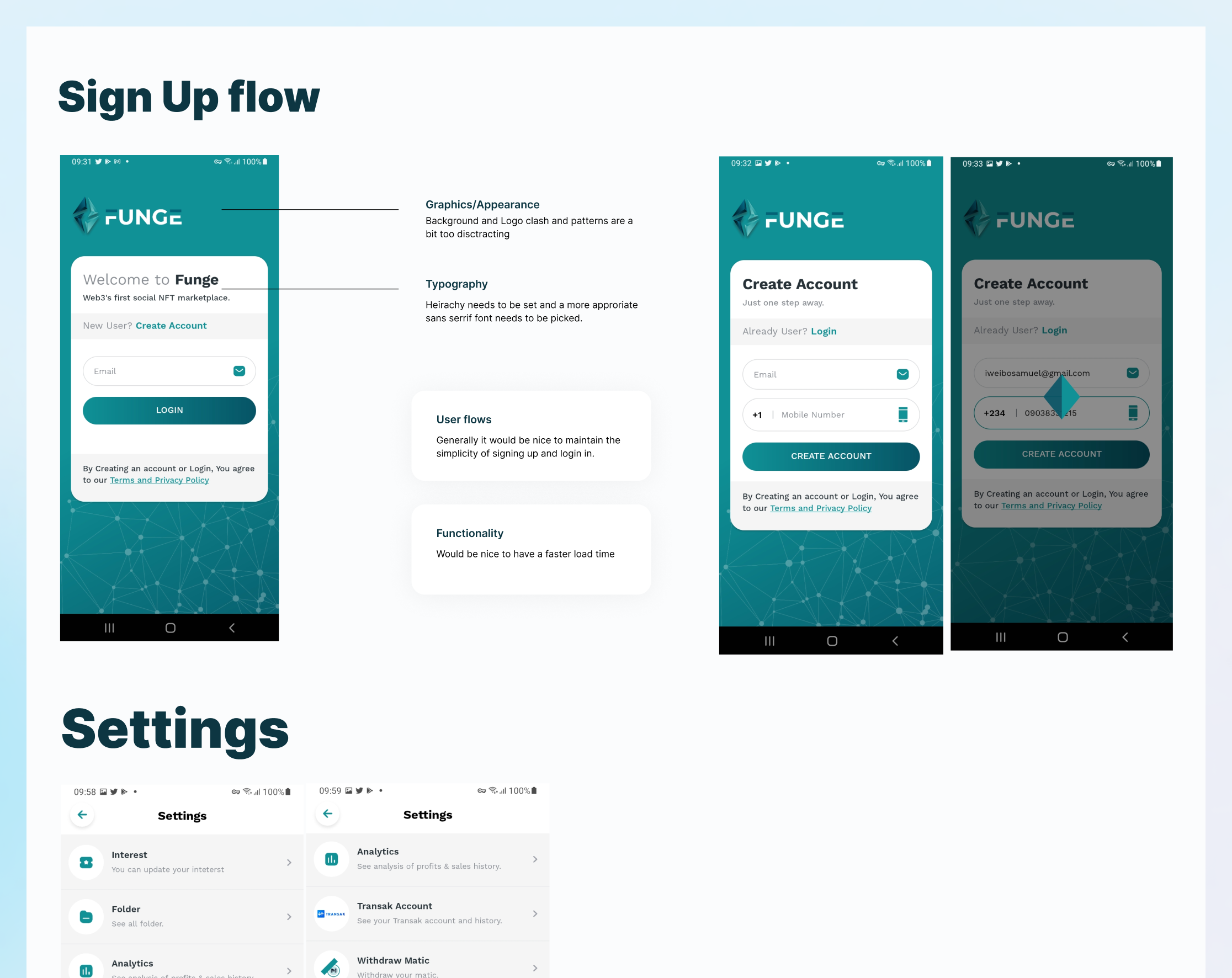
Heuristic Evaluation of V1 MVP
Before running any user research, I conducted a structured heuristic evaluation of the existing app. This is a step I insist on before any user sessions.
Community Research via Discord
The Discord community channel was a goldmine that had not been properly synthesised. I spent several sessions doing structured qualitative analysis of the feedback threads: tagging comments by theme, sentiment, and recurrence. This gave me signal on what was genuinely bothering users versus what was noise.
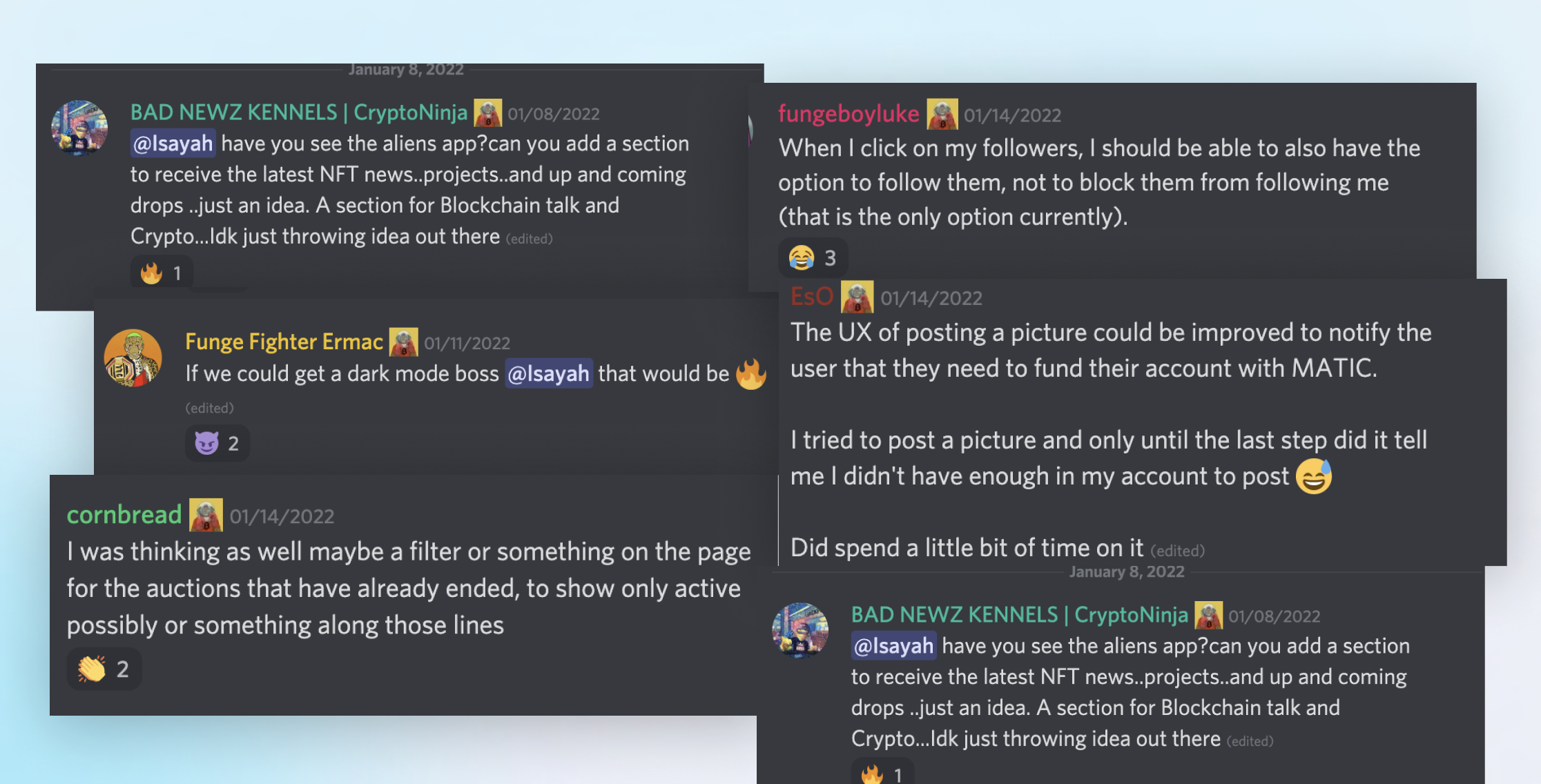
Key quote from community (paraphrased from Discord)
"I wanted to buy my first NFT through Funge because the gas fees are actually affordable here. But I gave up halfway because I had no idea what was happening after I clicked buy."
Survey: 110+ Respondents
I designed a structured survey targeting the Funge community across three user archetypes: crypto-native collectors, independent creators, and newcomers to Web3. The goal was not to confirm assumptions but to surface the gaps between what the client believed users wanted and what users actually needed.
Competitive Analysis
I focused the competitive analysis less on feature comparison and more on identifying the experience gaps the market had not addressed. The findings shaped the differentiation strategy more than any single internal insight.
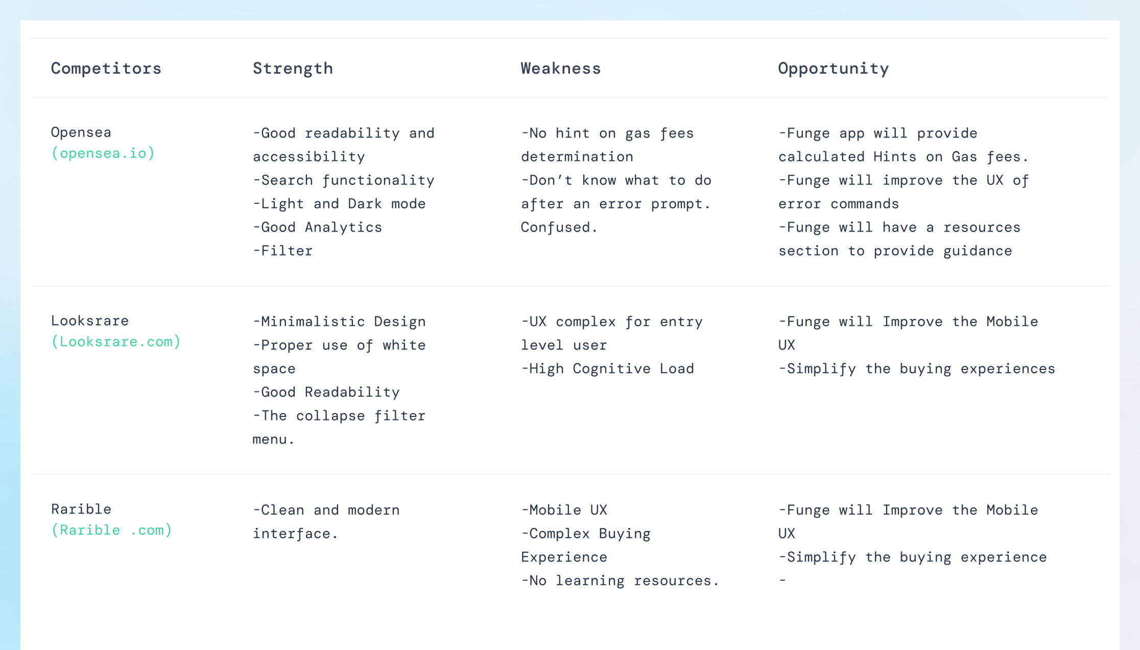
Strategic gap identified
No major NFT marketplace had meaningfully invested in education and progressive onboarding. Every platform assumed users arrived with crypto literacy. This was Funge's most defensible opportunity: not just a social layer, but a learning layer built into the core experience.
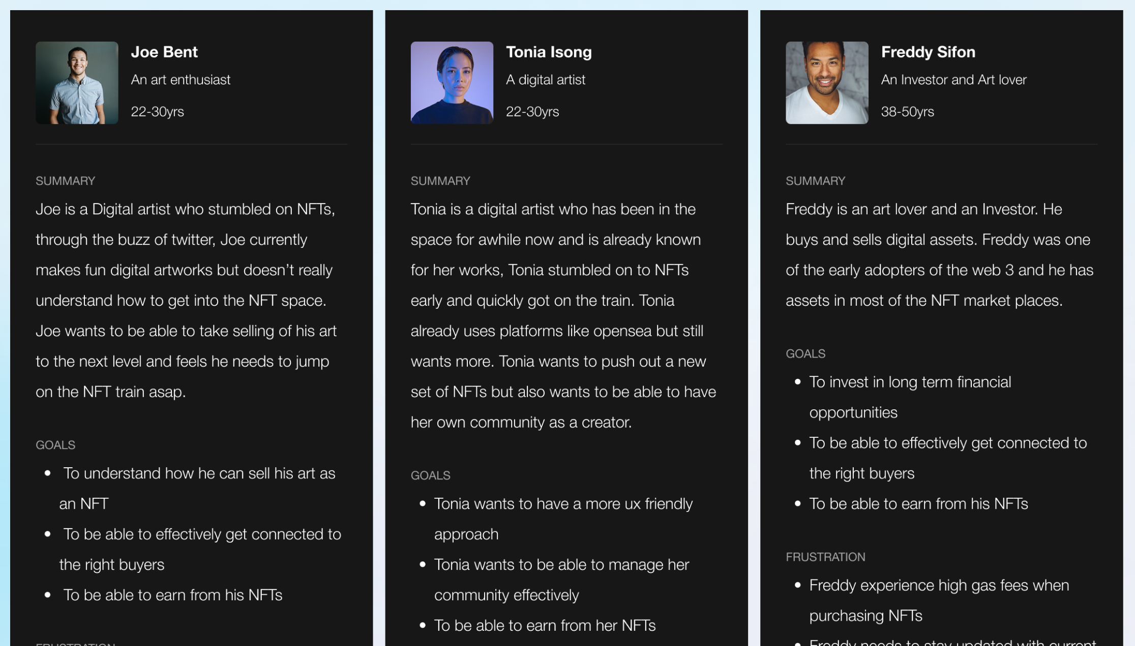
User Personas
Three personas were developed grounded in the research data: not archetypes invented in a workshop, but composite profiles built from actual survey responses and Discord quotes.
DESIGN STRATEGY
Aligning Goals to User Needs
One of the most common failure modes on feature-expansion projects is building a roadmap that satisfies stakeholder ambition without genuinely serving user needs. The mitigation is always the same: make the alignment between business objectives and user problems explicit and visible before a single wire is drawn.
Design Principles for Funge V2
Rather than jumping straight into feature design, I worked with the team to establish a short set of design principles that would act as decision-making guardrails throughout the project. These are not values statements: they are testable constraints.
Progressive disclosure over feature sprawl
Every complex feature should have a simple entry point. Advanced capability is revealed as users demonstrate readiness, not front-loaded in the UI.
Transparency as trust-building
Crypto is opaque enough. Every transaction state, fee estimate, and error message should tell users exactly what is happening and what they can do next.
Social proof integrated, not appended
Community features should not feel bolted on. Follow dynamics, creator reputation, and activity feeds need to be woven into the core purchase and discovery flows.
INFORMATION ARCHITECTURE
Flows and Structure
The V1 navigation was a symptom of a product built feature-by-feature without a coherent mental model. I rebuilt the IA from scratch using card sorting sessions with community members to understand how they naturally grouped platform capabilities, not how engineers had grouped them internally.
DESIGN SYSTEM
Building for Scale
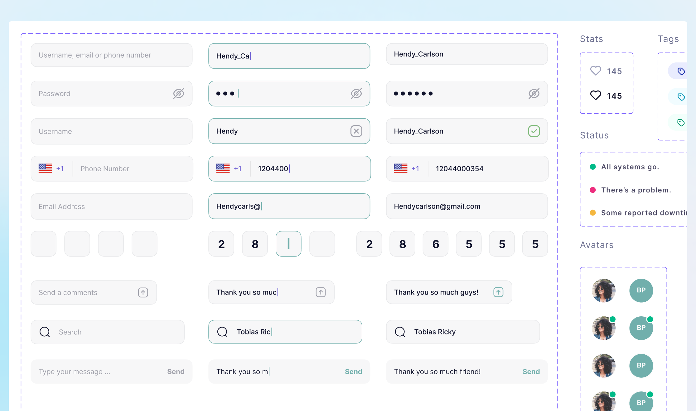
The V1 component library had been assembled reactively: one screen at a time. By the time I audited it, there were four different button styles in use with no clear hierarchy, three inconsistent input field states, and a colour palette that had drifted significantly from the brand guidelines. This was not a documentation problem. It was a structural one.
For a social marketplace with this many surface types (feeds, product detail pages, wallet interfaces, analytics dashboards, community areas), design consistency is not a nice-to-have. It is how users learn to trust the product. Inconsistency reads as instability, which is the last thing you want when real financial transactions are involved.
Approach
Conduct a full component audit before writing a single new component. Catalogue everything that exists, classify it by state (complete / broken / missing), then rebuild with scalability as the primary constraint, not just visual consistency.
KEY DESIGN DECISIONS
Where the Thinking Happened
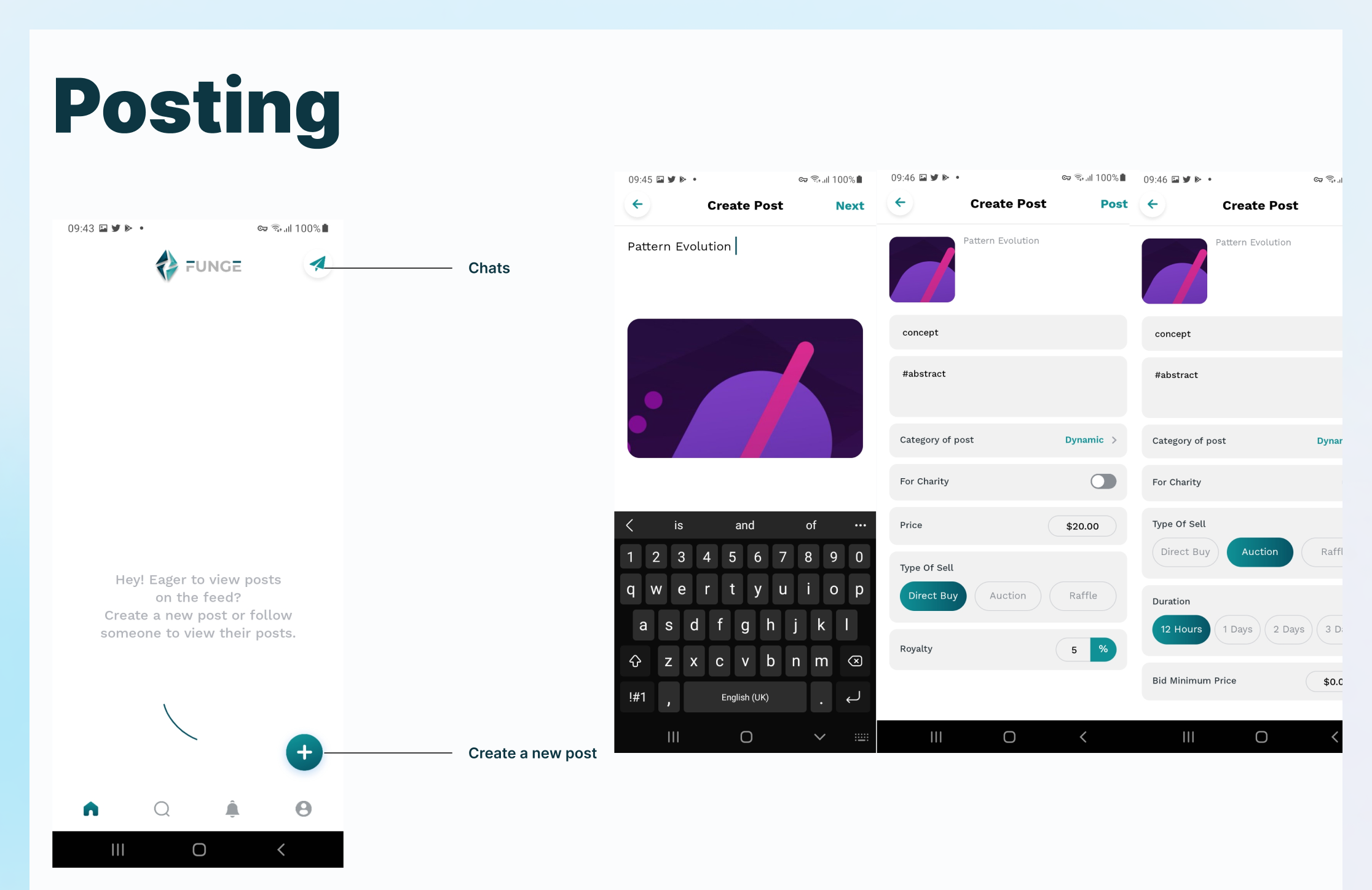
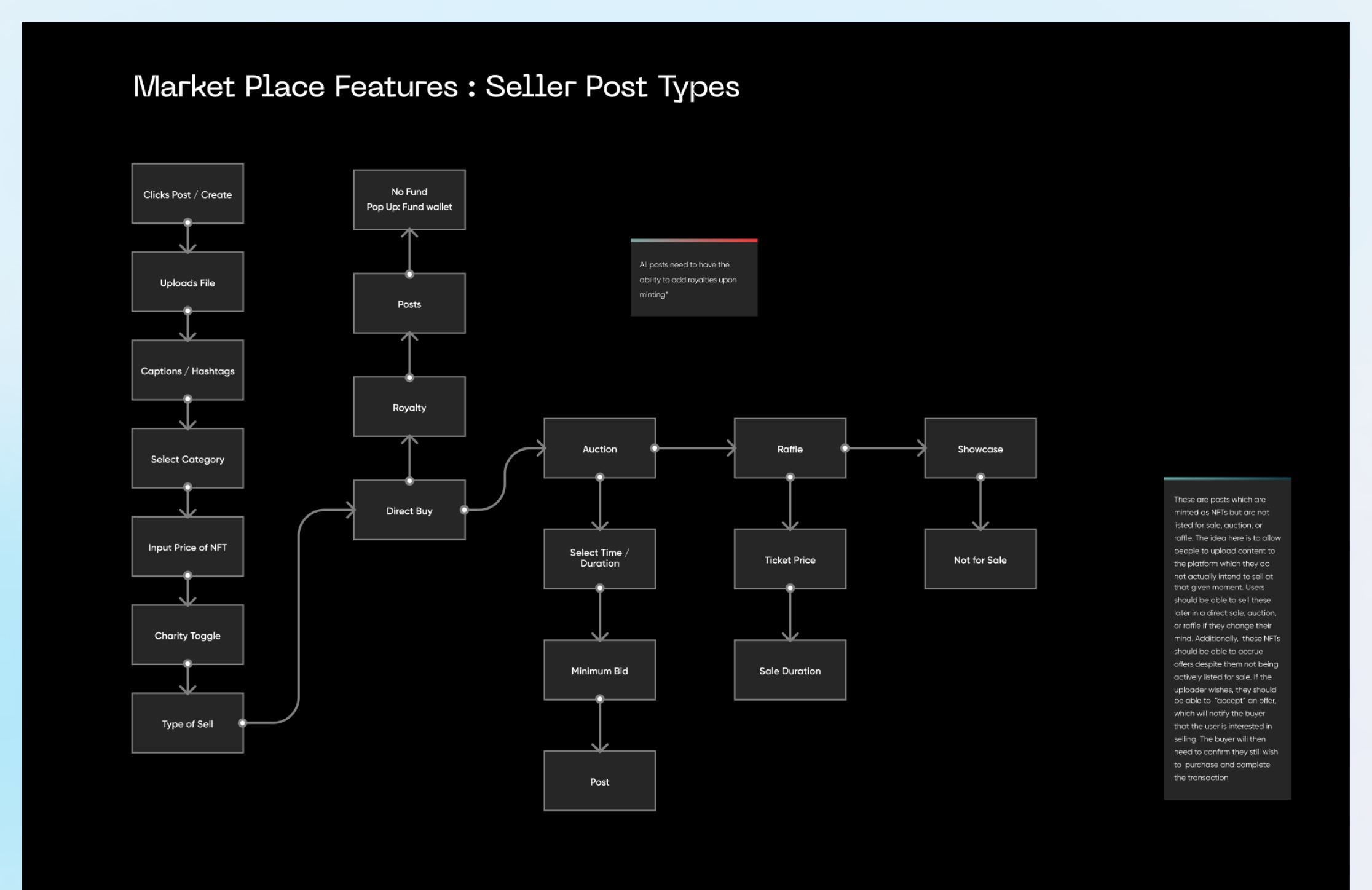
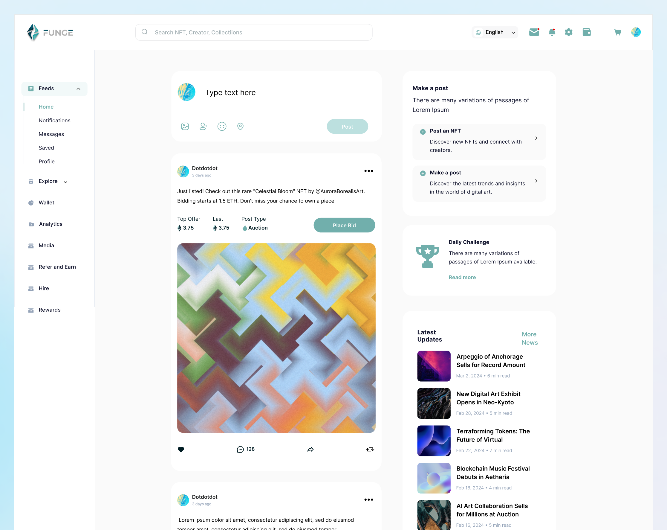
The Social Feed: Discovery, Not Just Engagement
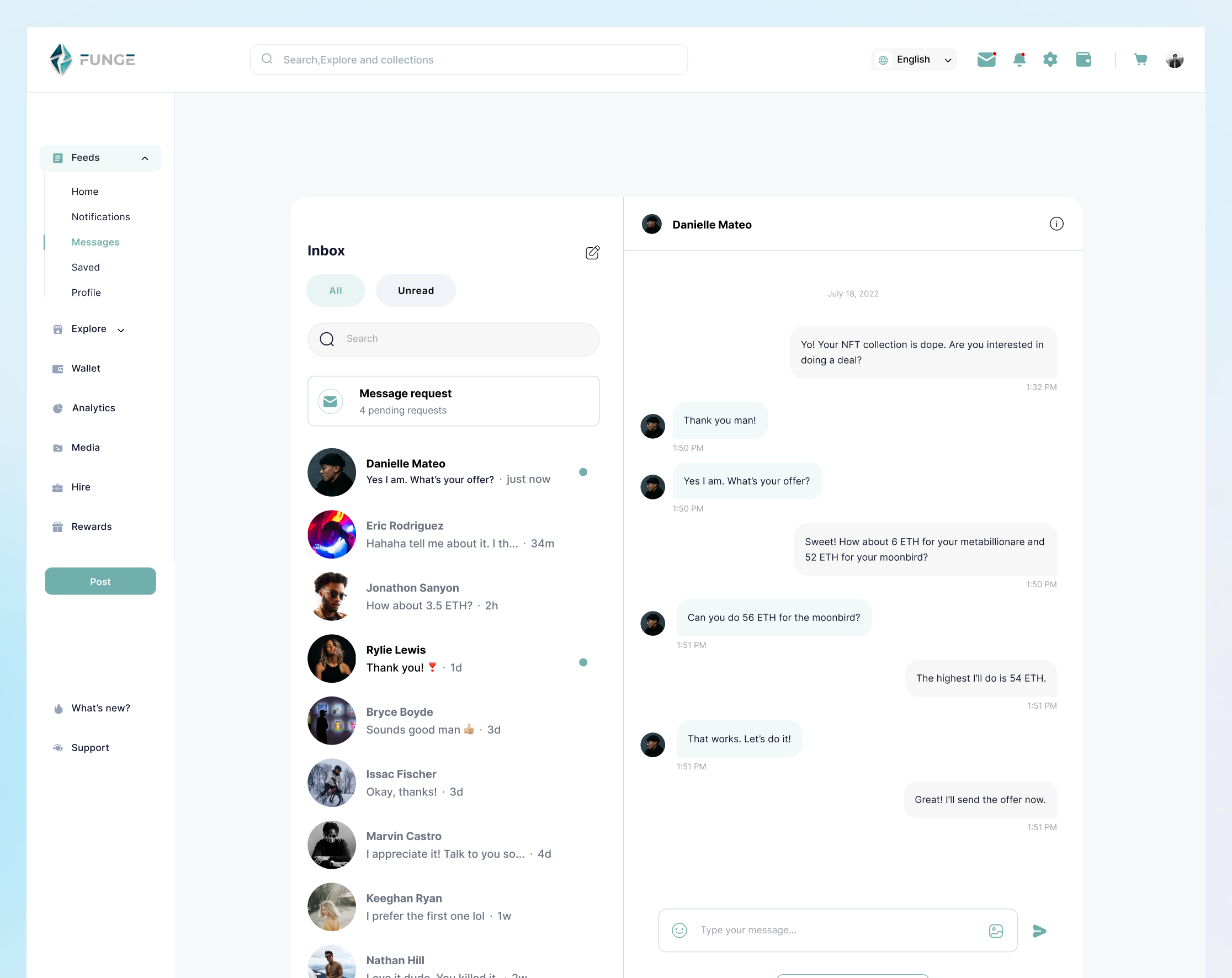
The brief asked for "community features similar to Discord". My counter-proposal was that a Discord-clone inside a marketplace would split user attention between two fundamentally different contexts. Instead, I designed a social feed that keeps discovery and commerce tightly coupled: you follow a creator, see their work in your feed, and can act on it immediately.
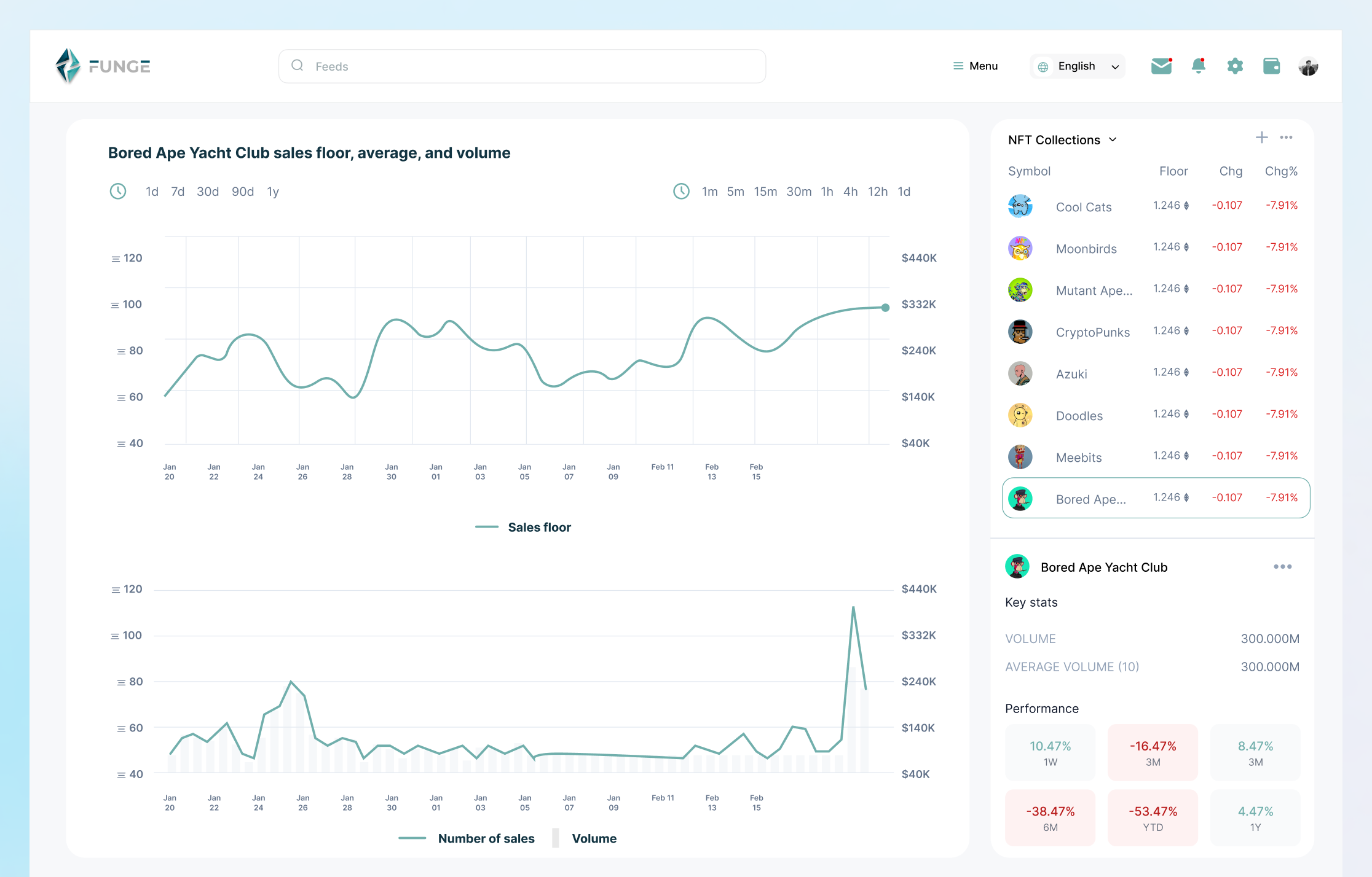
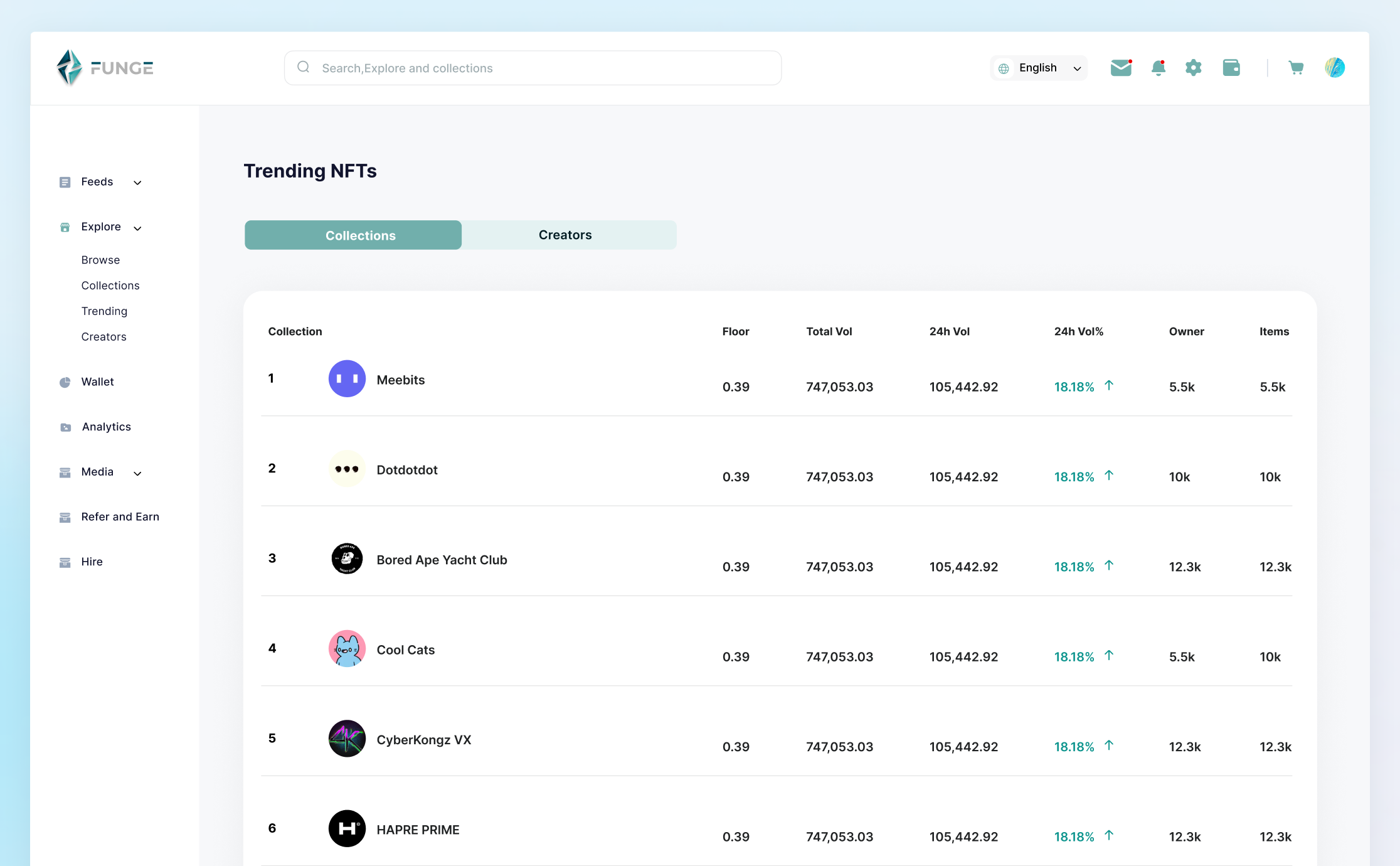
The feed also integrated news content and trending collection data, positioning it as a reason to open the app daily rather than only when making a transaction.
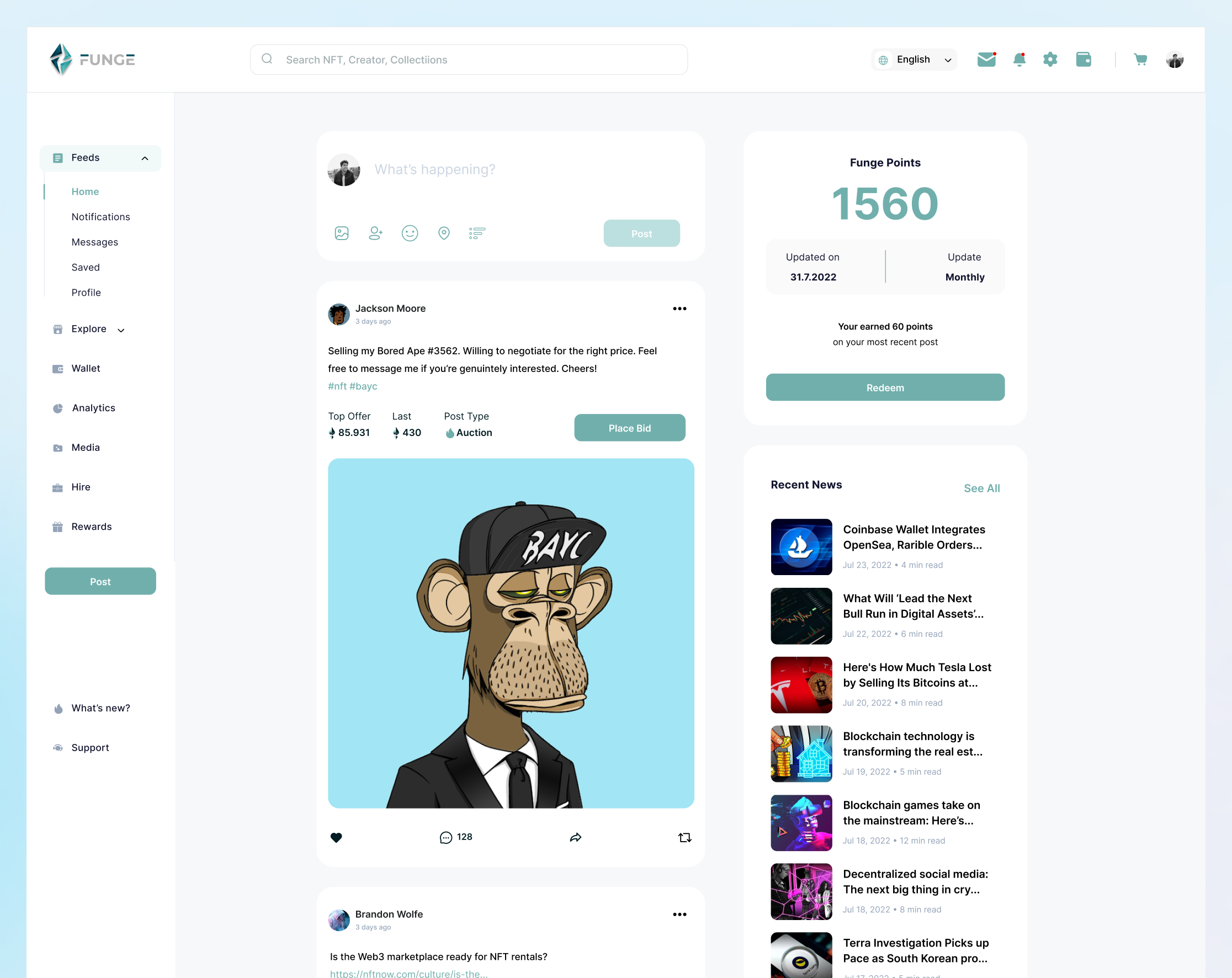
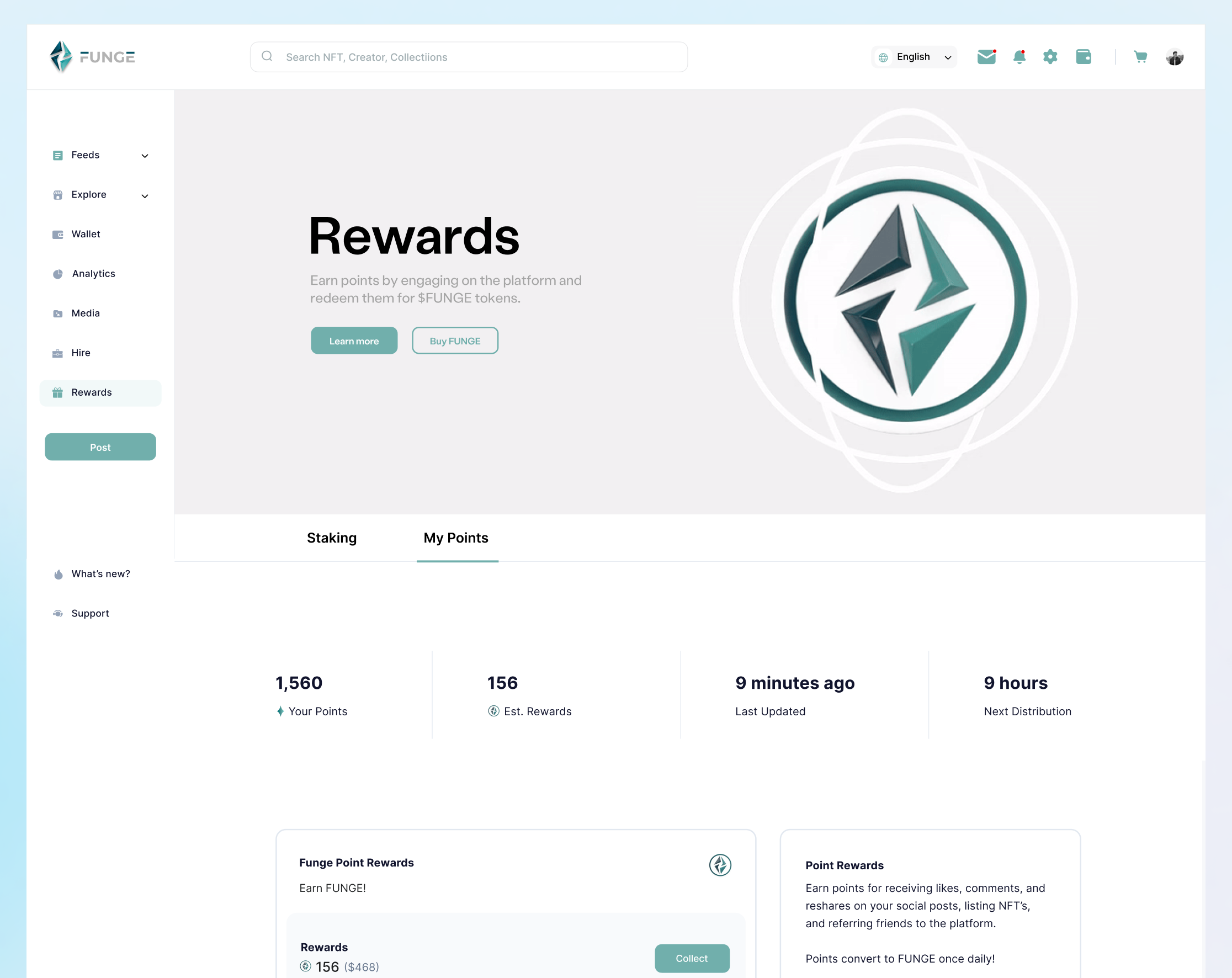
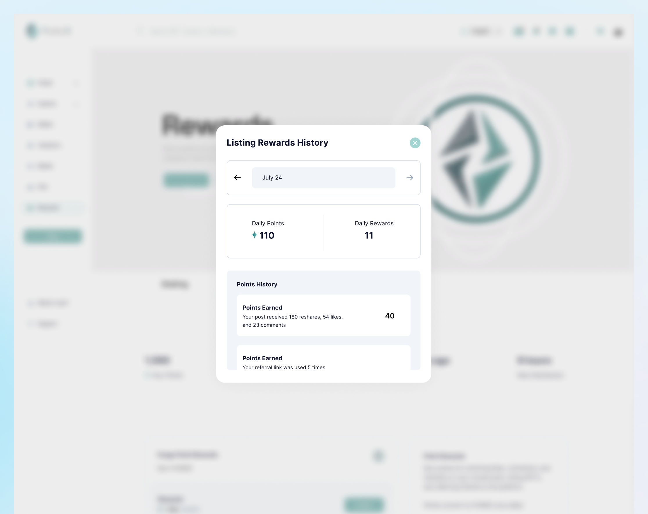
The Learning and Rewards System
This was the feature I pushed hardest for during scoping. The data was unambiguous: beginner users were abandoning the platform not because they did not want to engage, but because they did not know what to do next. Every competitor had assumed crypto literacy. Funge could own the beginner experience.
I designed a contextual education layer that surfaces guidance at the exact moment a user needs it: not as a separate Help section, but embedded in the transaction flows. Combined with a rewards mechanism that reinforced completion of key milestones, this addressed the retention gap identified in research.
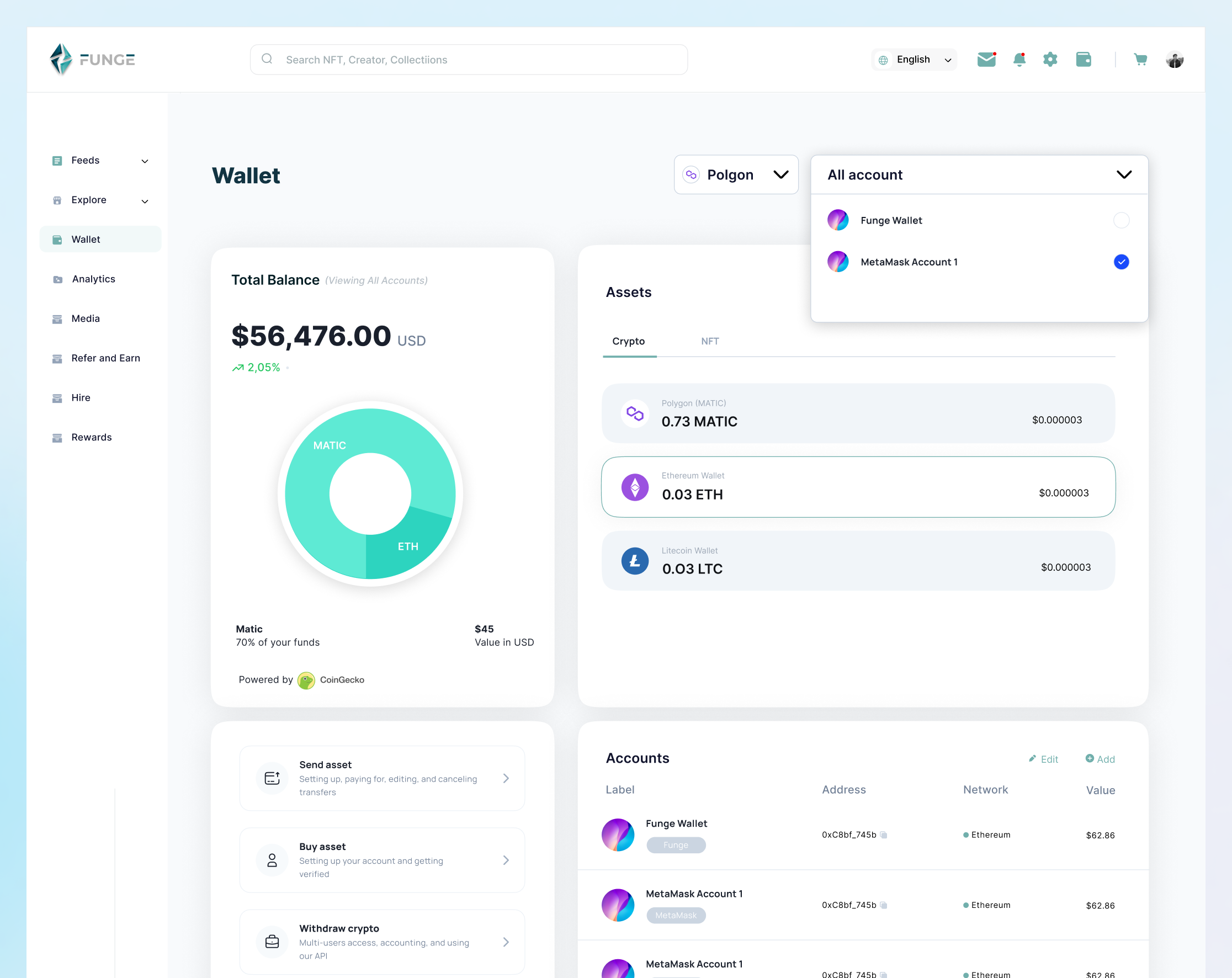
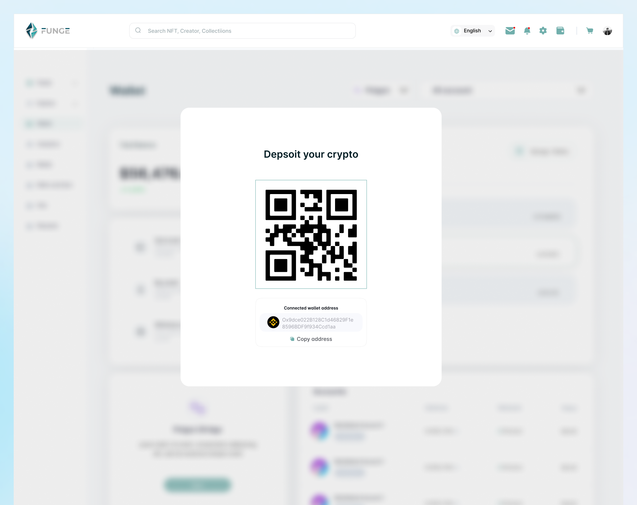
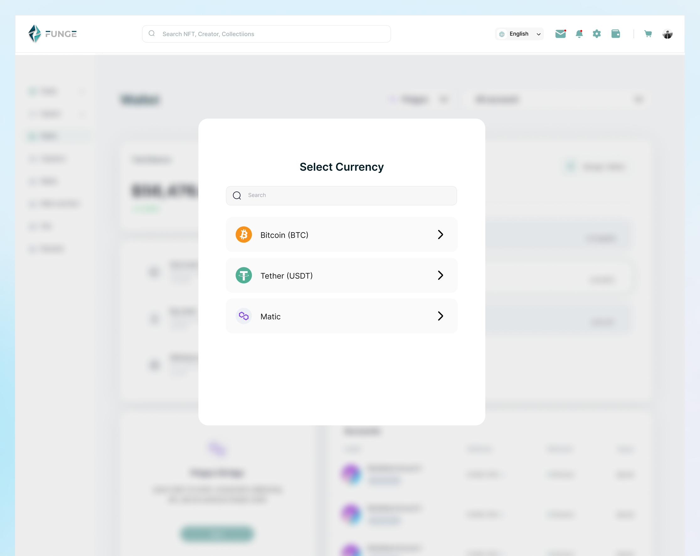
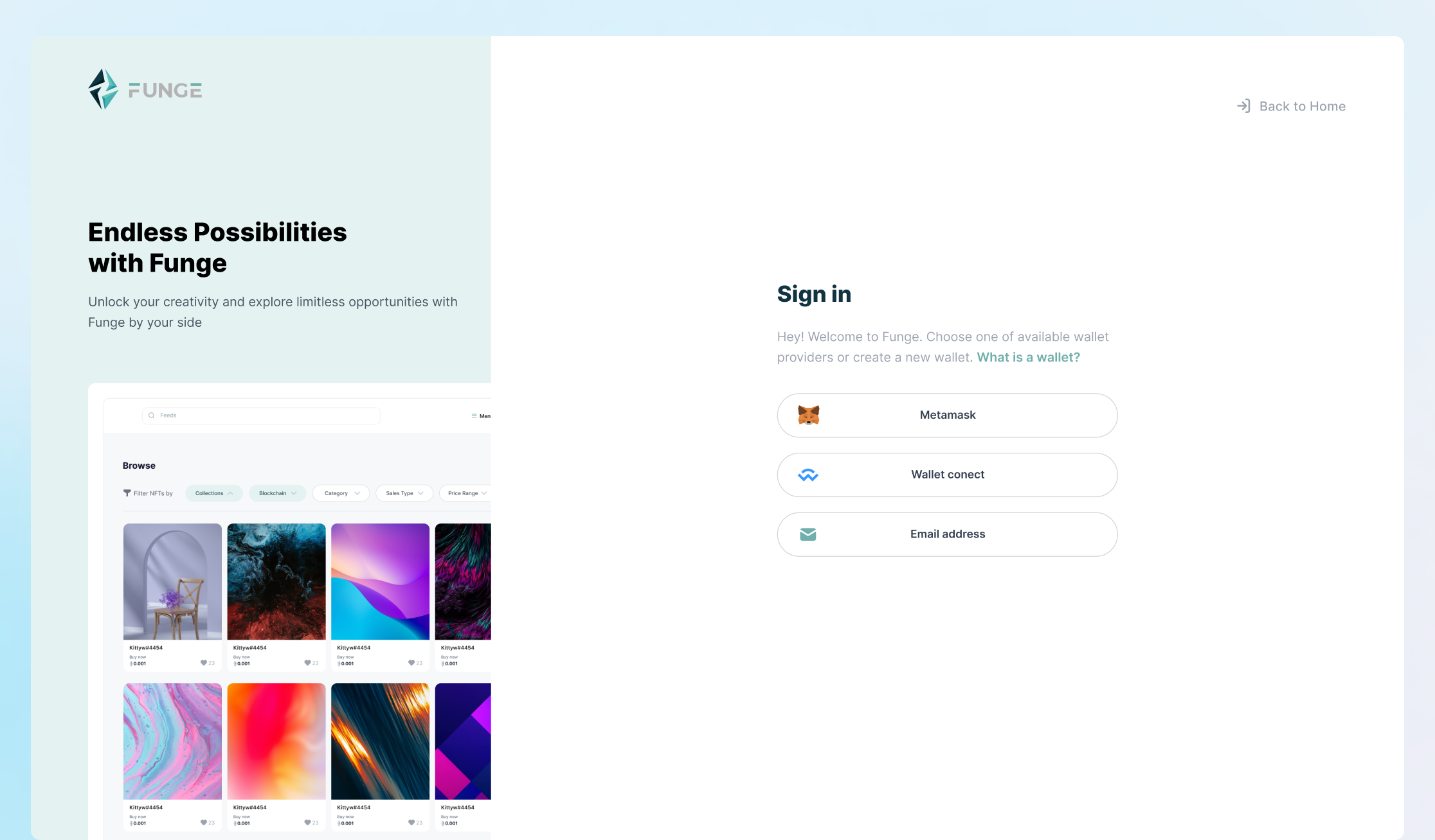
Wallet and Payment UX: Reducing the Crypto Barrier
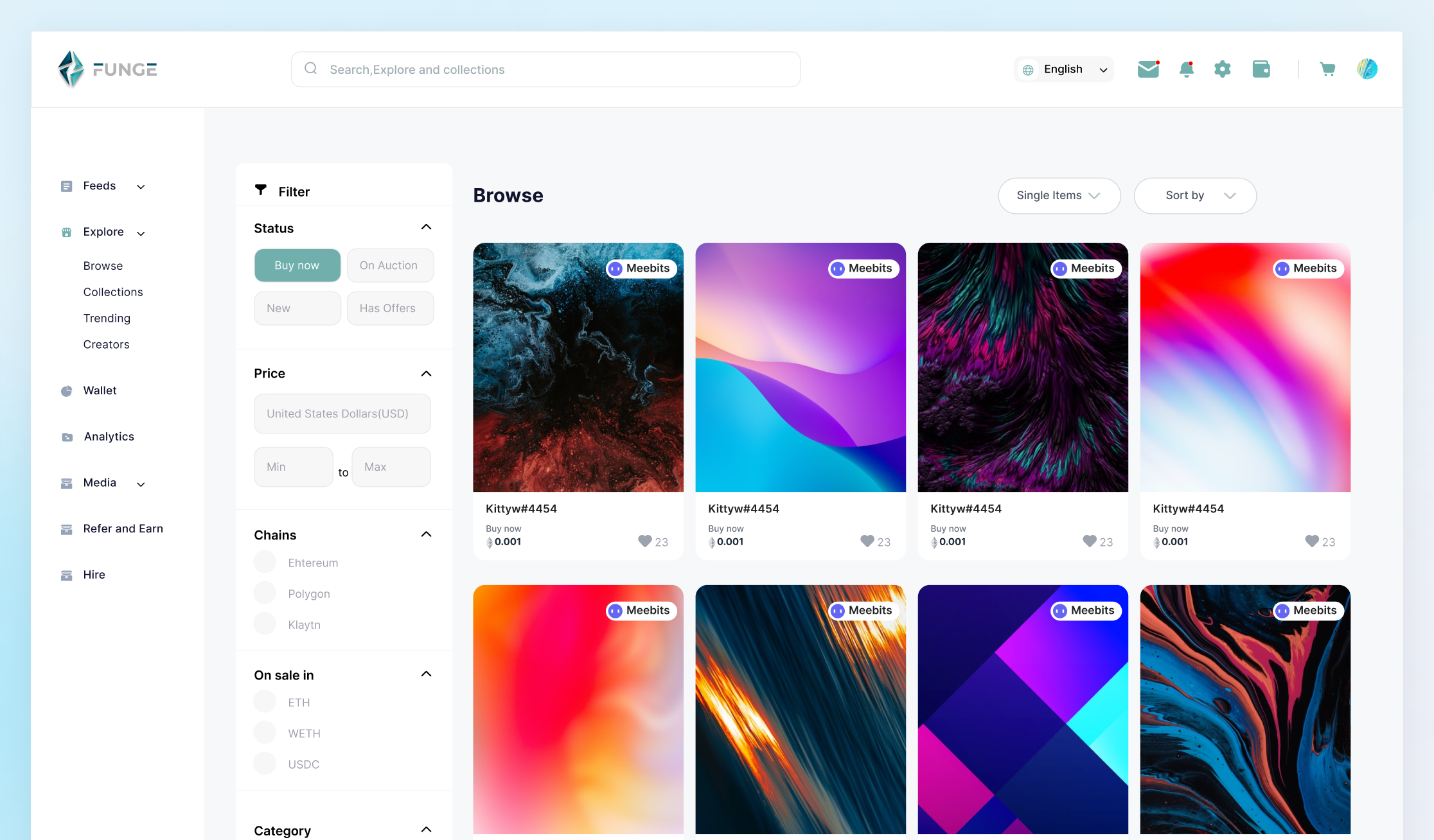
Requiring users to own Polygon (MATIC) before their first purchase was a fundamental acquisition barrier. The new wallet system integrated credit and debit card purchasing with automatic conversion: users could think in dollars and the platform handled the crypto mechanics behind the scenes. Gas fee transparency was a direct response to research data: 87.7% of users had cited opaque gas fees as a pain point. Every transaction screen now shows a plain-language fee estimate before users commit.
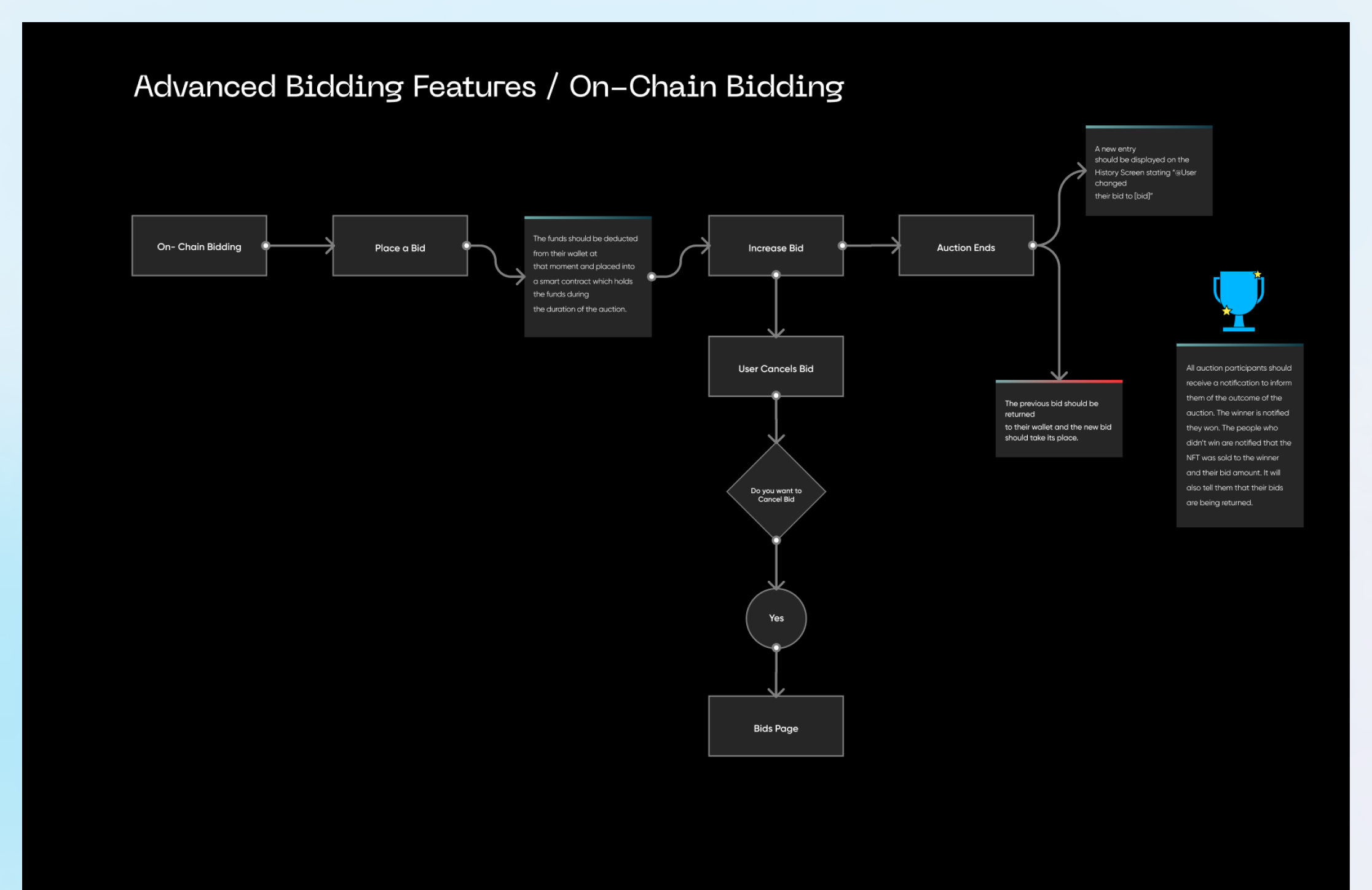
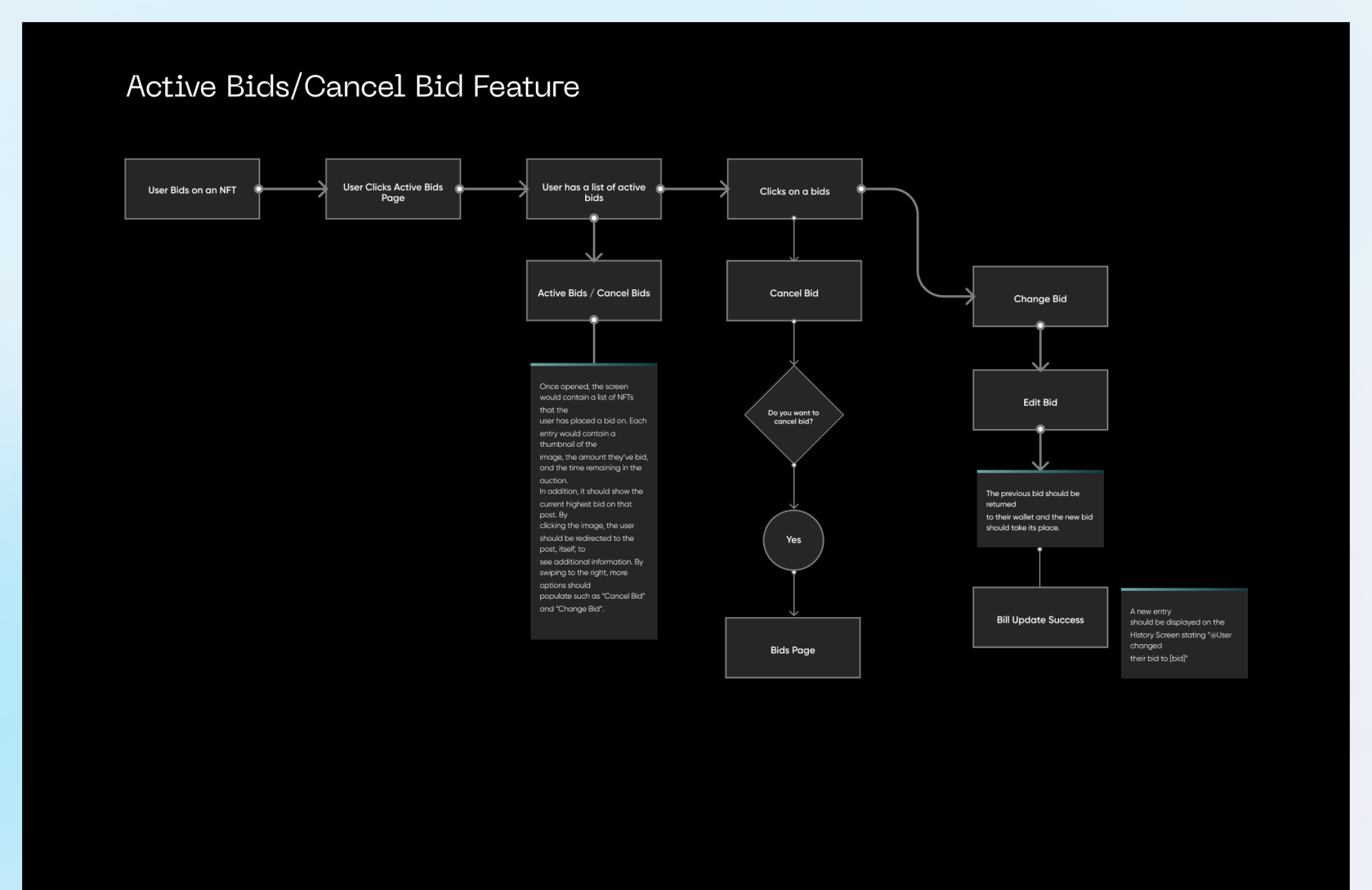
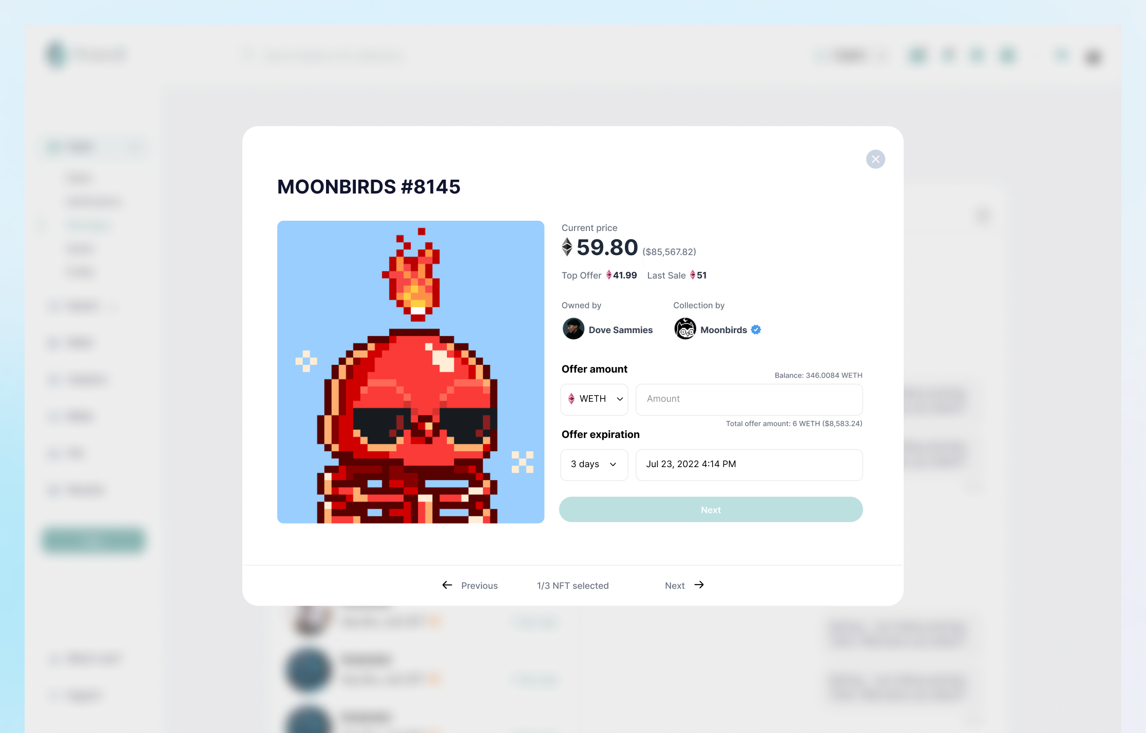
Auction System: Designing for High-Stakes Interactions
Auction UX is notoriously difficult because it requires users to make financial decisions under time pressure. Bad auction UX does not just frustrate users: it costs them money. The auction experience was designed around three principles: real-time status visibility, one-tap bid modification, and unambiguous outcome communication when auctions close.
Particular care was given to the post-auction state. All participants receive clear, specific notifications about the outcome, and losing bidders see their funds returned with explicit confirmation rather than a silent wallet credit.
More Screens
Onboarding and Authentication
Marketplace: Browse and Explore
Messaging and Community
REFLECTION
What Worked
The research-first approach was the right call, even though it delayed design work by three weeks. The alignment it created between the client's feature wishlist and a cleaner, evidence-backed prioritisation framework saved significantly more time later. Stakeholders who might have pushed back on certain feature de-prioritisations accepted the outcomes because they could see the user data behind them.
The competitive analysis surfaced the education gap as a genuine differentiator, not just a nice-to-have feature
Rebuilding the design system before designing features paid dividends in consistency and iteration speed
Embedding stakeholders in the Figma file throughout the process reduced late-stage surprises significantly
What I Would Change
- Earlier usability testing with beginner users. The personas were research-grounded, but I would want to validate the learning system flows with actual new-to-crypto participants before finalising the designs.
- A more structured design critique process. The collaboration with Samuel was productive, but we ran on momentum rather than structured review cycles. Scheduled critique sessions with external designers would have caught more edge cases.
- Tighter constraints on the feature set at the outset. The project grew in scope at several points. A more explicit MoSCoW prioritisation framework shared with the client earlier would have managed this more cleanly.
The Sad Part
Due to budget constraint on the client's side, I didn't see this project to when it was shipped.