WHAT SUCCESS WILL LOOK LIKE
Success metrics, set before build.
The design strategy defined concrete success metrics tied to both user behavior and business outcomes. These targets were established during the strategy phase to ensure design decisions were anchored in measurable goals.
>90%
Task completion rate
₦500M+
Total value locked
<15%
Early break rate
We defined these three metrics upfront because each one answers a different critical question about whether the design actually works:
>90% Task Completion. Can users even do this? The baseline usability check. If people can't successfully create a deposit, nothing else matters.
₦500M Total Value Locked. Does this work at scale? Aggregate proof that users aren't just trying the feature once. They're committing significant money to it. Business validation and user confidence combined.
<15% Early Break Rate. Low break rates mean the friction strategy worked. Users aren't acting impulsively and regretting it later. The design protects them from themselves.
The guiding principle throughout;
Design that explains itself. No hidden costs, no jargon, no surprises. Every calculation exposed. Every risk clearly named.
THE PROBLEM
Three products. Three mental models. One confused user.
The brief called for a single fixed deposit product section covering three radically different savings mechanics. Each presented its own design challenge and together they created a compound problem of clarity, trust, and motivation.
Penalty anxiety blocking conversion
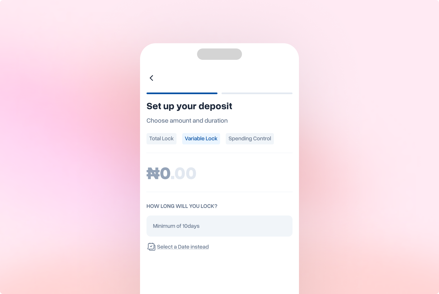
Variable lock offers emergency access with a 30% penalty. But percentages are abstract, users may not be able to evaluate whether "30%" was worth it without seeing the naira cost. Loss aversion theory shows vague loss feels worse than known loss.
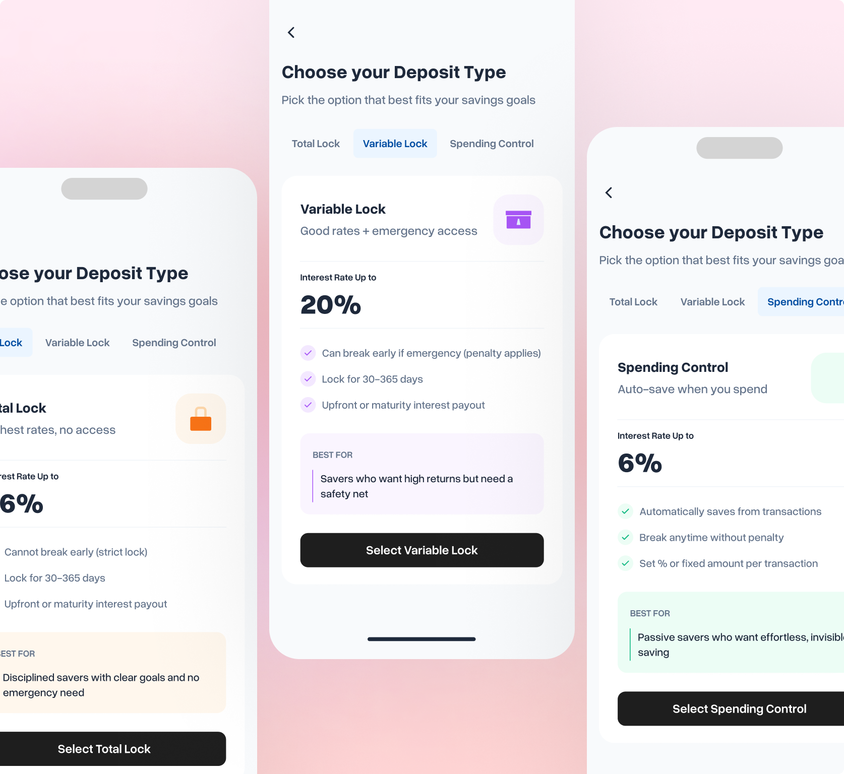
Three products nobody could tell apart
All three lock money to earn interest. Without differentiation beyond a comparison table, users may not be able to form distinct mental models. A table answers "which rate is highest?" but not "which works the way I save?"
Spending Control's concept didn't land
Auto-saving a percentage of every transaction is novel in Nigerian digital banking. The original "spending limit" framing failed, users may not connect "set a limit" to "earn interest." Mental accounting theory shows products must map to existing mental models.
"Research revealed that over 72% of users who broke deposits impulsively reported high regret afterwards. The UX problem wasn't building a better break flow, it was designing appropriate friction to prevent impulse decisions in the first place."
The opportunity was significant: a well-designed fixed deposit experience could drive meaningful adoption, reduce break rates, and build the kind of trust that converts one-time depositors into long-term savers, a win for the bank.
GATHERING INSIGHTS
Understanding the problem through existing patterns
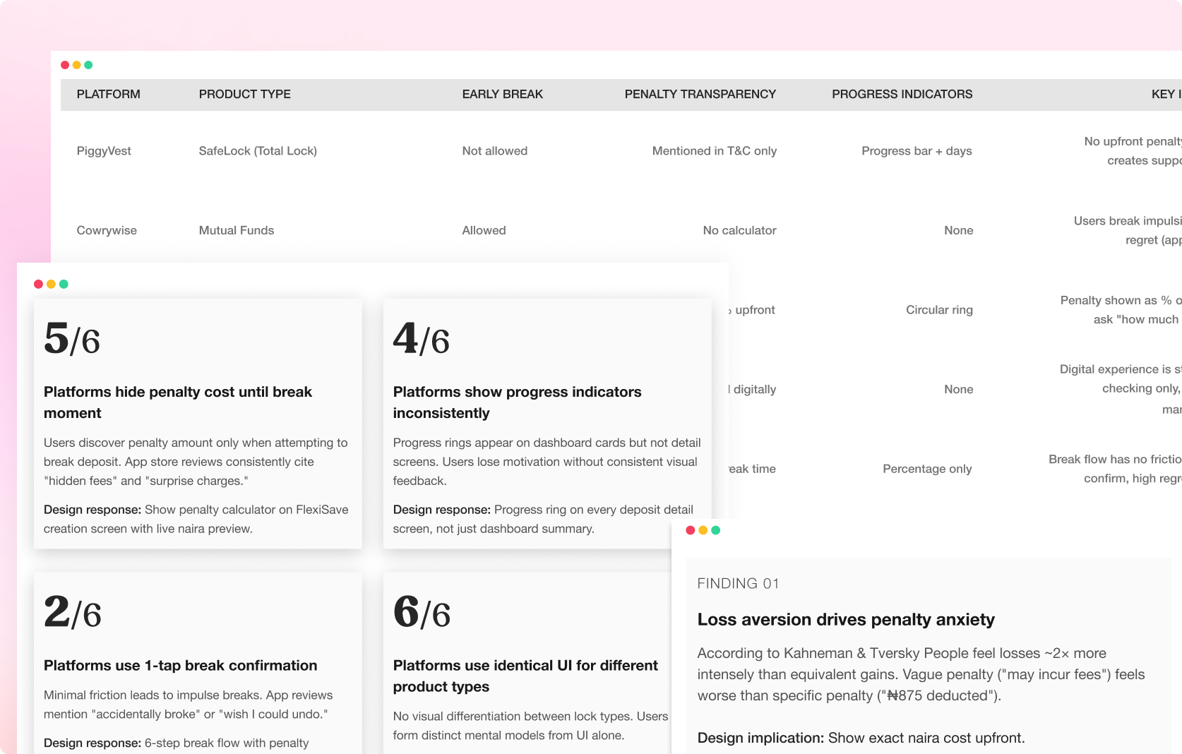
Time constraints prevented primary user research. Instead, I synthesized insights from competitive analysis of established platforms, behavioural finance literature, and heuristic evaluation of existing deposit products. The goal was to identify proven patterns and documented failure modes before designing a single screen.
Competitive analysis to identify industry patterns, behavioural finance literature to understand decision-making psychology, and heuristic evaluation of existing products to catalog UX friction points.
KEY INSIGHTS
Key Insights gathered
Transparency over reassurance
Competitive analysis showed platforms that hide penalty costs generate trust issues. Behavioral economics confirms vague loss feels worse than known loss. Show exact naira amounts before commitment.
Calibrate friction to financial risk
Platforms with 1-tap break flows show high regret in reviews. Thaler & Sunstein's nudge theory validates friction as a feature. Multi-step confirmation for high-stakes actions, instant access for low-risk views.
Progress visibility drives persistence
Goal-setting research shows visual progress increases commitment. Platforms with progress rings have lower early-break rates (inferred from feature presence in top-rated apps). Include progress indicators on every screen.
Differentiation at every interaction layer
All 6 analyzed platforms use identical UI for different deposit types. Mental accounting theory shows products need distinct categories. Use color, icon, flow structure, and screen layouts to differentiate.
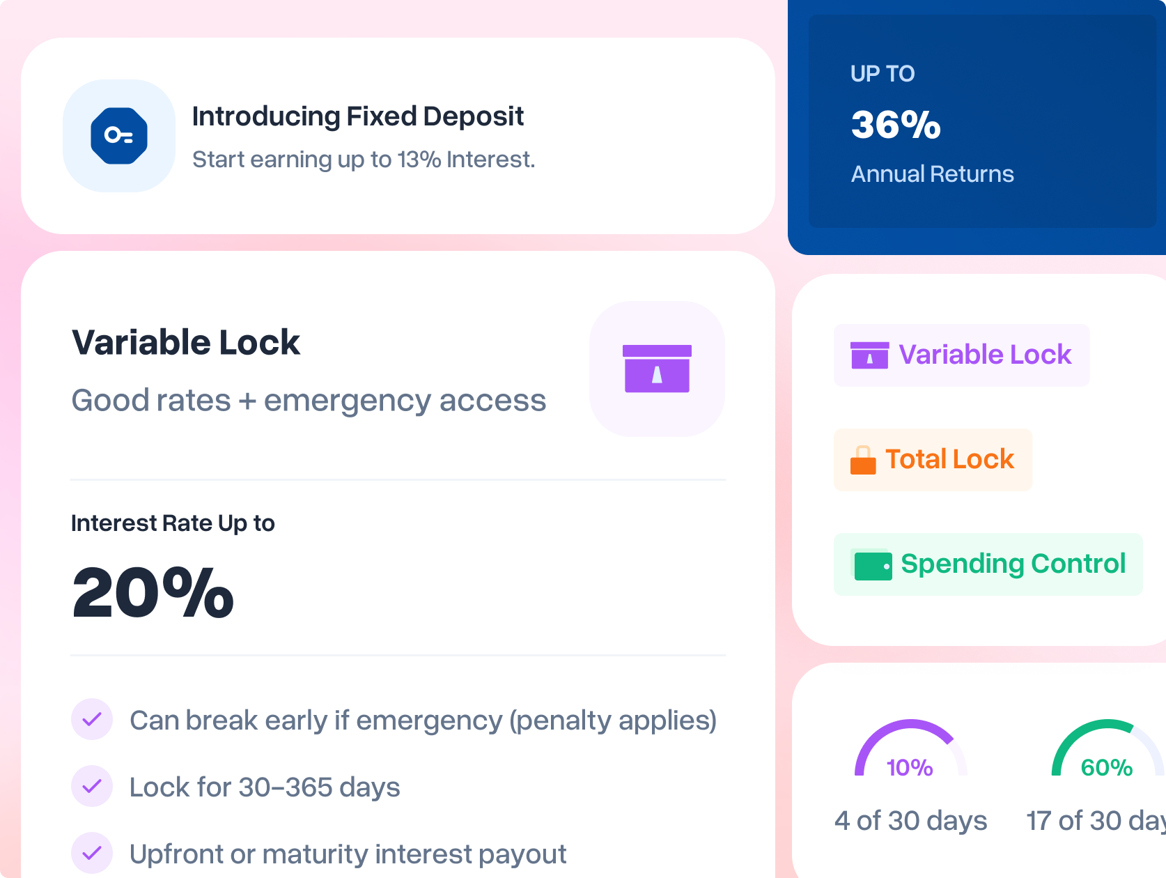
Mental models that guided Design
Variable Lock
Familiar savings account with emergency access fee. Design emphasizes "emergency exit available" with transparent cost preview upfront.
Total Lock
Users conceptualize it as something that must be physically broken to access. Design reinforces with lock iconography and "unbreakable until maturity" messaging.
Spending Control Lock
Invisible saving that happens automatically. Users relate to putting spare change in a jar digitally triggered by spending behavior.
INFORMATION ARCHITECTURE
Hierarchy that earns trust at every level
Every financial product asks users to trust it with something real, their money. Information architecture decisions in fintech have direct emotional consequences. I mapped content priority ruthlessly: what earns trust first, what explains second, what clarifies third.
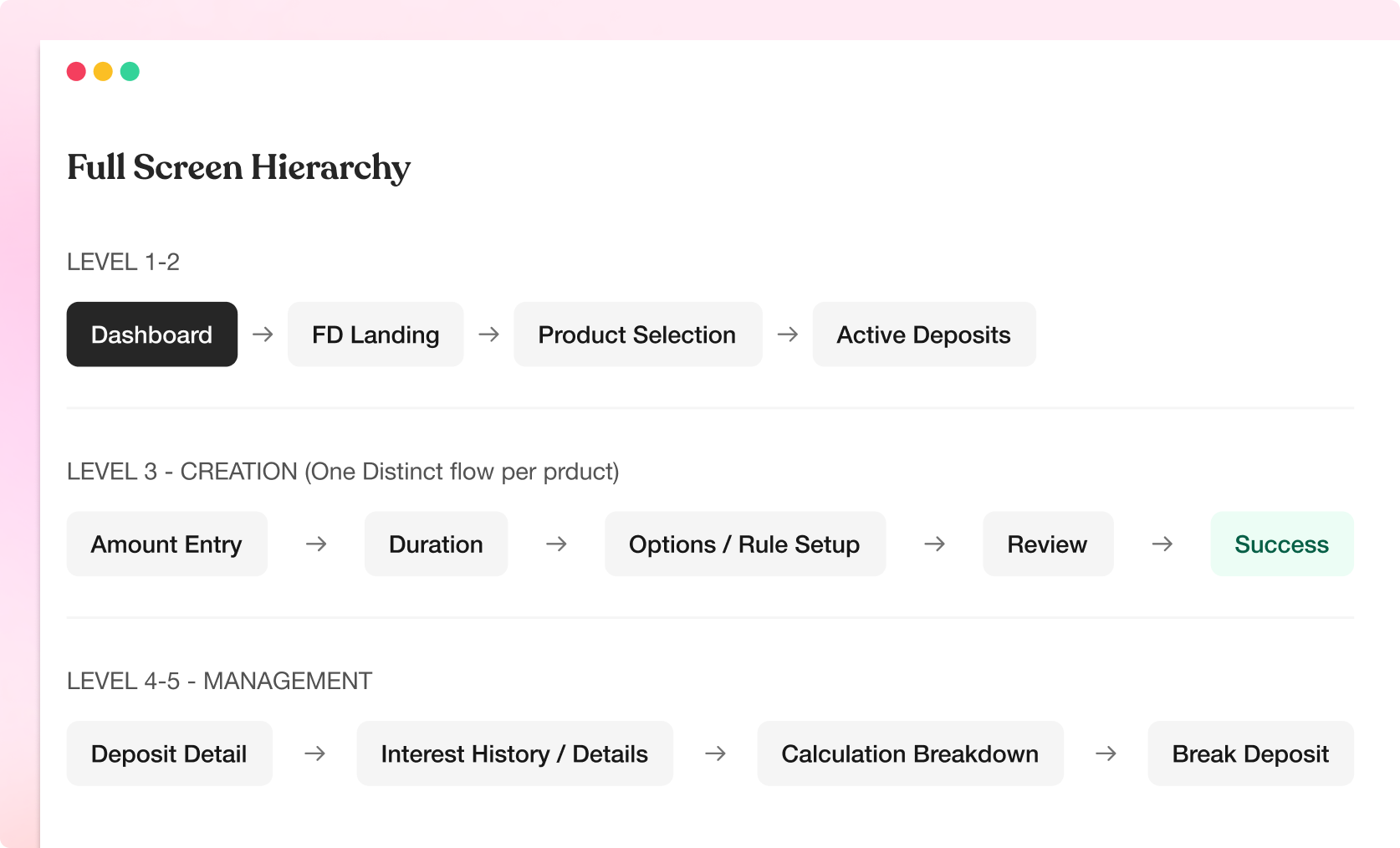
The system sits within a five-level hierarchy. The critical IA decision was when to differentiate by product type. Too early caused analysis paralysis; too late caused confusion during creation.
PUTTING IT ALTOGETHER
Starting from the middle.
I started with the components that would define the system. This is the part where I grab my headset, turn on my favourite playlist, and allow my imaginations run. I designed from the middle out; starting with the atomic decisions that create a visual language, then expanding into screens and flows once the system has a voice.
Creating a Deposit
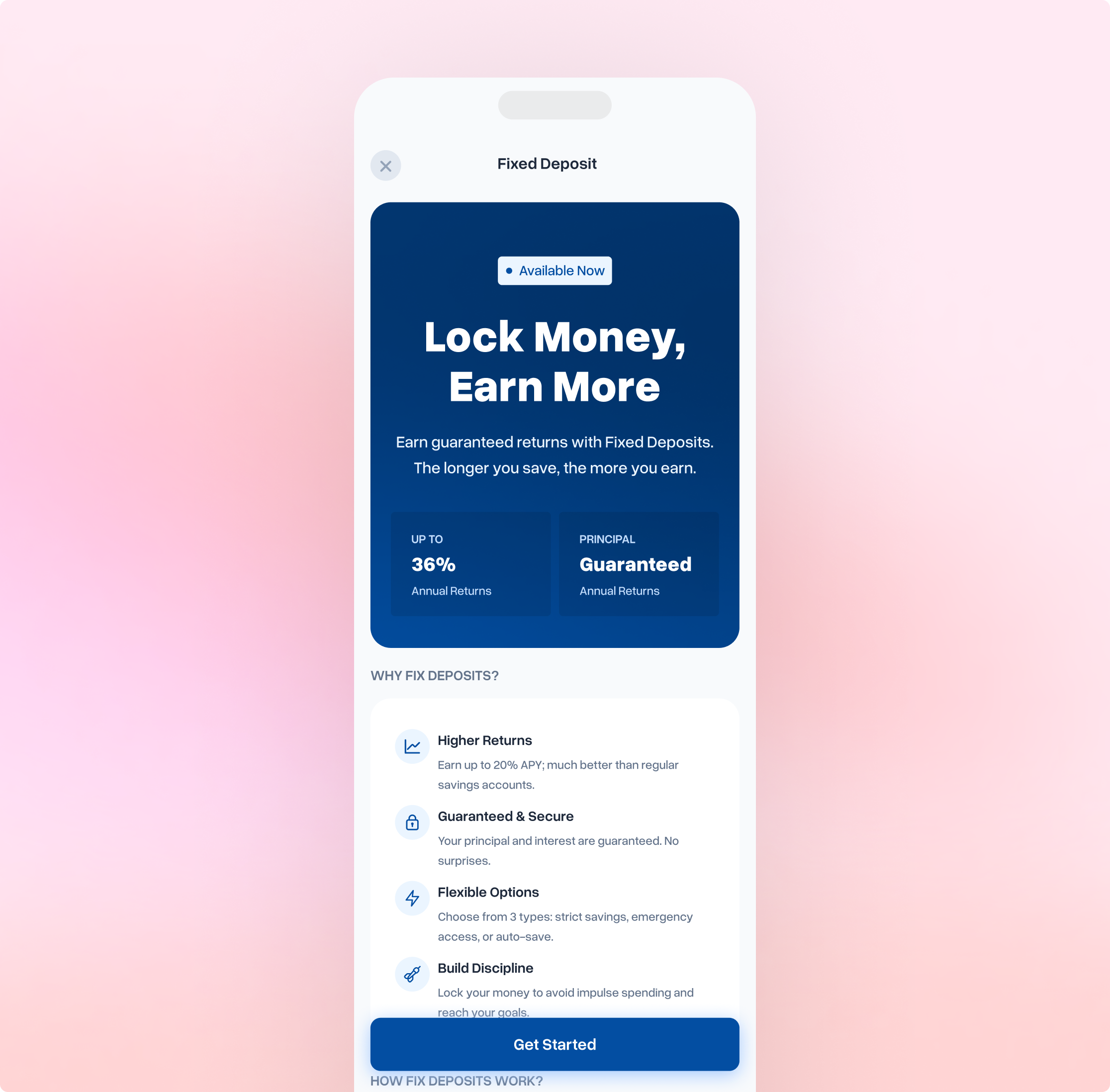
Before a user can create a deposit, they need to understand what they're choosing. The selection screen presents three products as distinct identities.
Introducing the three deposit types. Each product card shows: icon, name, tagline, 3 key features, interest rate badge, and CTA. The cards are vertically stacked with clear visual separation. Color coding begins here.
Deposit Management
The detail screen is where users spend most of their time after creation. It's not just a status page, it's the control center for a single deposit. The design challenge was showing current state, progress, and available actions without overwhelming a user who is already in a committed financial relationship with this screen.
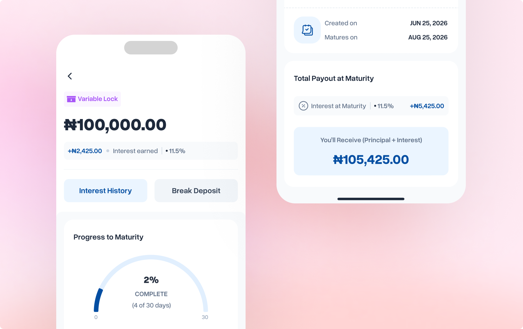
Matured Deposits & Completion
When a deposit reaches maturity, the entire detail screen transforms. This isn't just a status update, it's a success moment that deserves recognition. The design had to celebrate the user's achievement while providing clear documentation of what happened and what comes next.
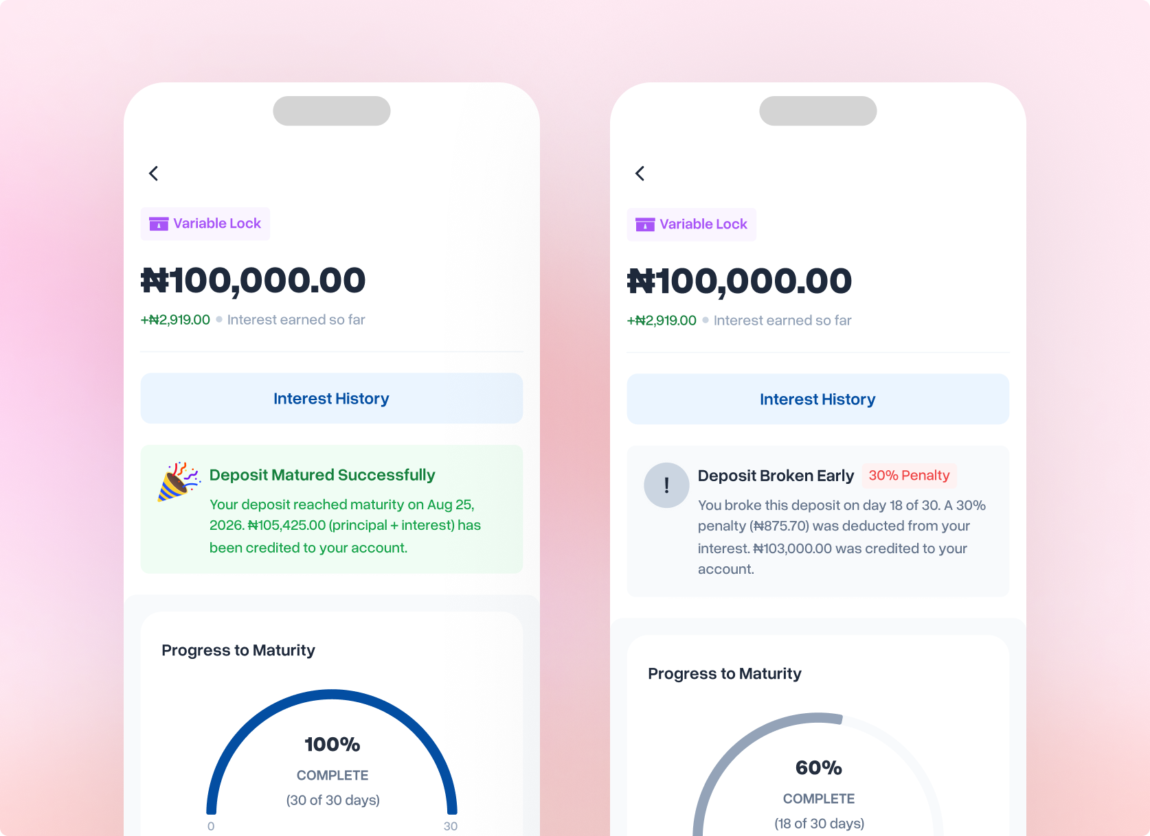
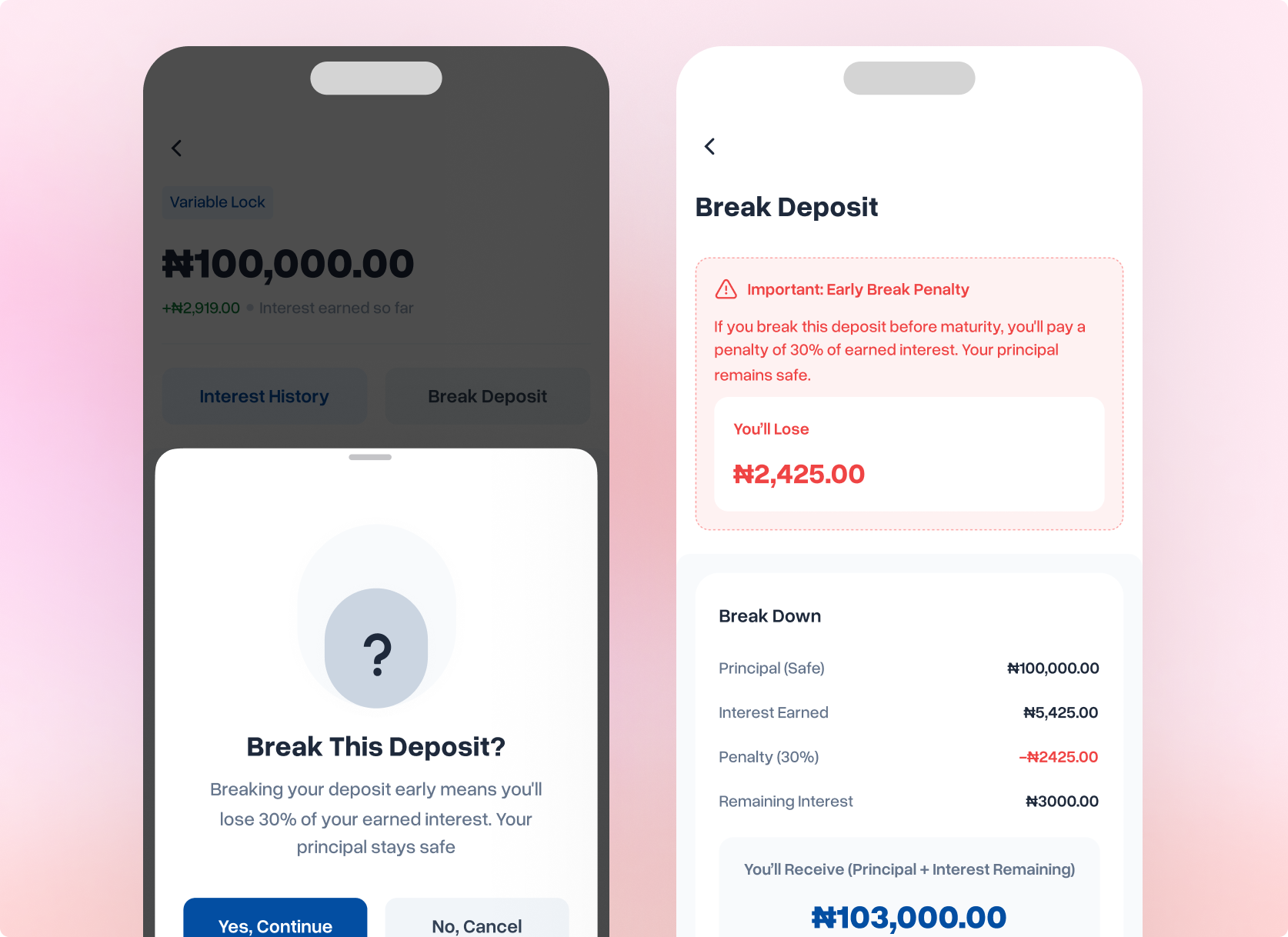
Breaking a Deposit
Breaking a deposit early is the highest-stakes interaction in the entire product. Users are about to lose money: real money, not just opportunity cost.
The design challenge wasn't just showing penalty information. It was creating a flow that prevents impulsive breaks driven by short-term emotion, while still respecting users who genuinely need emergency access. This required deliberate friction, calibrated at every step.
During competitive analysis, I examined break flows across 6 Nigerian fintech platforms. The pattern was consistent: minimal friction, 1-tap confirmation, penalty shown only at the moment of breaking. App store reviews told the story: users repeatedly mentioned "accidentally broke my deposit" and "didn't realize I'd lose so much."
UX Strategy
The strategy I used is called escalating commitment: each step in the flow requires slightly more deliberate action than the previous one. This isn't about making things difficult. It's about creating pause points where users can engage their reflective thinking system instead of their automatic impulsive system.
Friction Calibration Framework
Not all actions deserve the same level of friction. I designed a three-tier framework based on two factors: reversibility and financial impact.
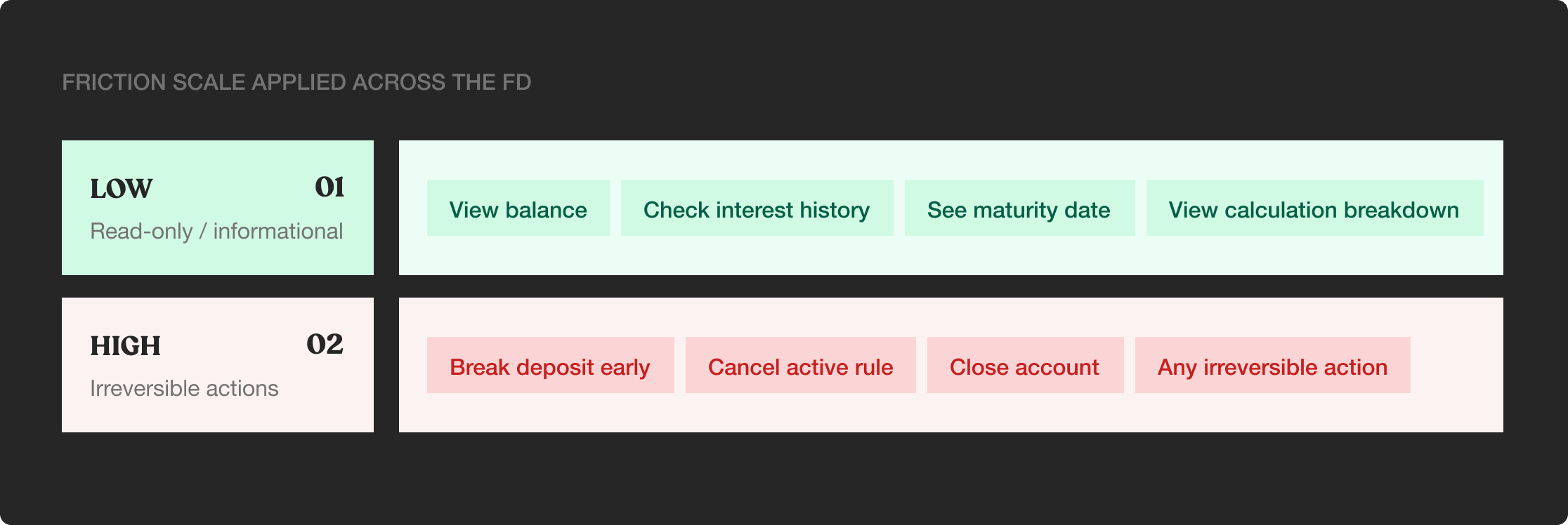
Edge Case Handling
What if the user tries to break a SafeVault deposit?
Total Lock deposits cannot be broken. That's the product's core value proposition (maximum returns in exchange for total lock). When a user taps "Break Deposit" on a SafeVault detail screen, they see a specific modal explaining why it's not possible and when their funds will be available.
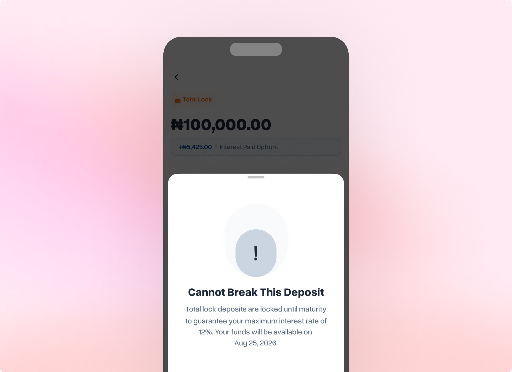
Friction in UX is often framed as the enemy: something to remove, optimize away, smooth over. But when an action is irreversible and financially costly, friction becomes a design tool. The break flow isn't just about showing penalty information. It's about creating space for reflection in a medium designed for speed.
REFLECTIONS
My Takeaway from this project
Designing financial products compresses every UX challenge into one product: trust, complexity, anxiety, delight, and real-world consequences. These are the lessons I'll carry forward.
01-Product naming is design work, it belongs in the brief room
Total Lock, Variable Lock, Spending Control were mechanism-first names that described what the product does to money, not what it does for users. Renaming them in design review felt overdue. This conversation should happen at brief stage, with the designer at the table, not as a late-stage copy polish.
02-Transparency outperforms reassurance, every time
My instinct early on was to soften penalty language to make breaking a deposit feel less punishing. The research corrected me: users didn't want reassurance, they wanted information. The more precisely I showed the cost (30%, not "a fee"), the more trusted the system became. Hiding complexity doesn't remove it. It just moves the anxiety to a different moment.